Click to take a look at it
1st Anniversary.
Something was made, and something was not.
We celebrate what happened in between
— what occurred on this surface.
1주년, 무언가를 만들었고, 무언가는 만들어지지 않았습니다.
그 사이에서, 이 표면에서 발생한 것들을 기념합니다.
1st Anniversary / HANHARAM DESIGN STUDIO / 2026.03
Something was made, and something was not.
We celebrate what happened in between
— what occurred on this surface.
1주년, 무언가를 만들었고, 무언가는 만들어지지 않았습니다.
그 사이에서, 이 표면에서 발생한 것들을 기념합니다.
1st Anniversary / HANHARAM DESIGN STUDIO / 2026.03
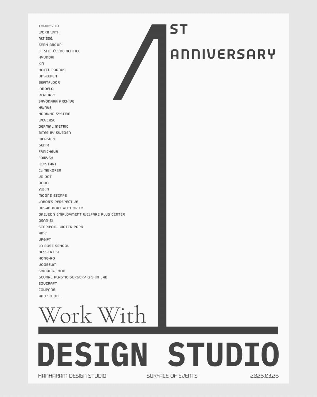
thanks to / work with
Altissé
SeAH Group
le site événementiel
HYUNDAI
KIA
Hotel Parnas
Unseeken
Befitfloor
Innoflo
Veridapt
Sayonara archive
HWAVE
Hanwha System
Weverse
Dermal Metric
Bites by sweden
Measure
Genix
FRAICHEUR
fairysh
keystart
Climbkorea
Voidot
DONO
YUXIN
Moons Escape
Labor's Perspective
Busan Port Authority
Daejeon Employment Welfare Plus Center
Osan-si
Seoripool Water Park
AMZ
UPGIFT
La rose school
Dessert39
Hong-ro
Uooseum
Shinang-chon
Geunal Plastic Surgery & Skin Lab
EduCraft
Coupang
And So On...
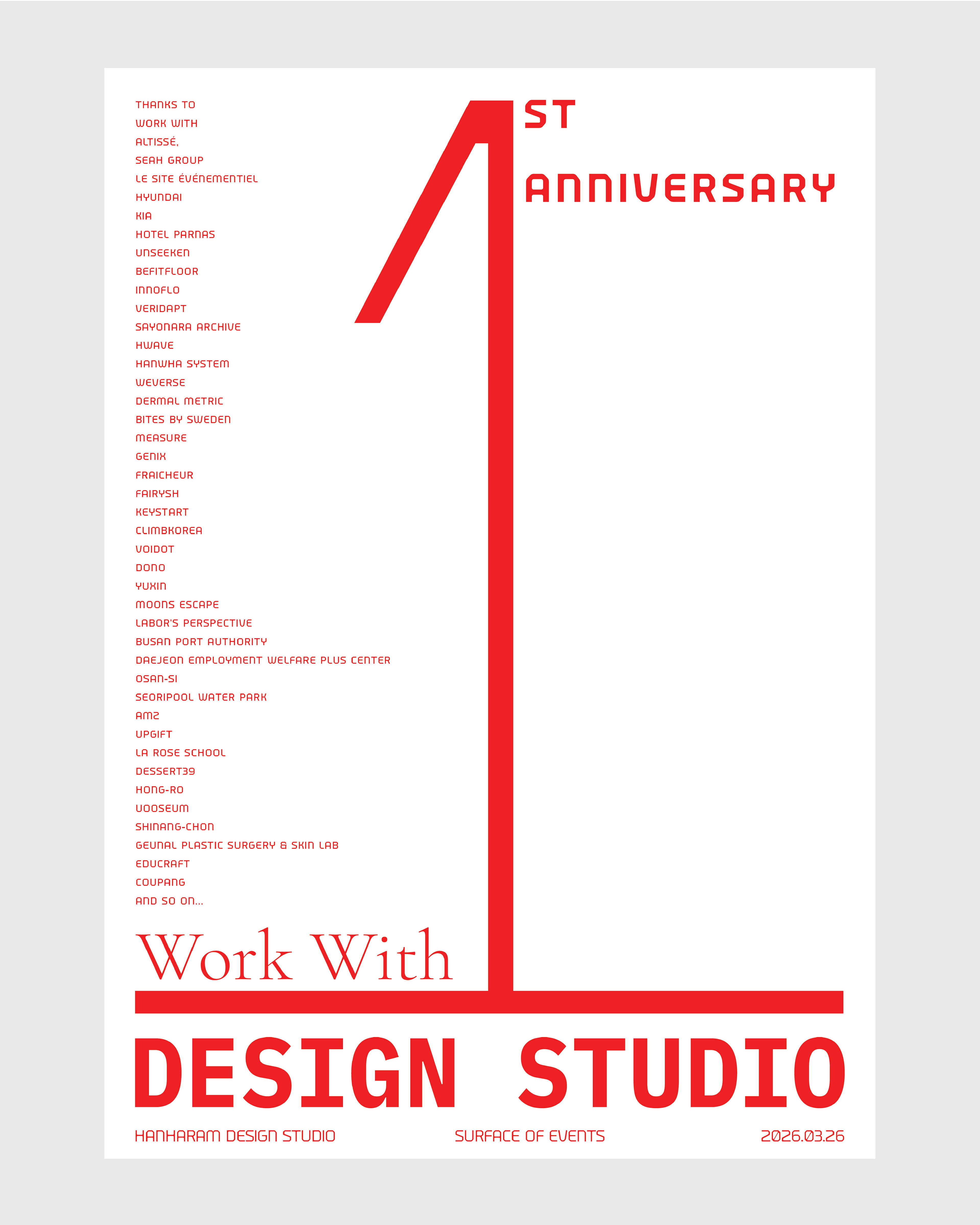
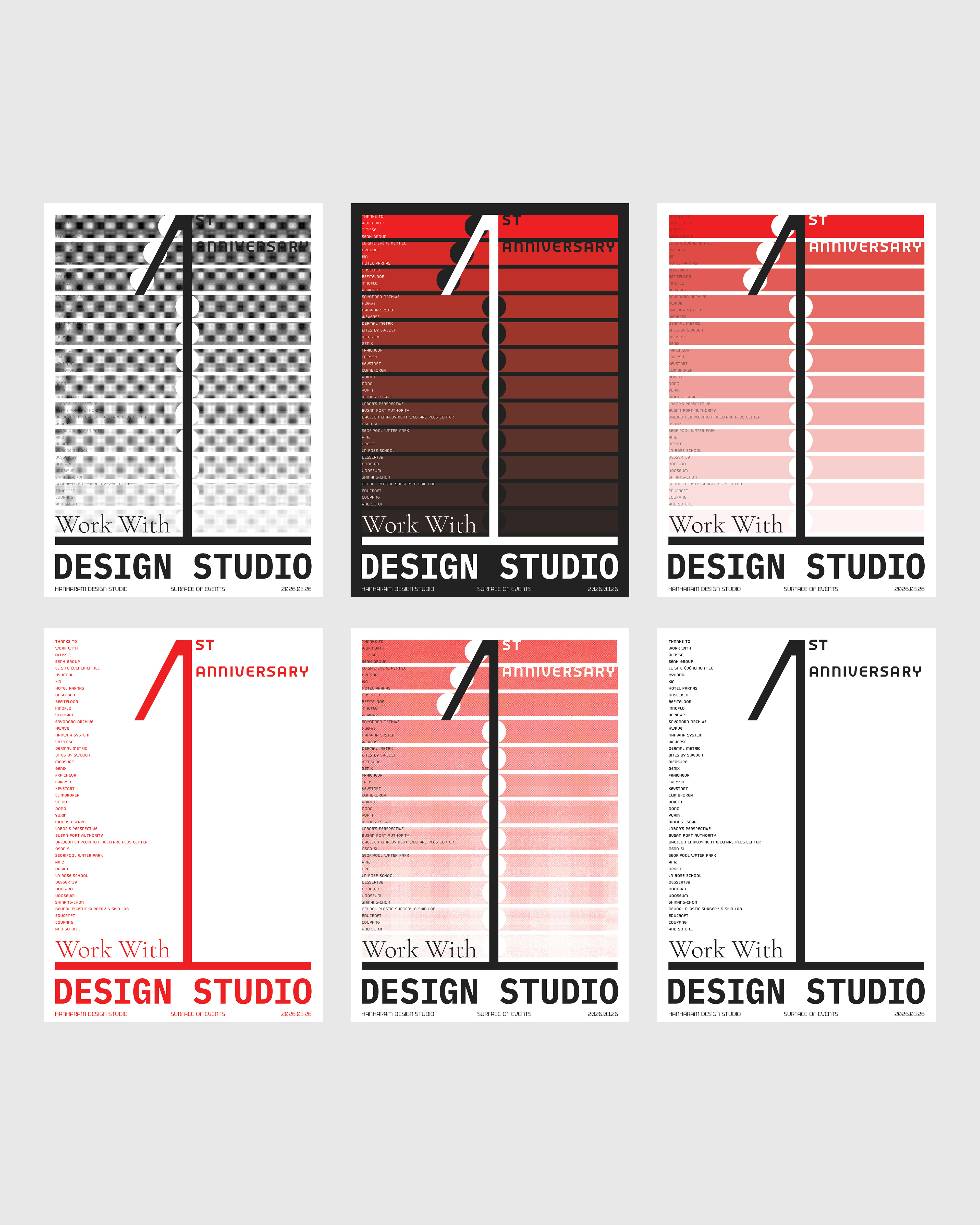
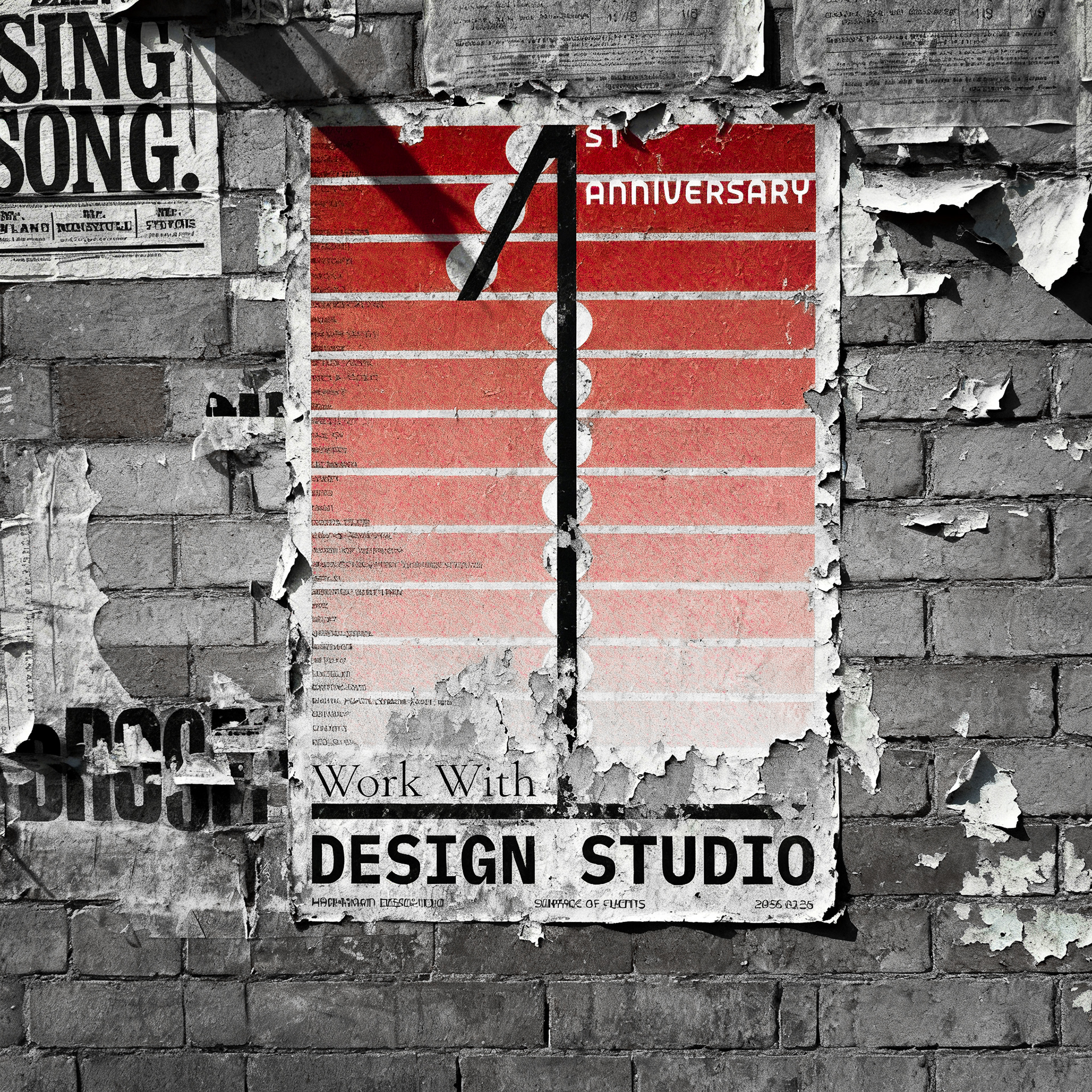
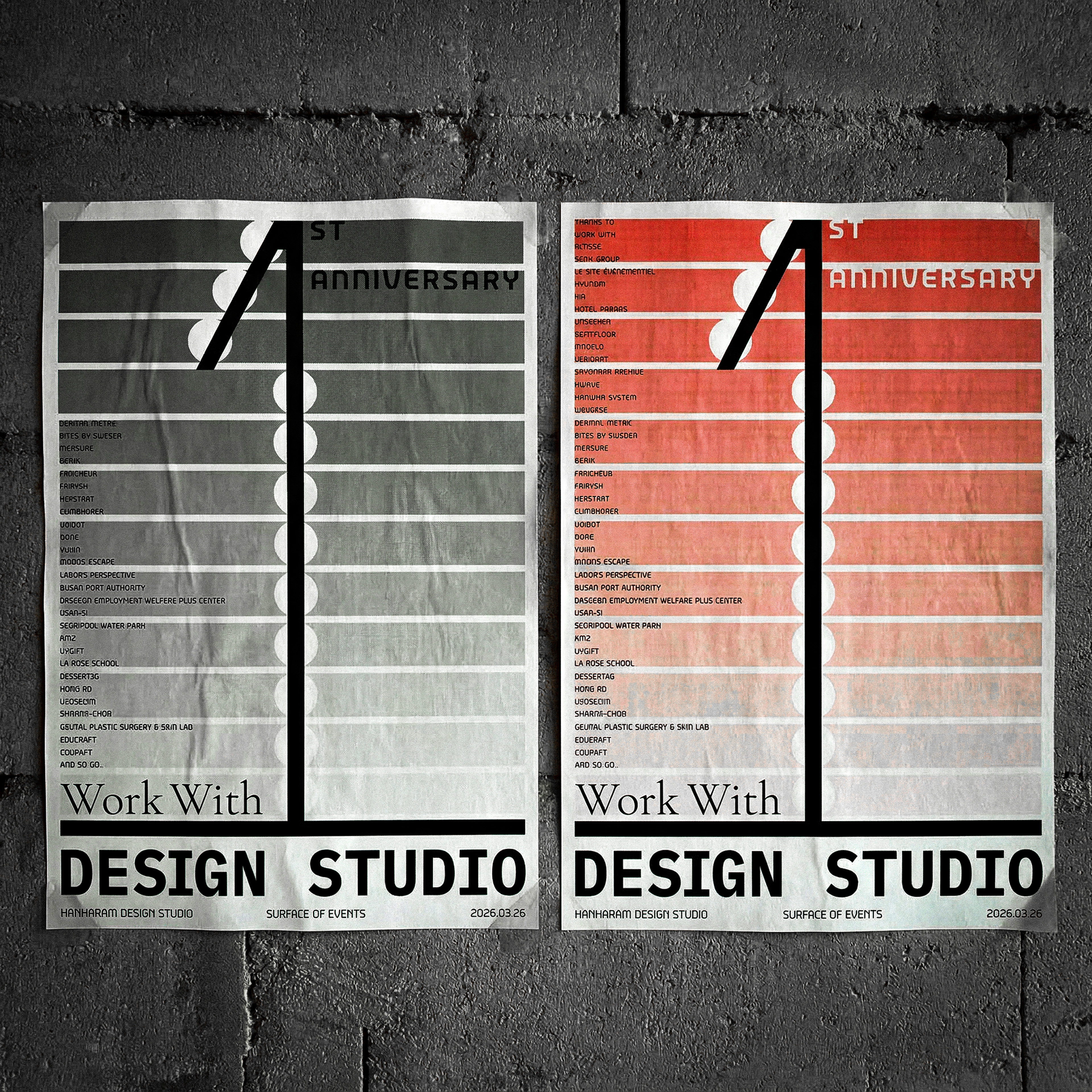
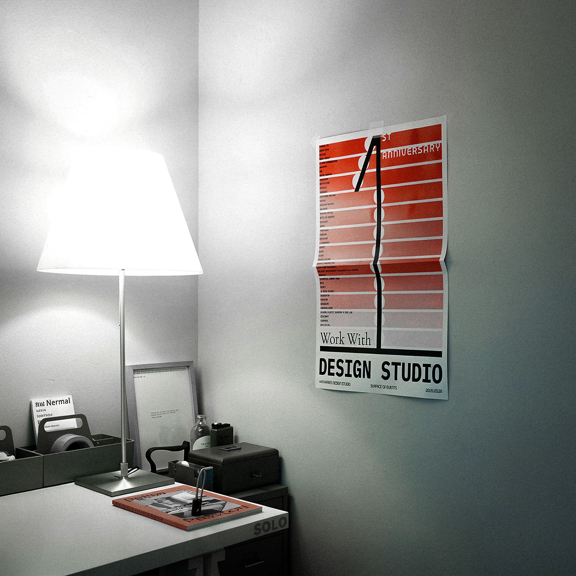
The structure of the poster rises from bottom to top. The pale tone at the base deepens as it climbs. This gradient is the texture of a year — things that began faintly, accumulating and condensing into intensity. There are 12 stripes. One year, 12 months. Each band gains a month's worth of clarity as it stacks upward. Not fading with time, but growing more distinct. The numeral 1 is the axis that runs through this surface. It passes vertically through accumulated time, lodged firmly somewhere between action and place. Its wide base holds the weight of those 12 months.
포스터의 구조는 아래에서 위로 올라간다. 하단의 옅은 색은 위로 올라오며 점점 짙어진다. 이 그라데이션은 1년이라는 시간의 질감이다. 희미하게 시작된 것들이 쌓이고 응축되며 강도를 얻어가는. 1년, 12개월. 각각의 띠는 한 달치의 선명함을 얻으며 위로 쌓인다. 시간이 지날수록 흐려지는 것이 아니라, 지날수록 또렷해졌음을. 숫자 1은 이 표면을 꿰어낸 축이다. 쌓인 시간을 수직으로 관통하며, 행위와 장소 사이 어딘가에 단단히 박혀 있다. 넓게 디딘 발은 그 12개월의 무게를 받치고 있다.
1st Anniversary. Something was made, and something was not.
We celebrate what happened in between — what occurred on this surface.
We celebrate what happened in between — what occurred on this surface.
1주년, 무언가를 만들었고, 무언가는 만들어지지 않았다.
그 사이에서, 이 표면에서 발생한 것들을 기념한다.
그 사이에서, 이 표면에서 발생한 것들을 기념한다.
— HANHARAM DESIGN STUDIO, 2026.03
design not just...

Design is often understood as the visualization of structure, the articulation of identity, the schematization of function. This logo-image refuses those definitions. It is not a sign that symbolizes meaning or represents a name. It is a thin surface on which events occur — a structure that makes visible the place where meaning is born. The composition is simple. Two words — DESIGN and STUDIO — and a single mass suspended between them. This typography is neither a proper name nor a brand identity. Design as action and studio as form are not placed side by side; they are constituted by the gap between them. The logo-image exposes that gap. And the mass that emerges from within it is a position where time, sensation, and response are condensed. This mass does not sit at the perfect center. It is slightly off. From that position, it holds the horizontal between one structure and another. Deleuze writes in The Logic of Sense: meaning does not rise from depth. Meaning always occurs on the surface, constituted not by identity but by series of difference, not by content but by the sliding of events. This logo-image is that sliding surface itself — a physical cross-section that bears the weight of shifting sensation. Design makes no claim through this mass. Instead, it exists as a position where balance is provisionally established. Not judgment, but bearing. Not identity, but response. Not universality, but the sustainability of difference. This logo does not assert itself. Slightly displaced from center, it simply remains. Design has always occurred that way.
디자인은 흔히 구조의 시각화, 정체성의 형상화, 기능의 도식화로 이해된다. 그러나 이 로고-이미지는 그러한 정의를 기각한다. 이것은 의미를 상징하거나 이름을 대변하는 기호가 아니다. 그 자체로 사건이 발생하는 얇은 표면이며, 의미가 태어나는 장소를 가시화하는 하나의 구조다. 구성은 단순하다. 두 개의 단어 - DESIGN과 STUDIO - 그리고 그 사이에 떠 있는 하나의 매스. 이 타이포그래피는 고유명도 브랜드명도 아니다. 디자인이라는 행위와 스튜디오라는 형태는 나란히 병렬되지 않고, 그 사이의 간극에 의해 구성된다. 로고-이미지는 바로 그 간극을 드러낸다. 그리고 그 틈에서 떠오른 매스는, 시간과 감각과 응답이 응축된 하나의 위치다. 이 매스는 완벽한 중심이 아니라 중심에서 살짝 벗어난 자리에 있다. 구조와 구조 사이의 수평을 그 위치에서 감당한다. 들뢰즈는 『의미의 논리』에서 말한다. 의미는 심층에서 솟아오르지 않는다. 의미는 언제나 표면에서 발생하며, 정체성이 아닌 차이의 계열, 내용이 아닌 사건의 미끄러짐으로 구성된다. 이 로고-이미지는 그 미끄러지는 표면 자체이며, 이동하는 감각의 무게를 감당하는 물리적 단면이다. 디자인은 이 매스를 통해 주장을 하지 않는다. 대신, 균형을 잠정적으로 성립시키는 위치로 존재한다. 판단이 아닌 감당, 정체성이 아닌 응답, 보편이 아닌 차이의 지속 가능성. 이 로고는 자신을 주장하지 않는다. 중심에서 약간 벗어난 자리에서, 조용히 위치하고 있다. 디자인은 언제나 그렇게 발생해왔다.