
Band Identity Design - oddsoma
밴드 아이덴티티 디자인 - 오드소마
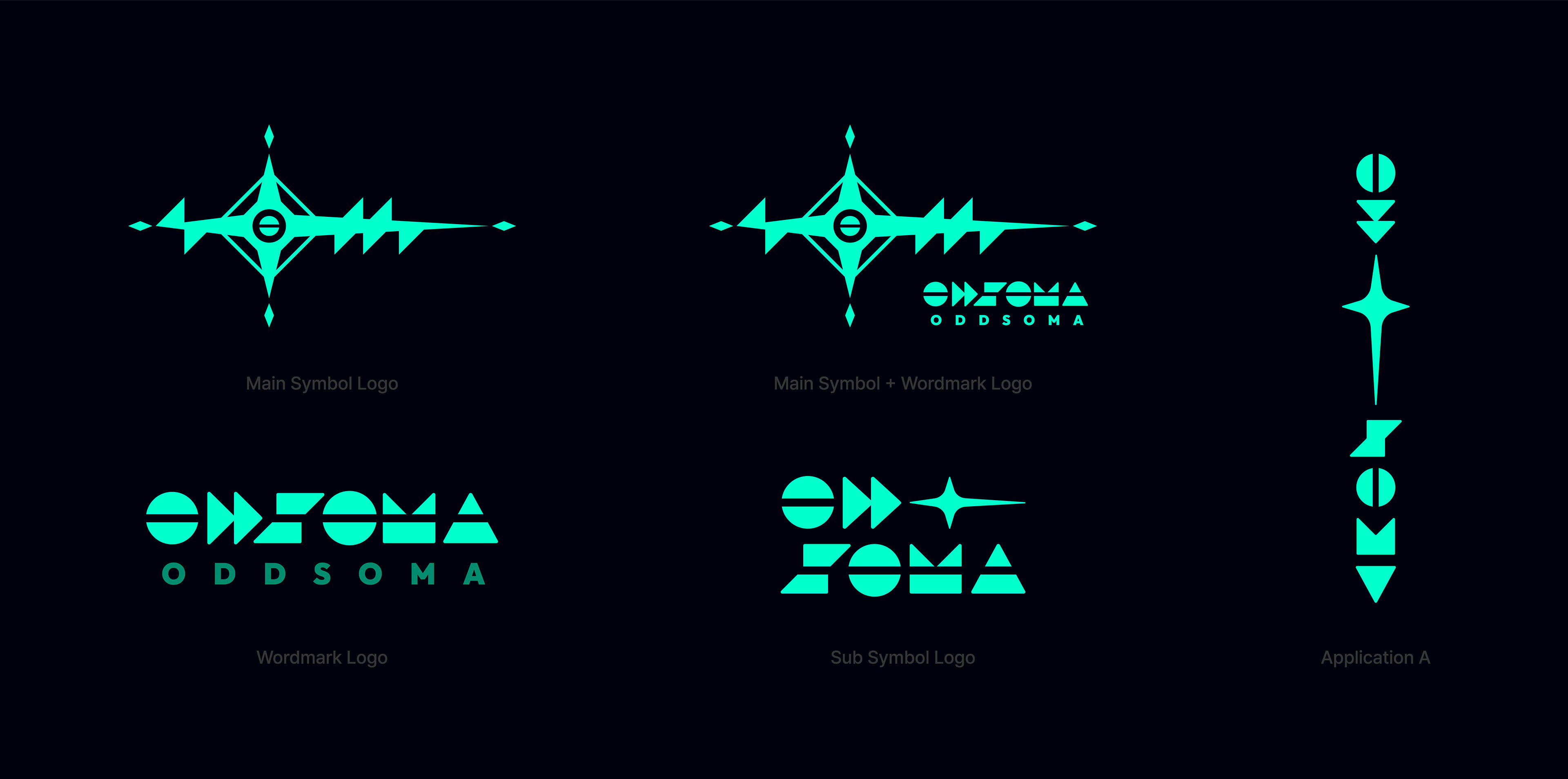
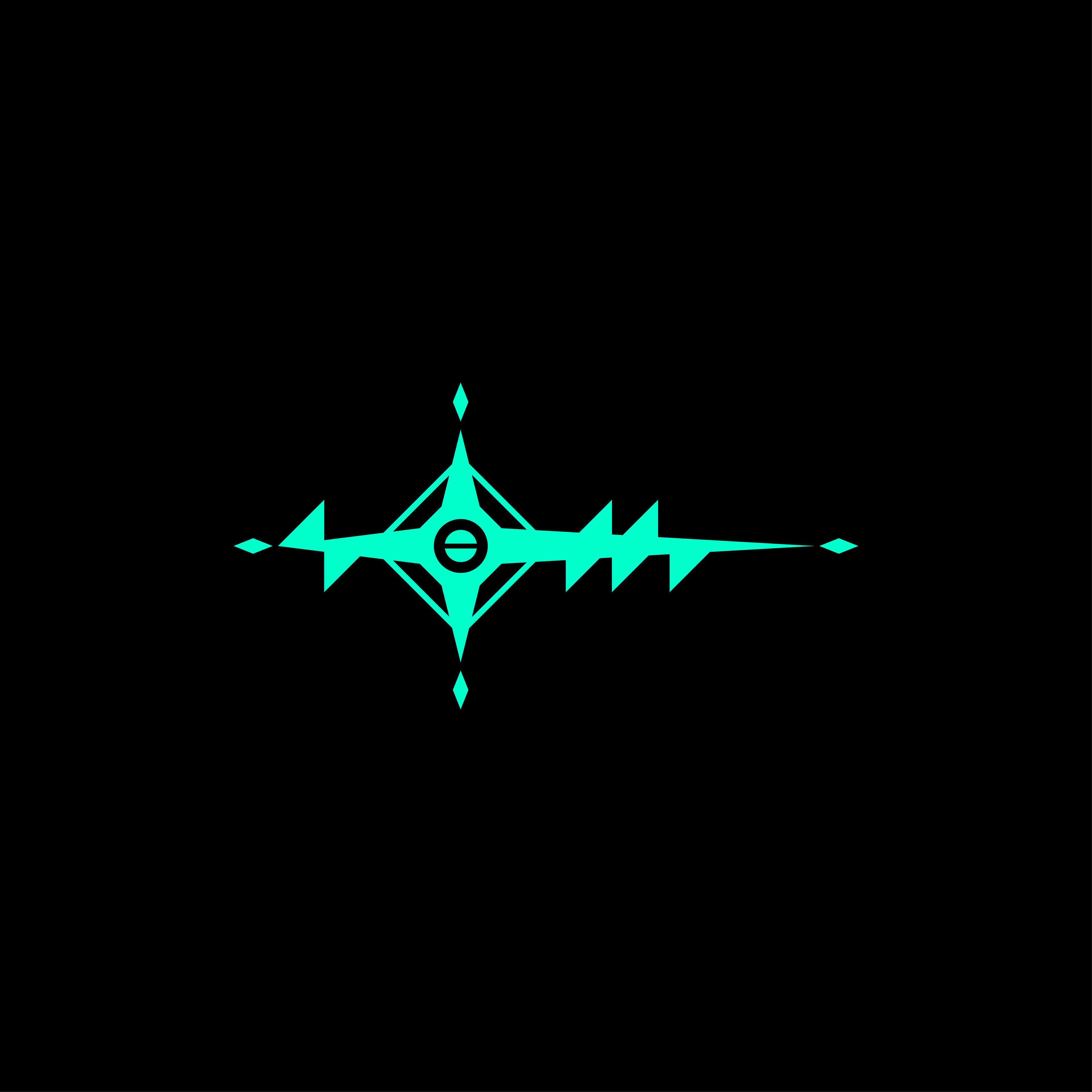
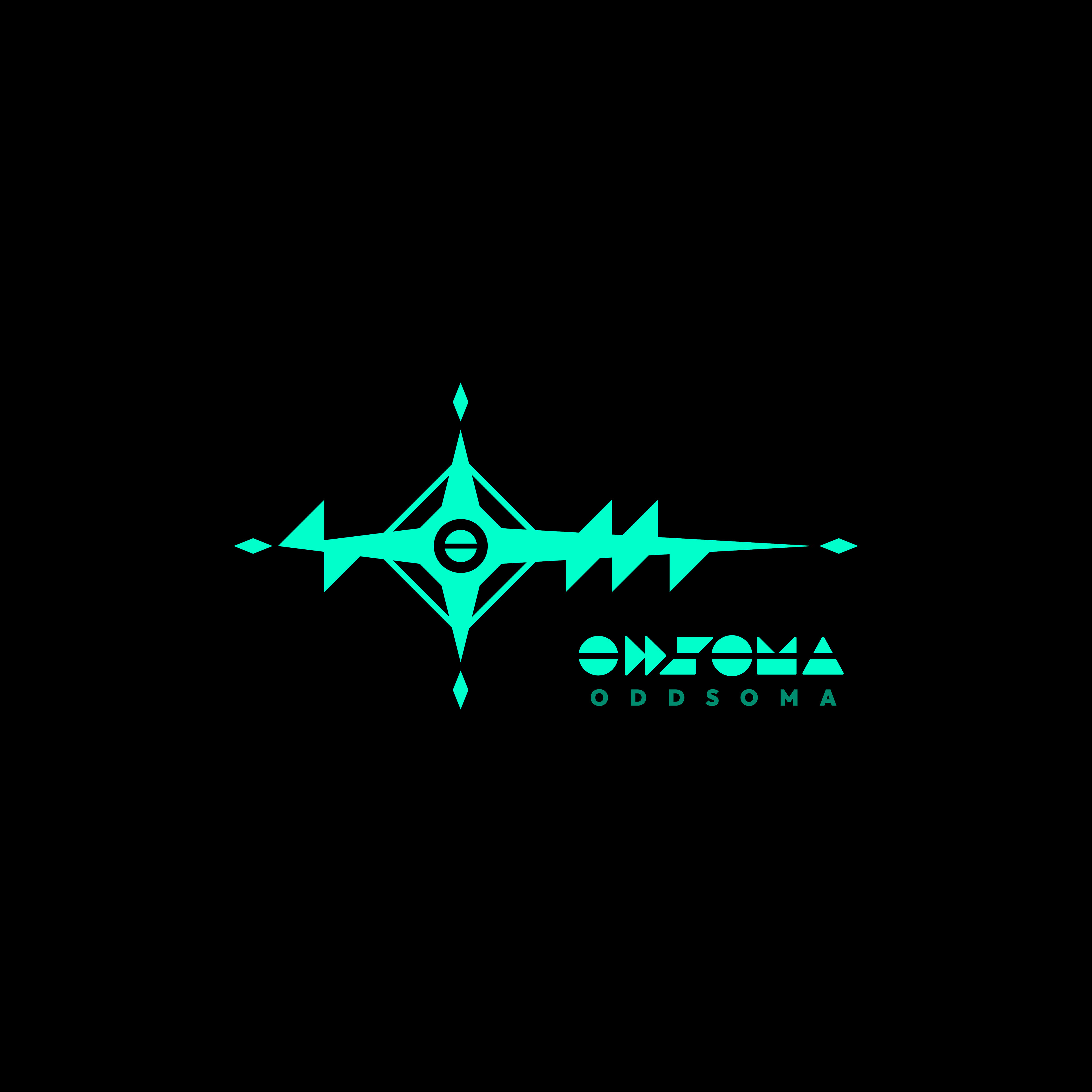
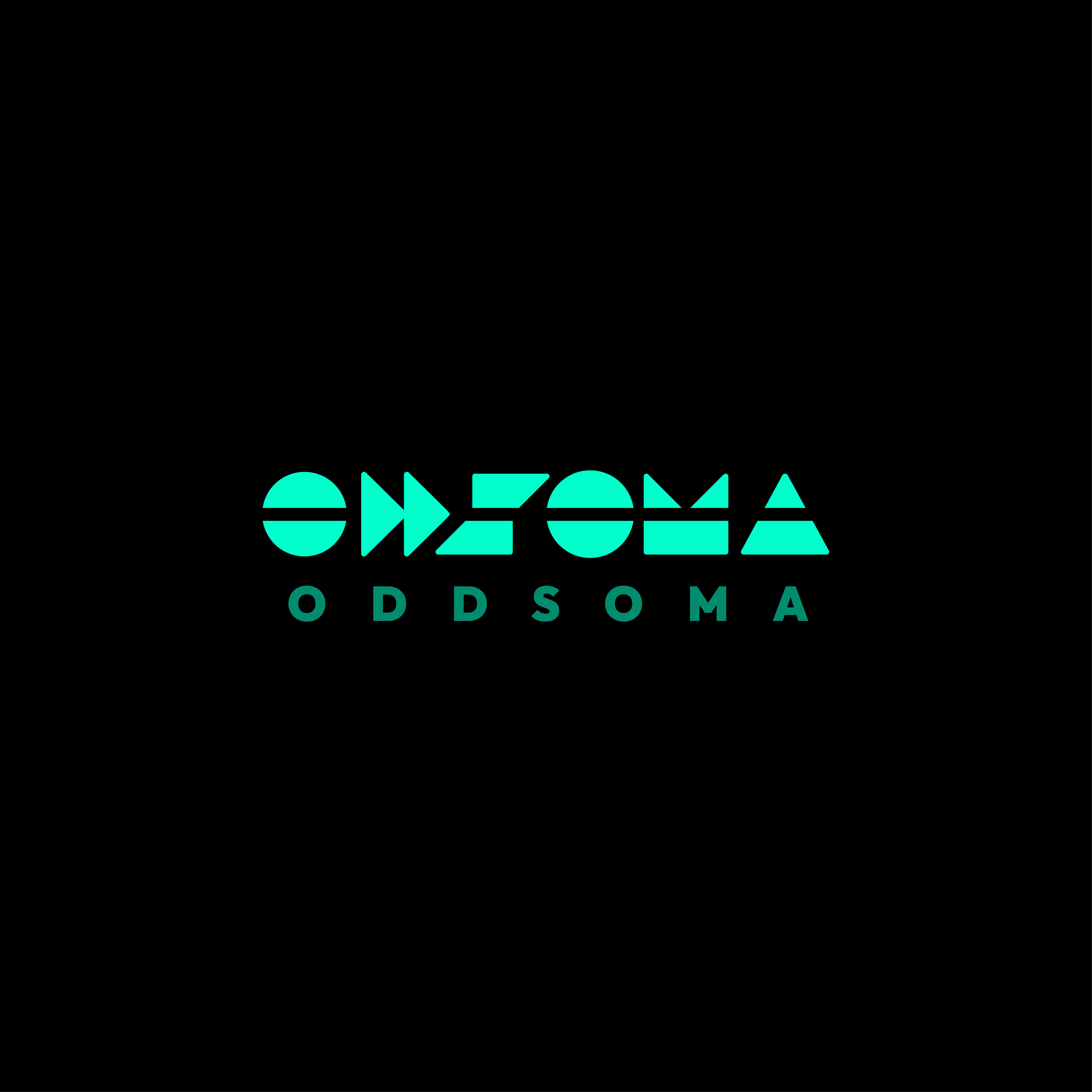
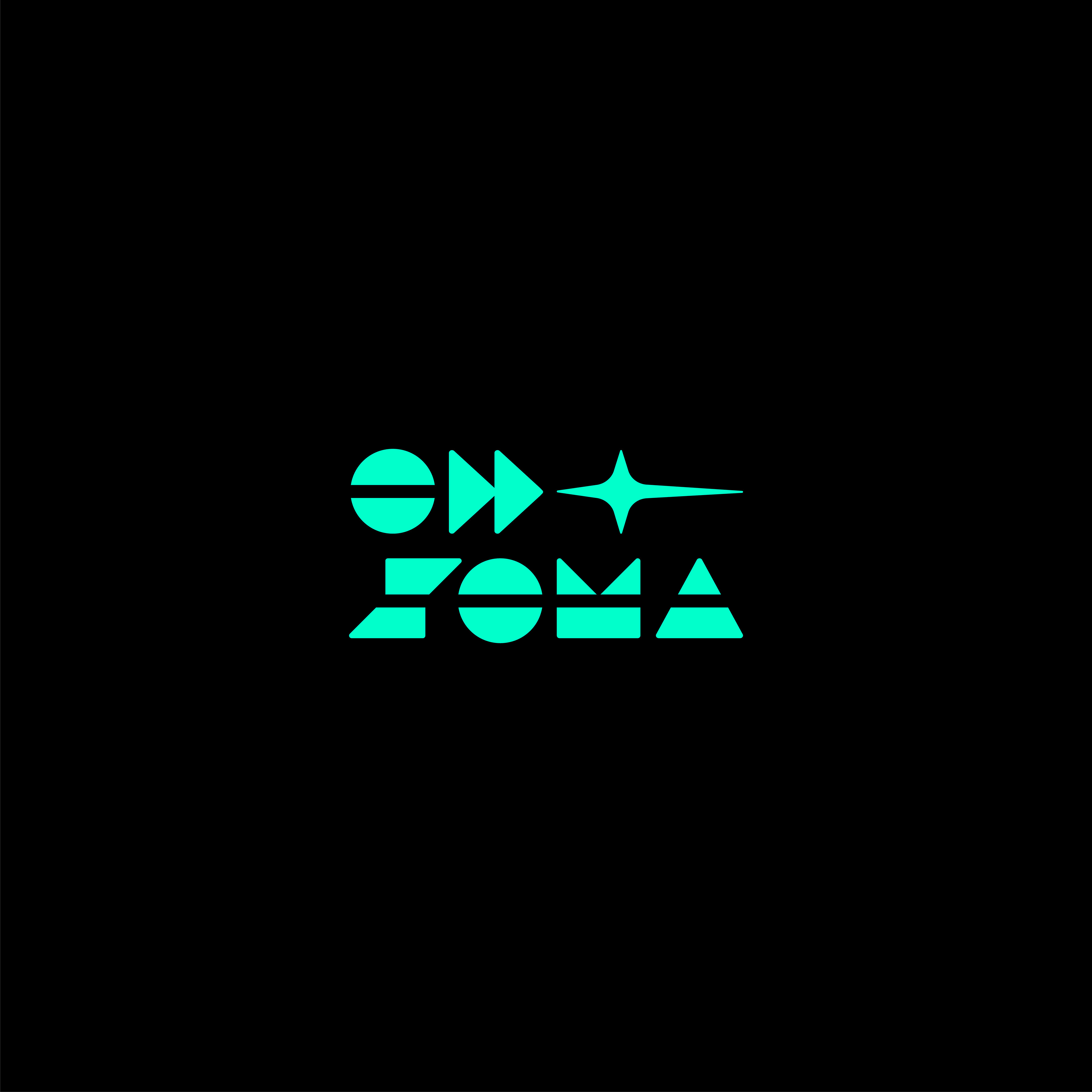
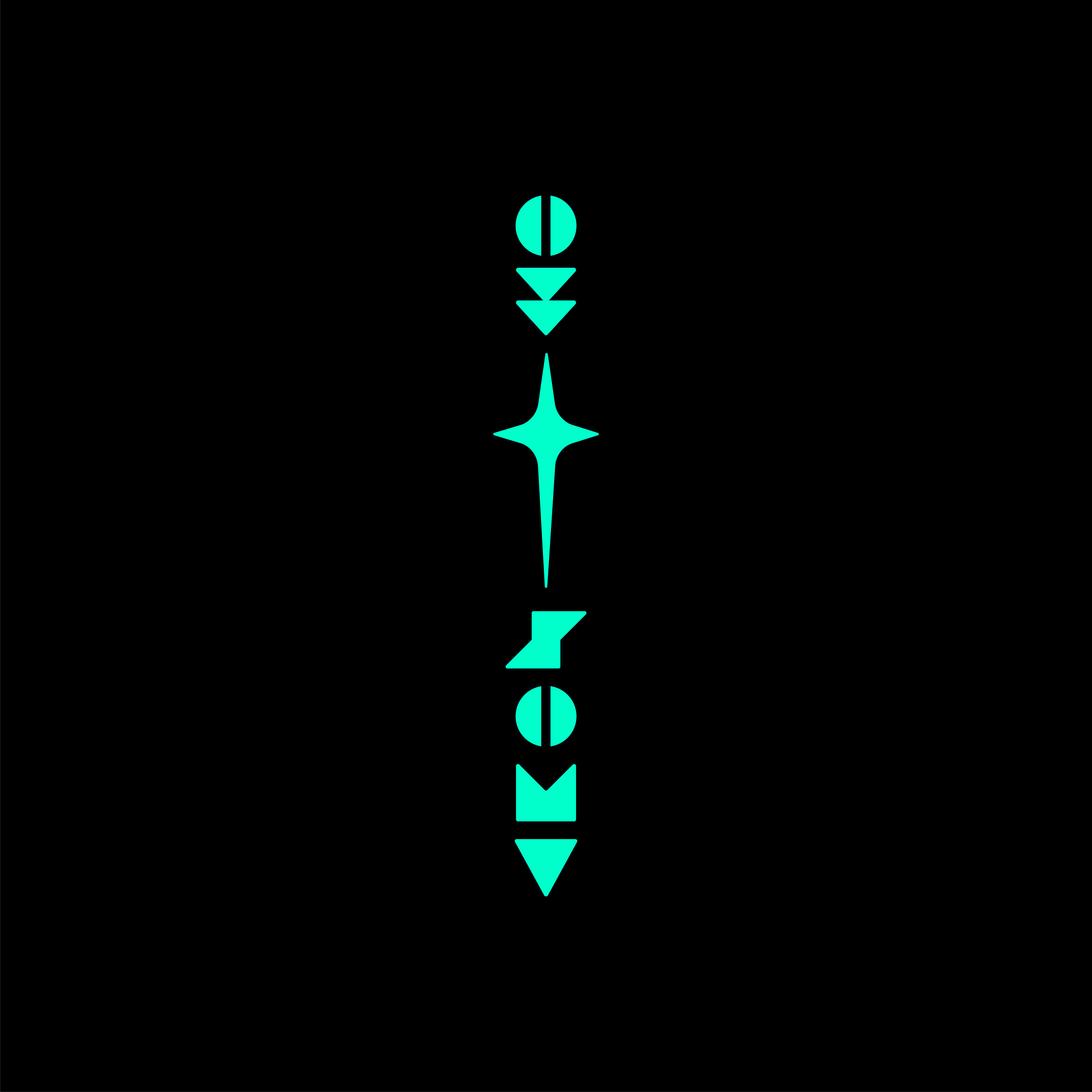
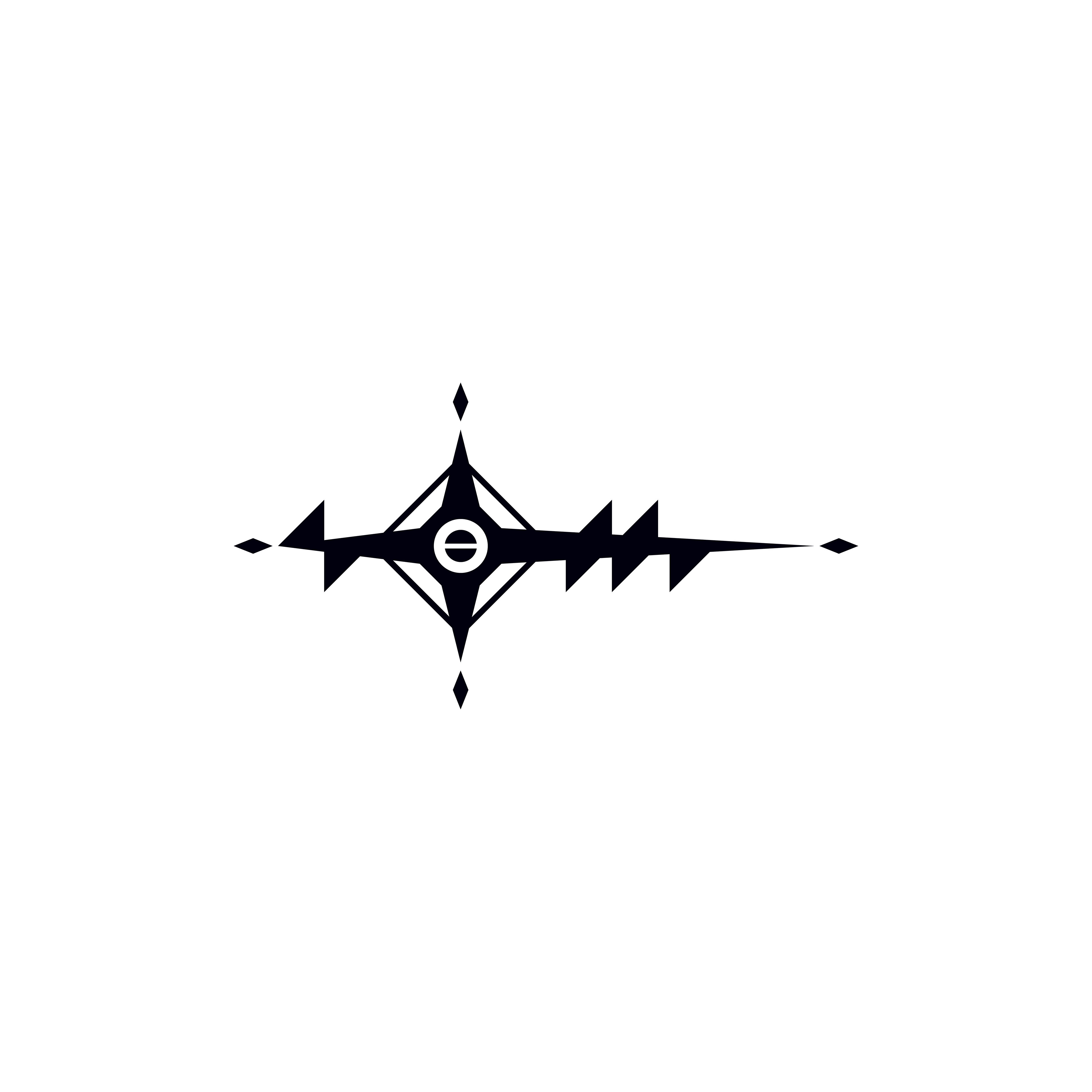
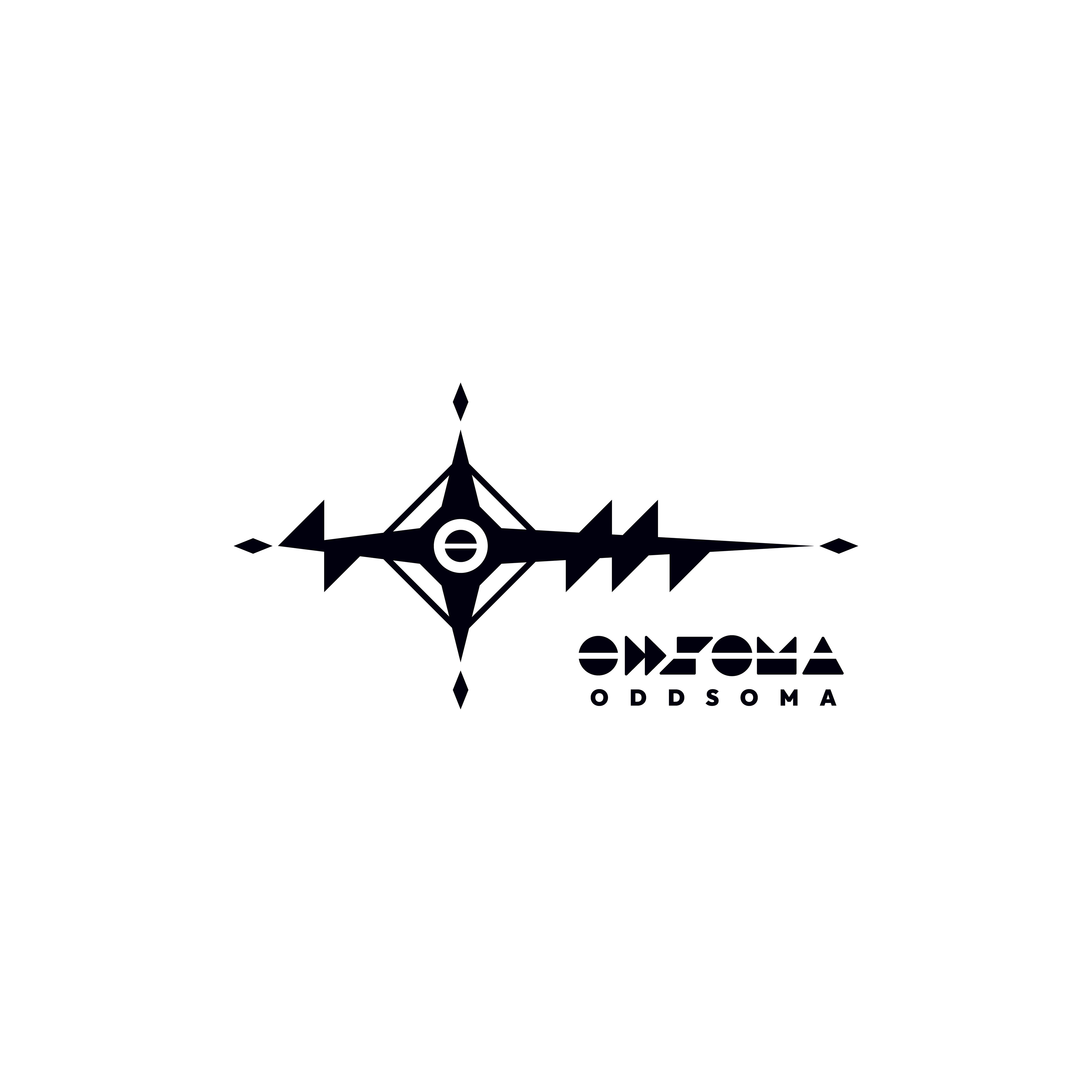
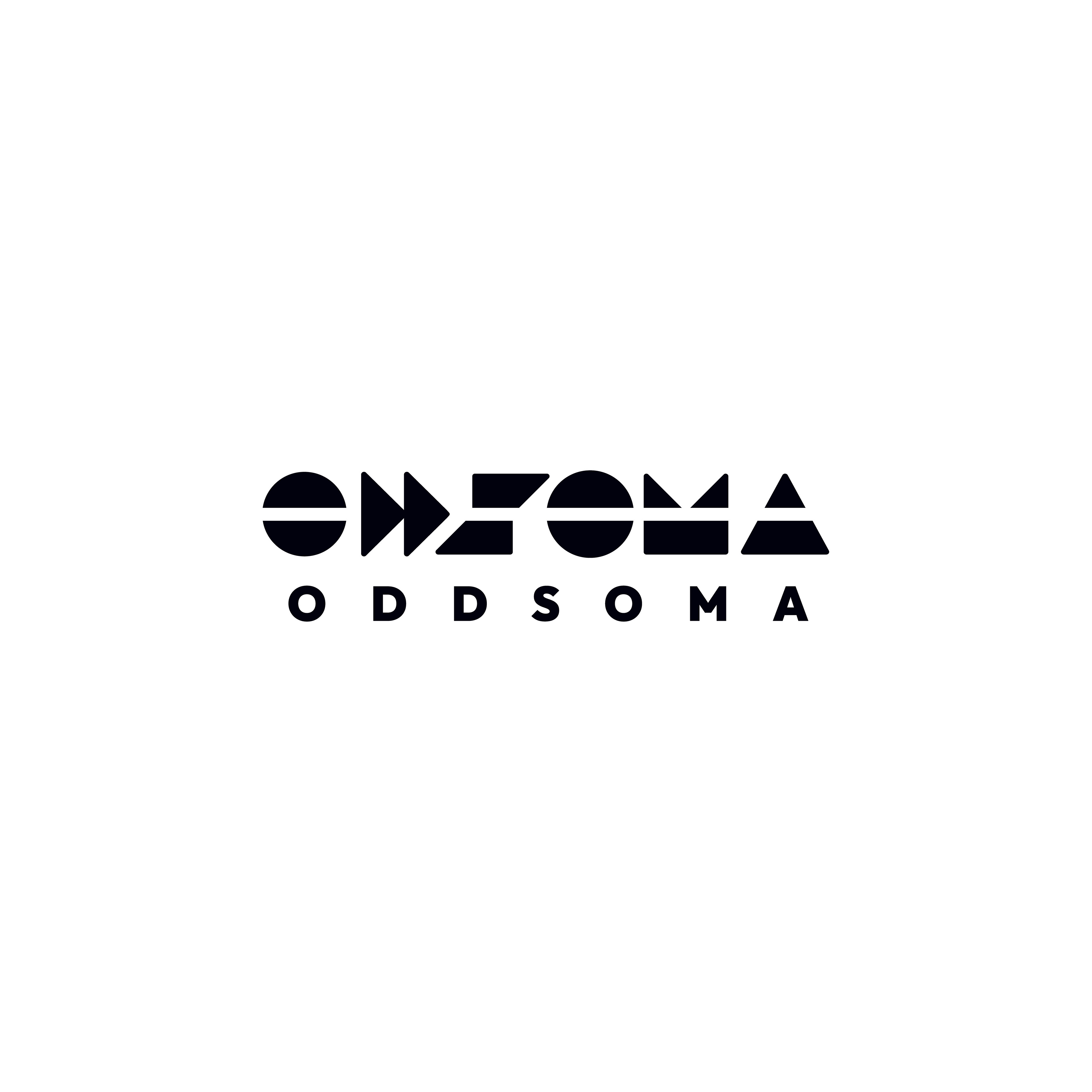
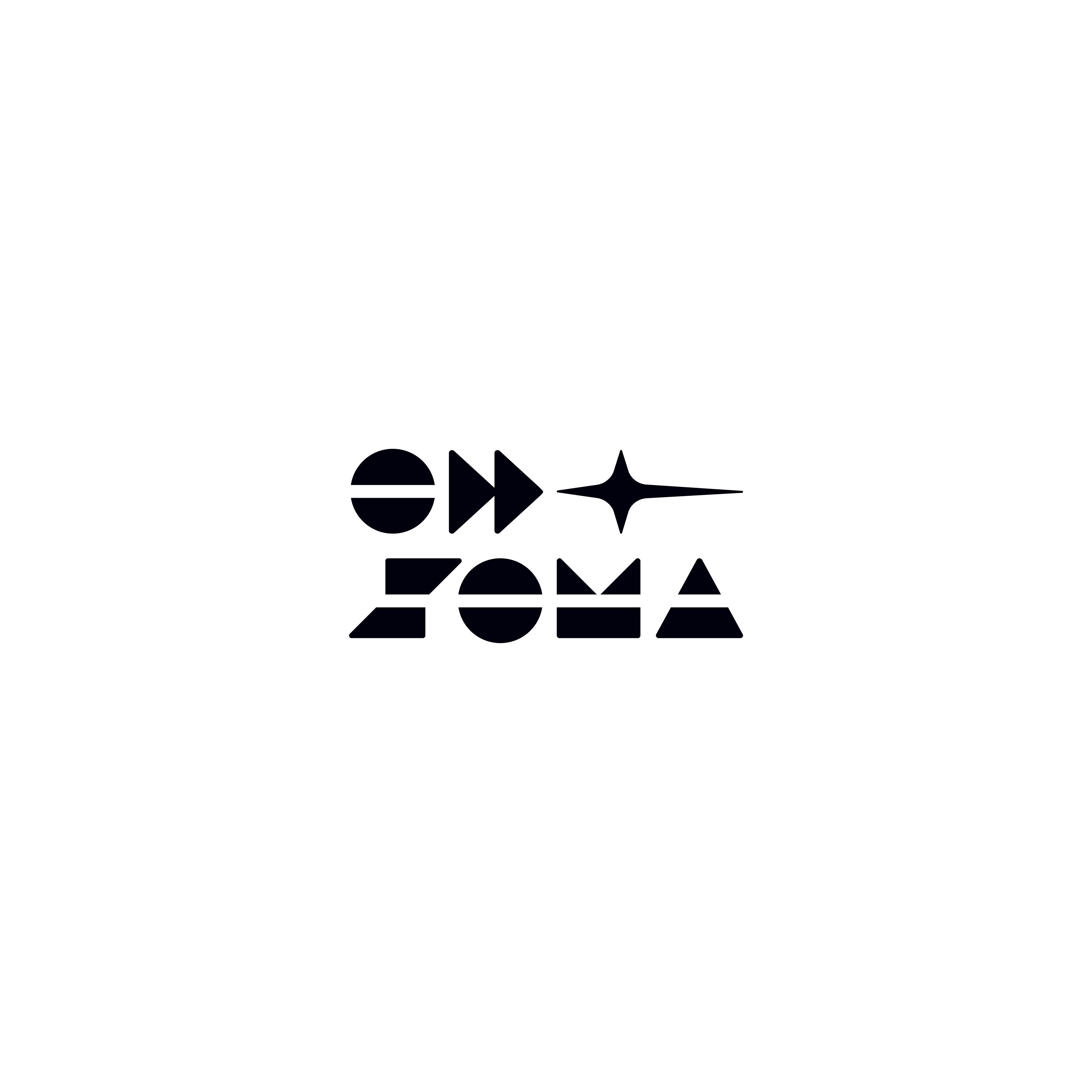
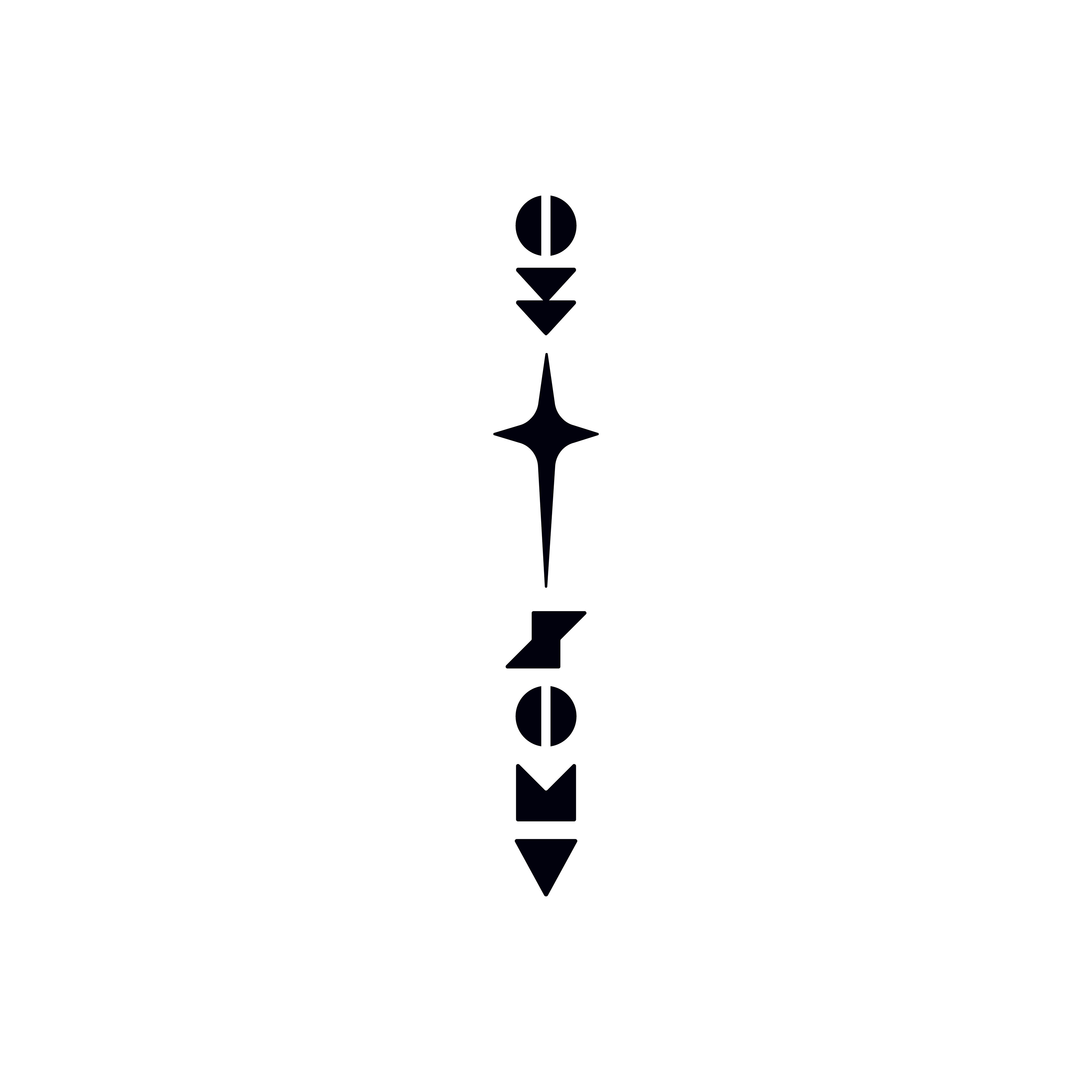
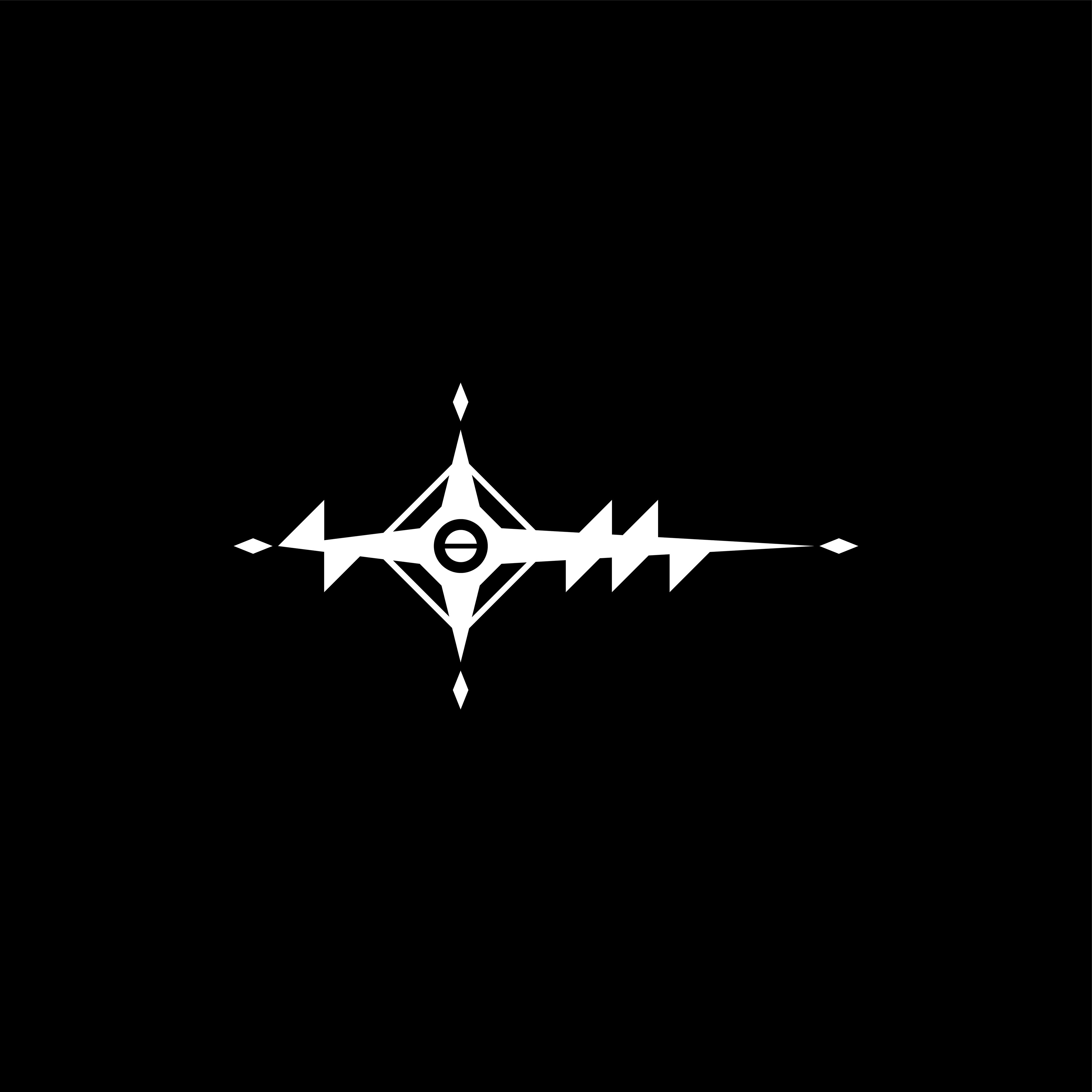
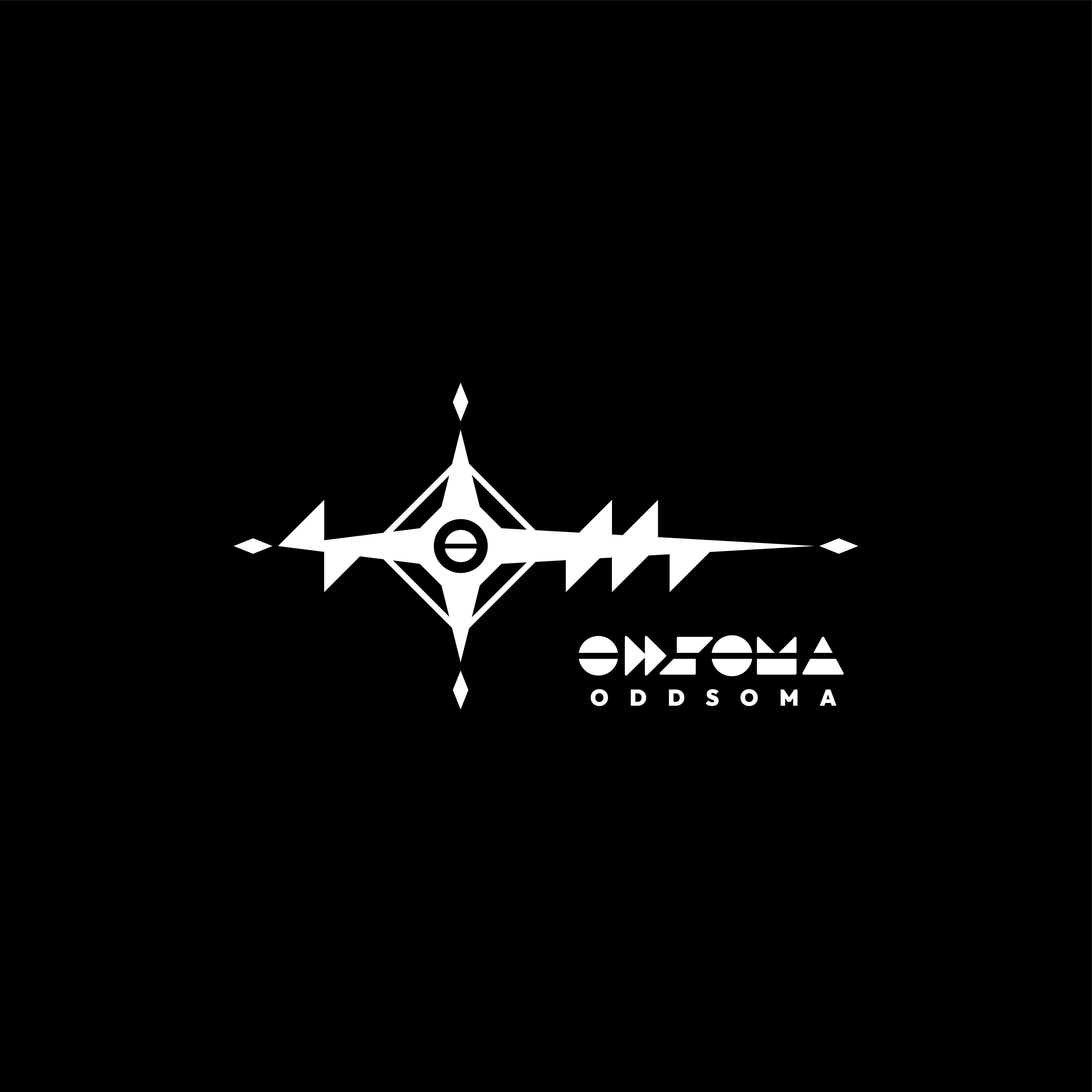
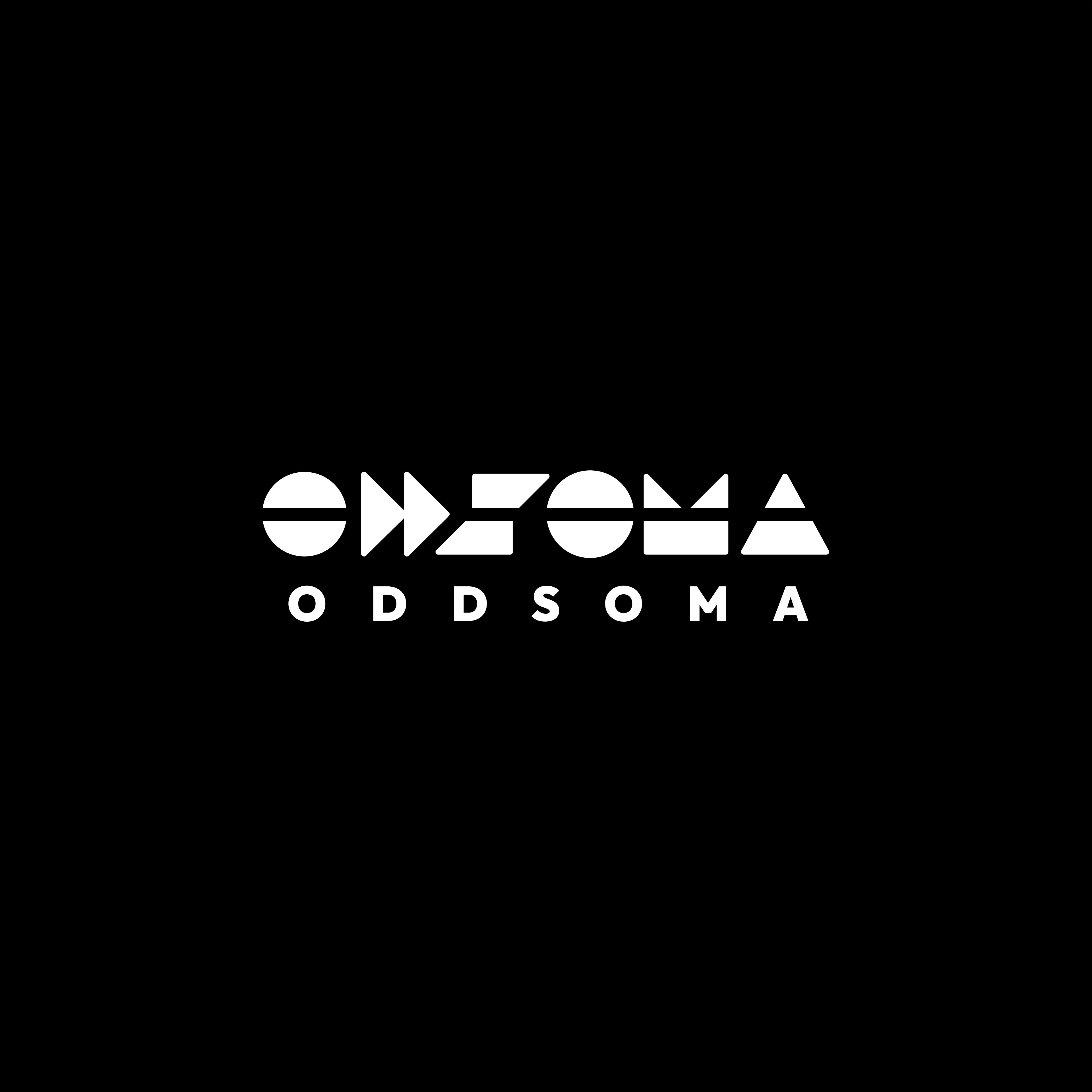
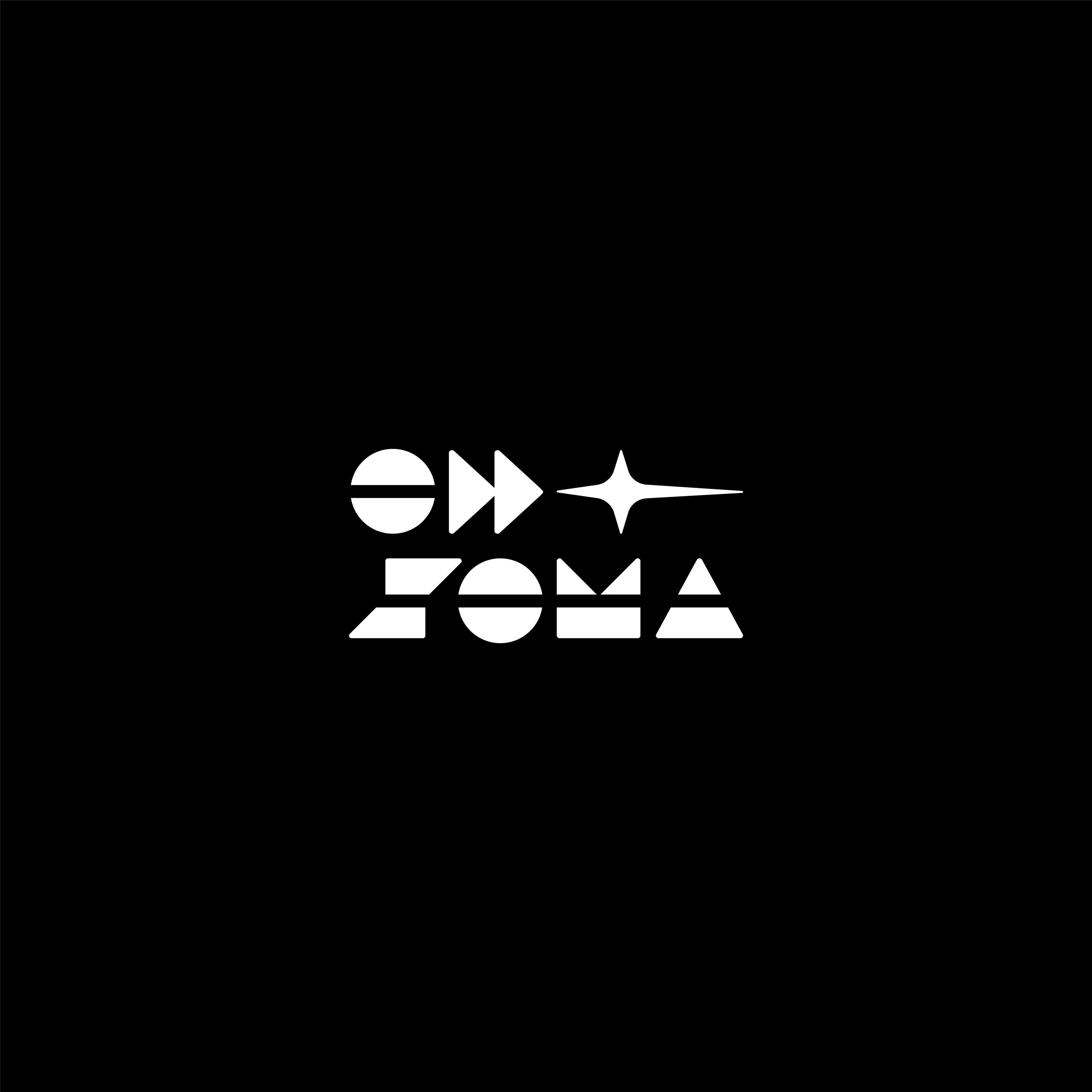
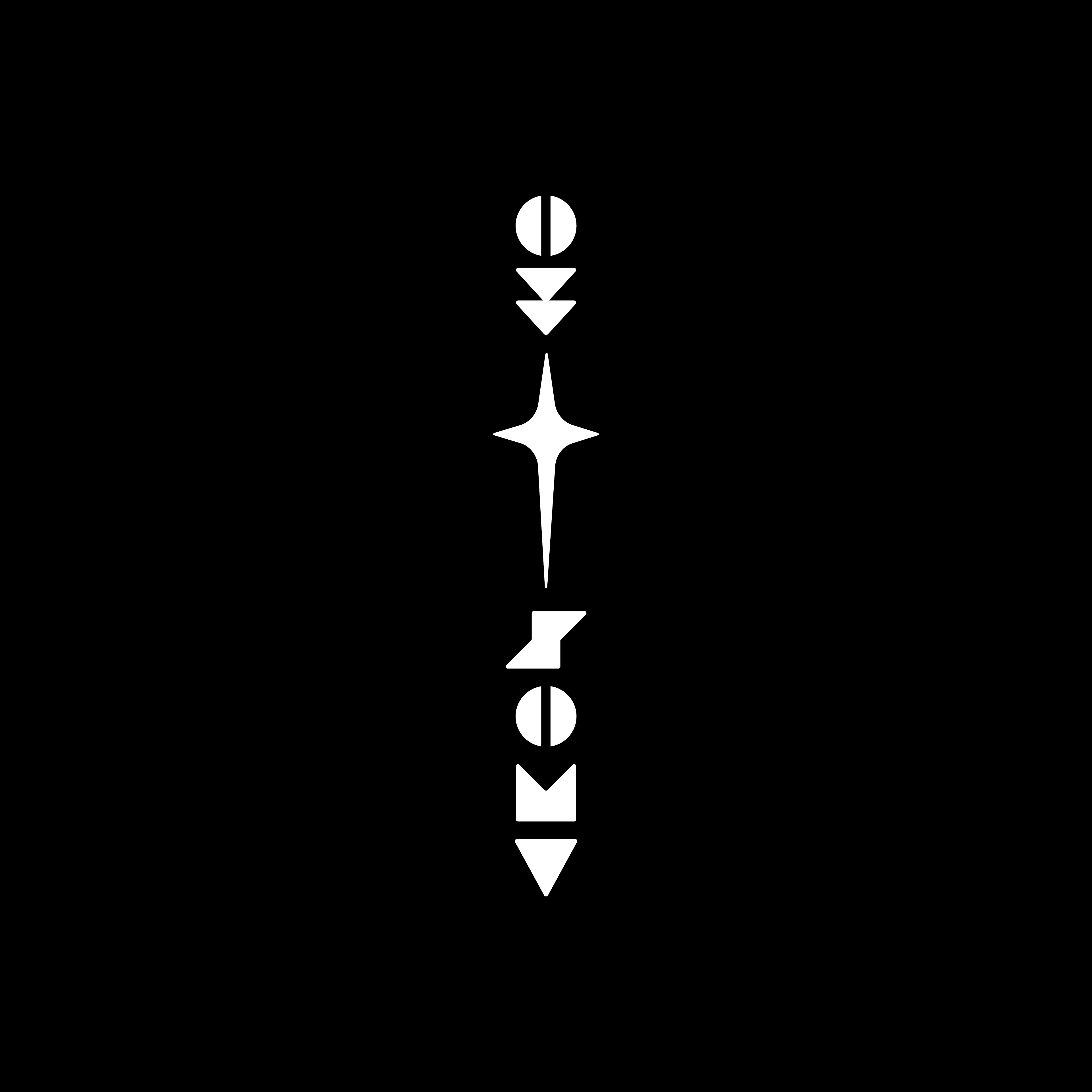
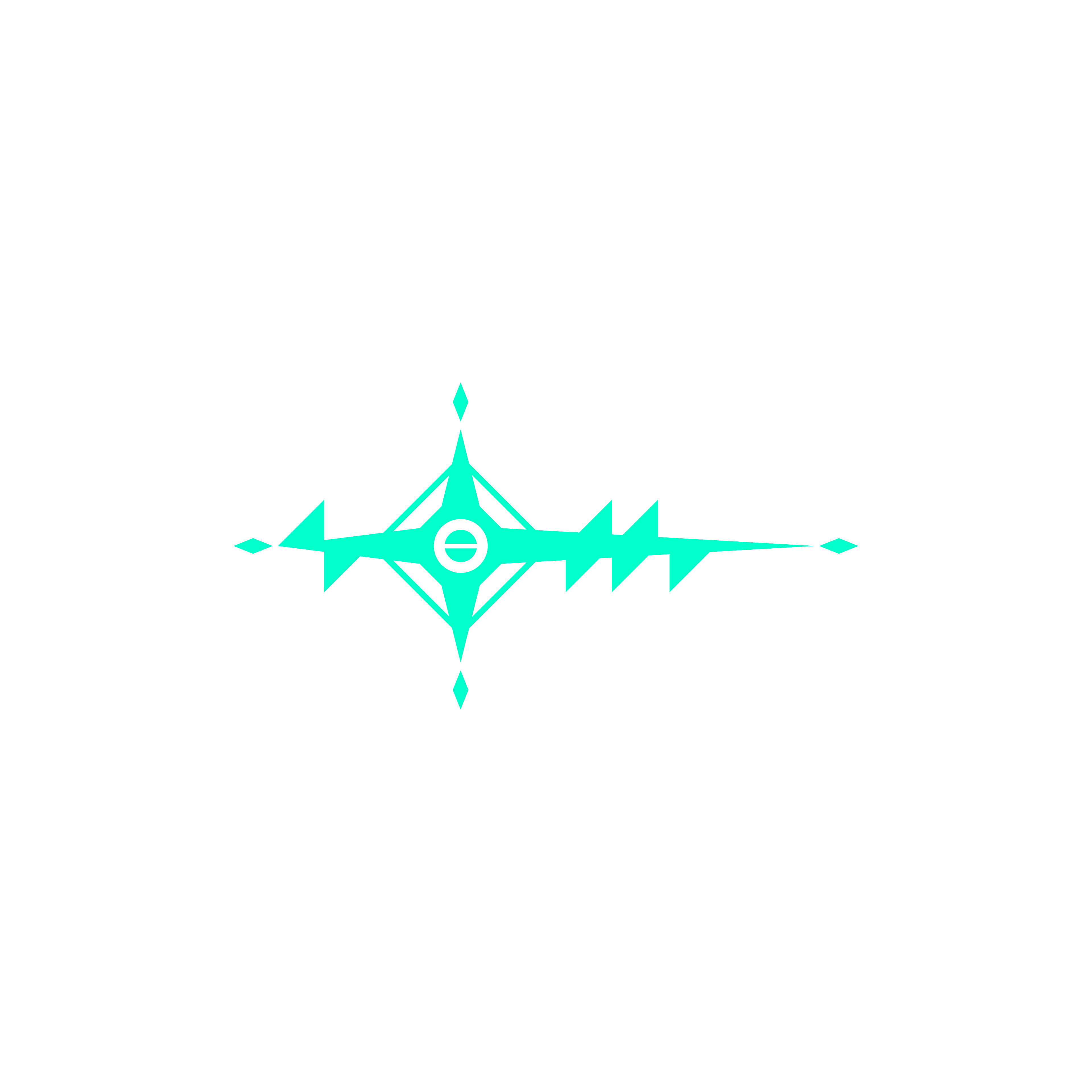
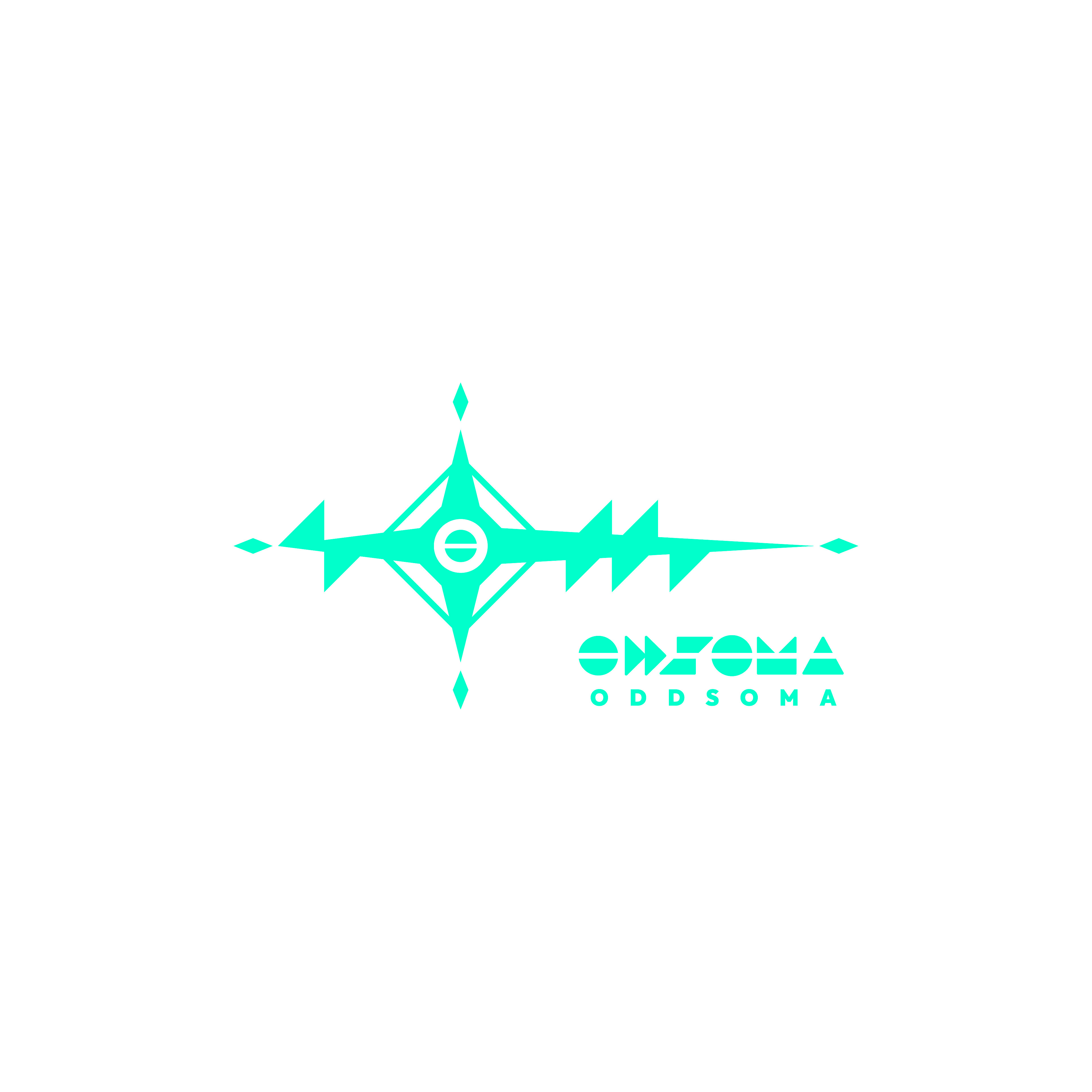
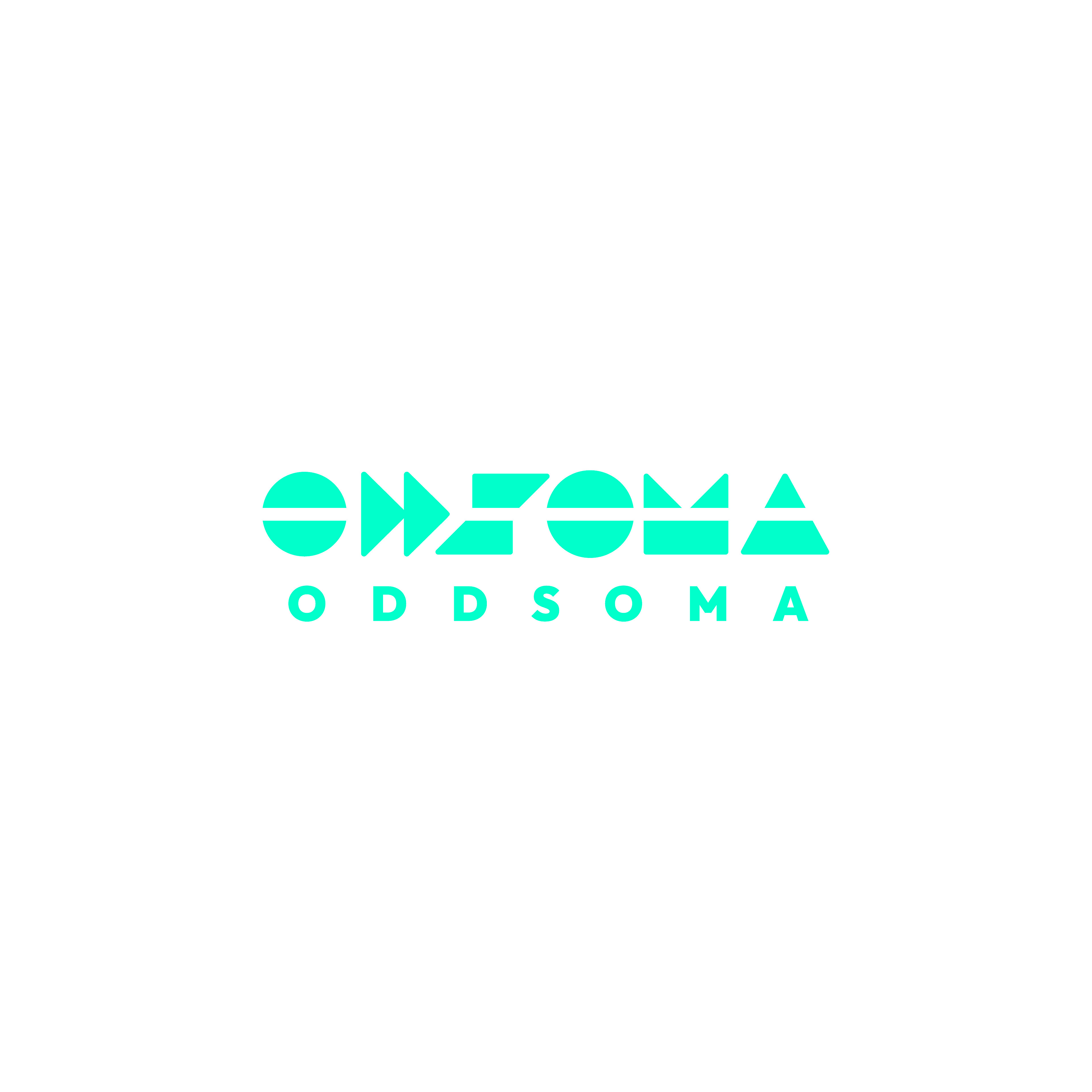
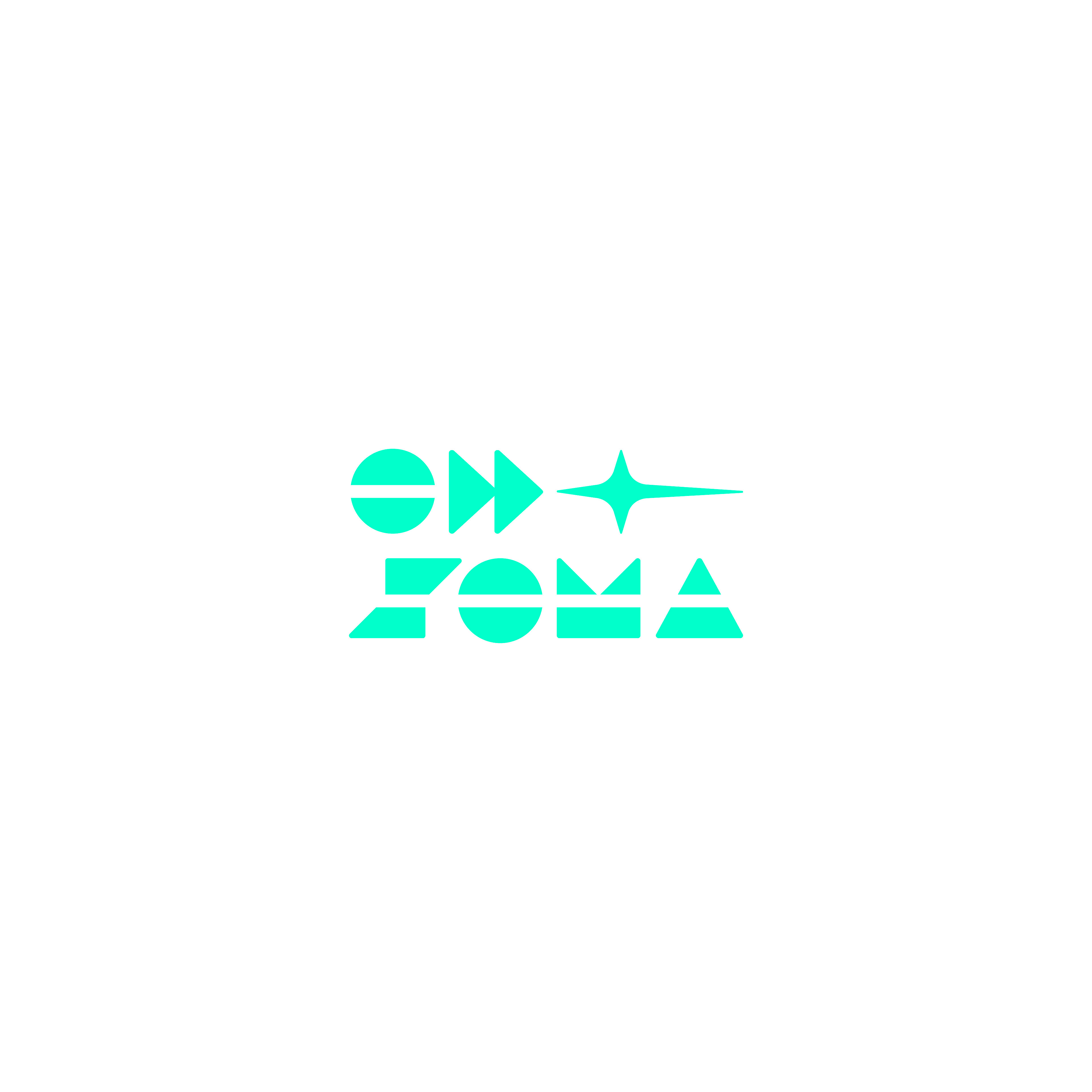
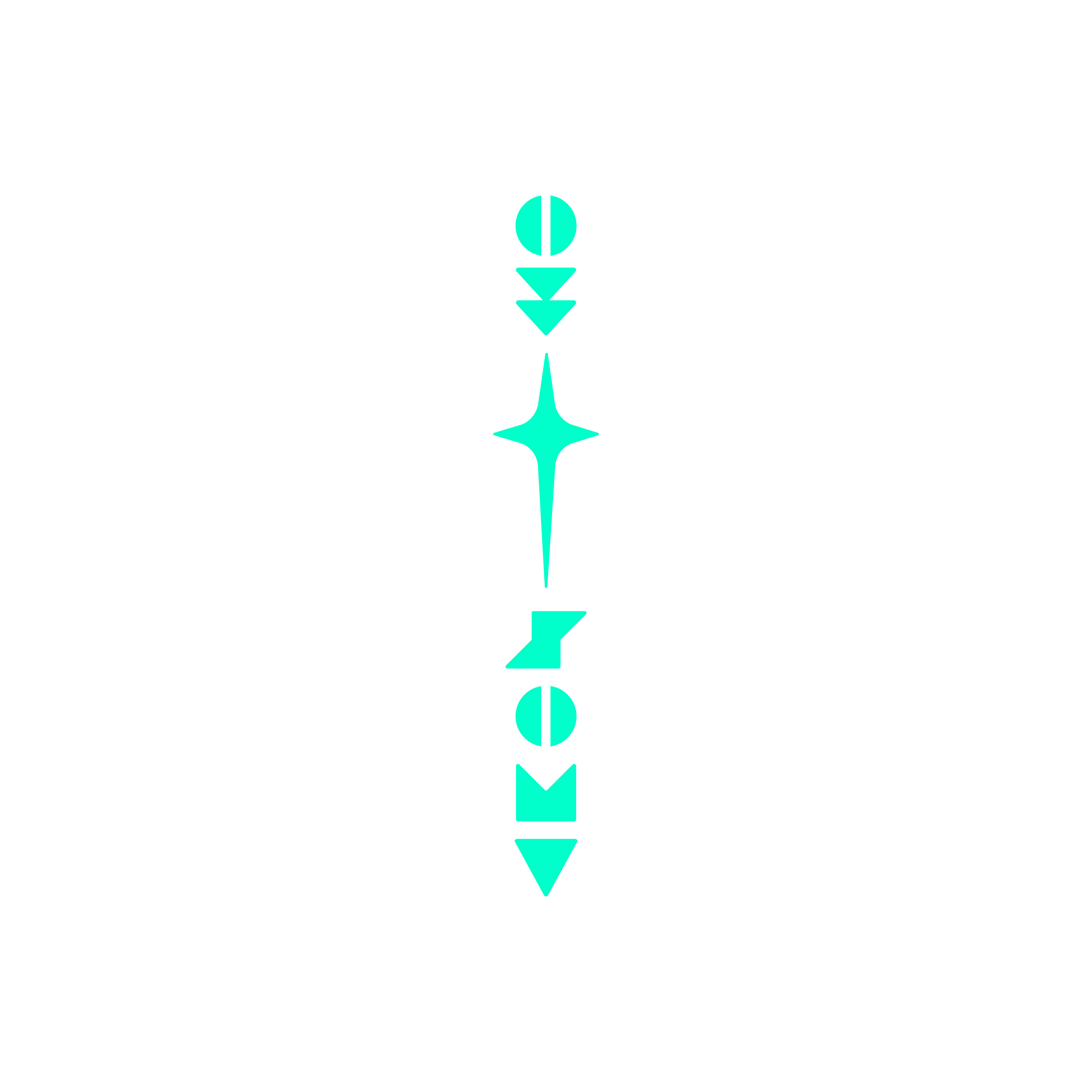
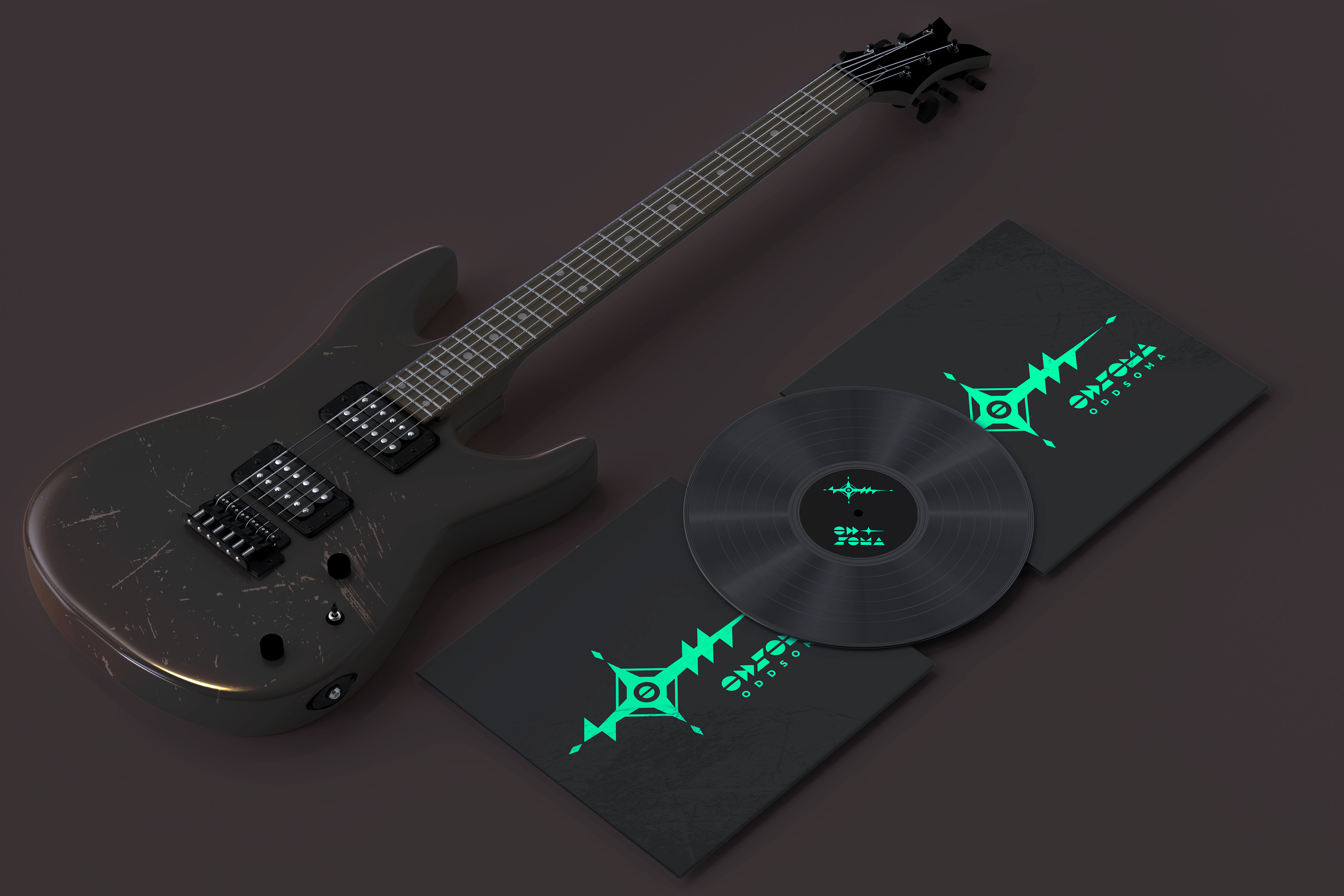
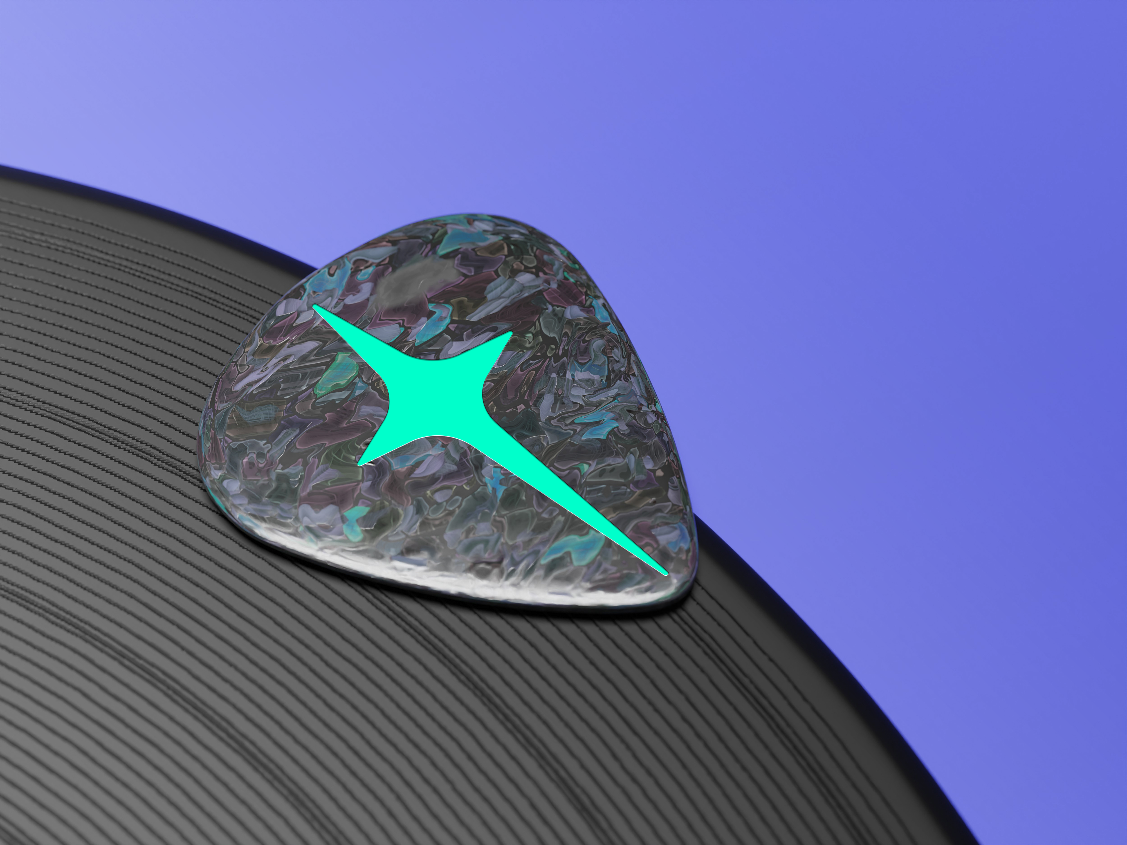
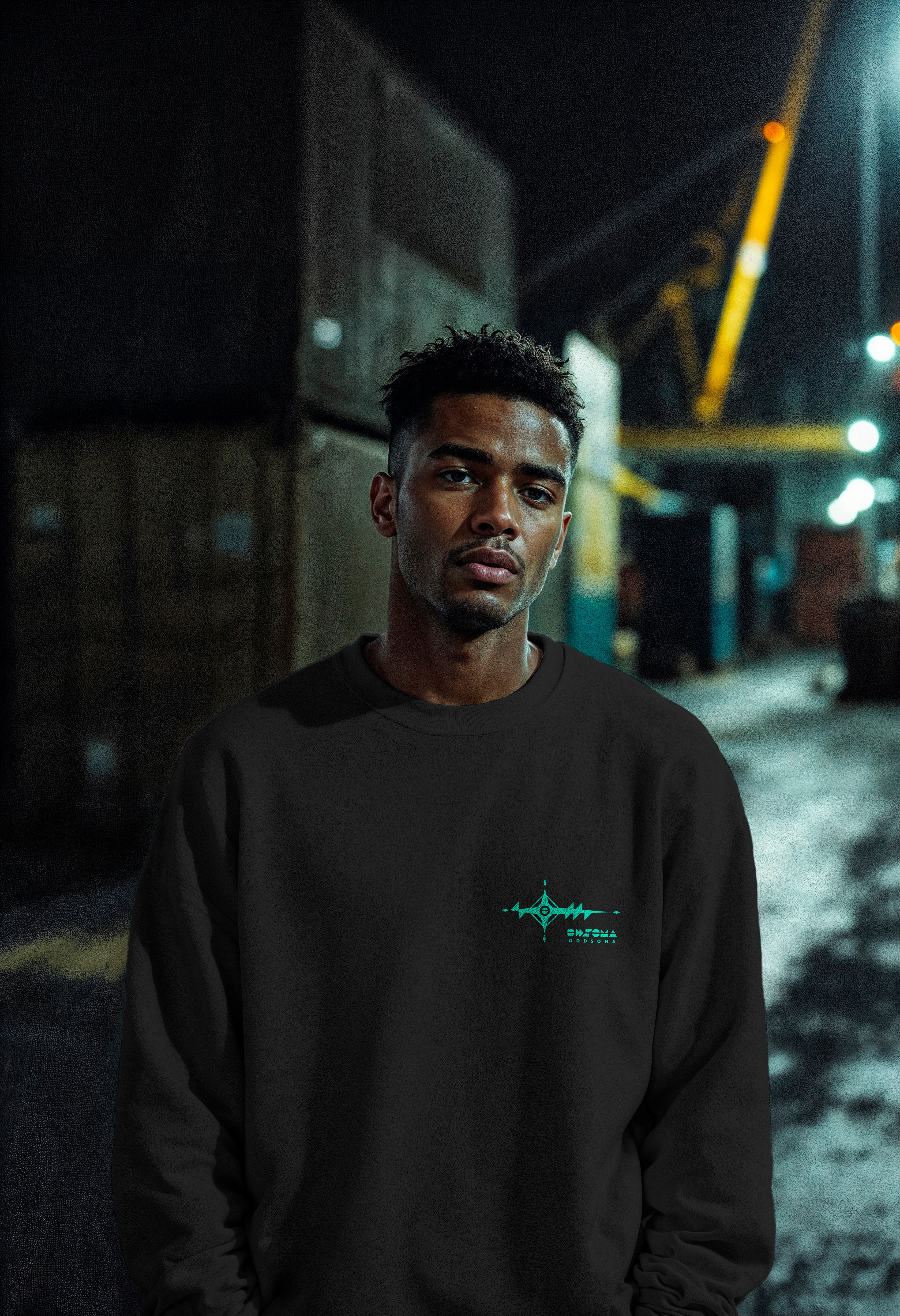
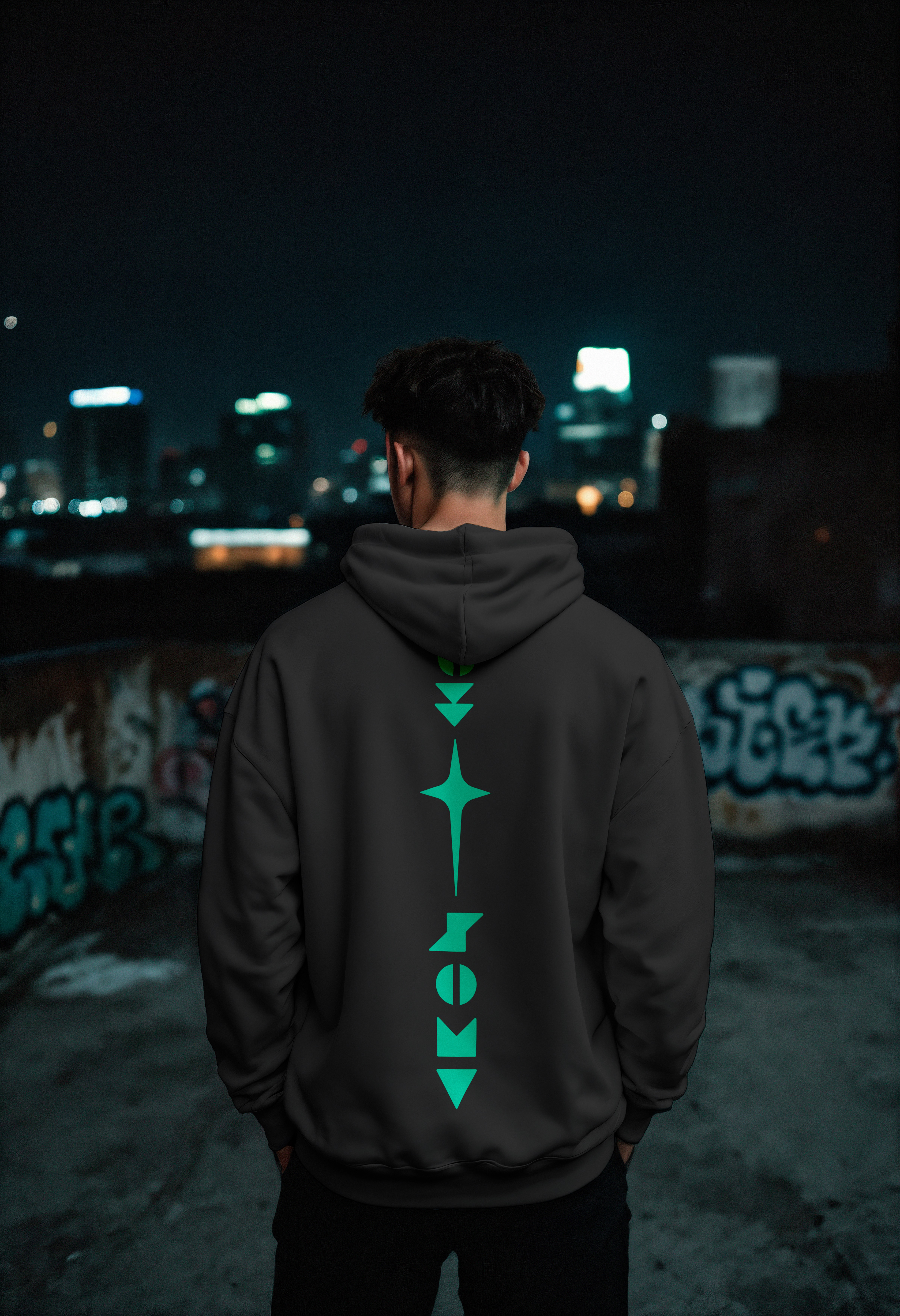
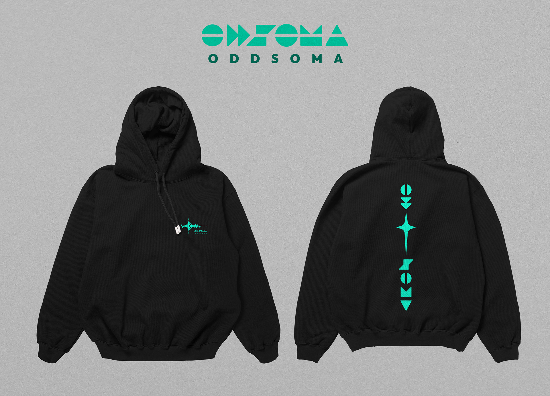
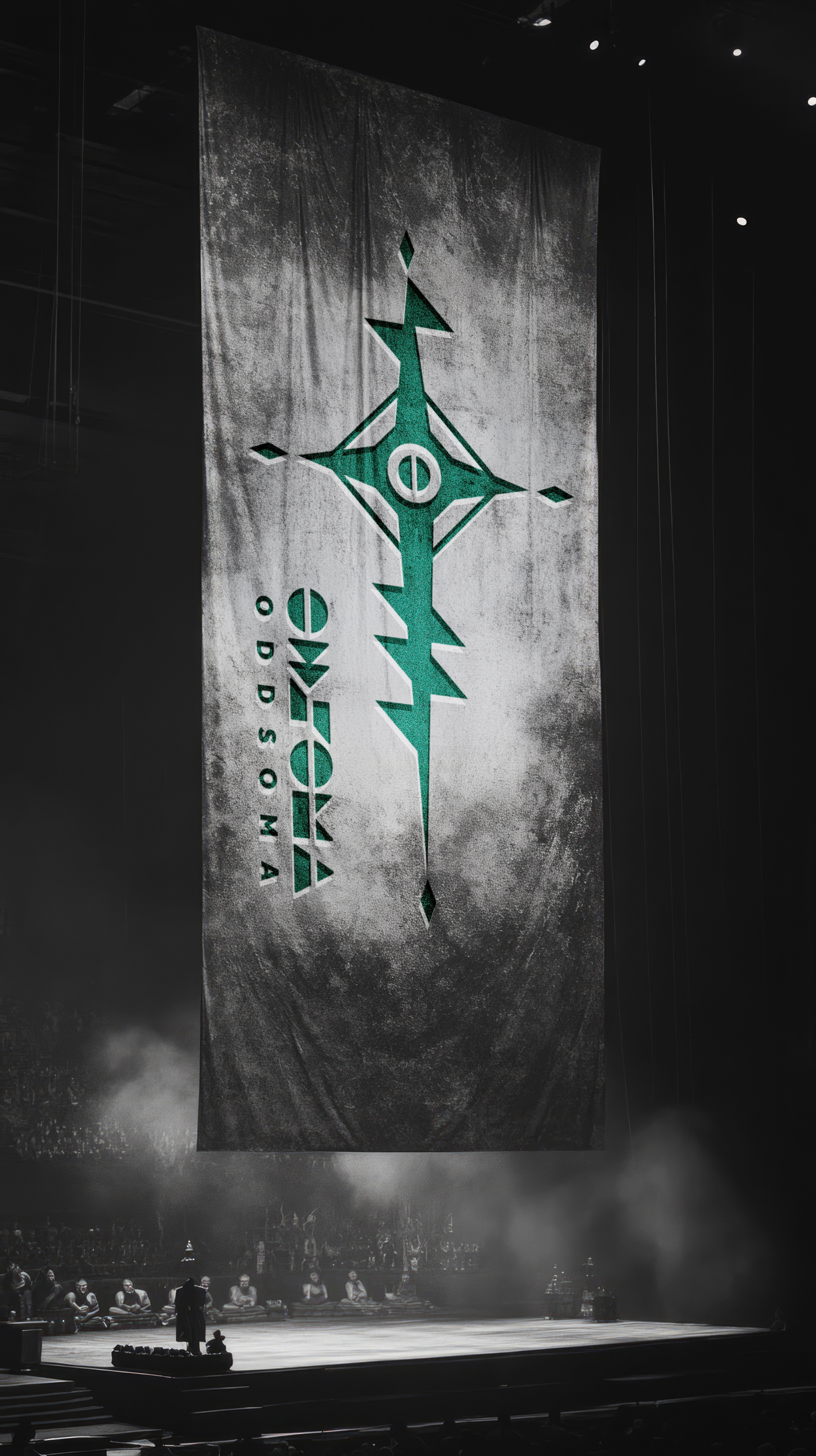
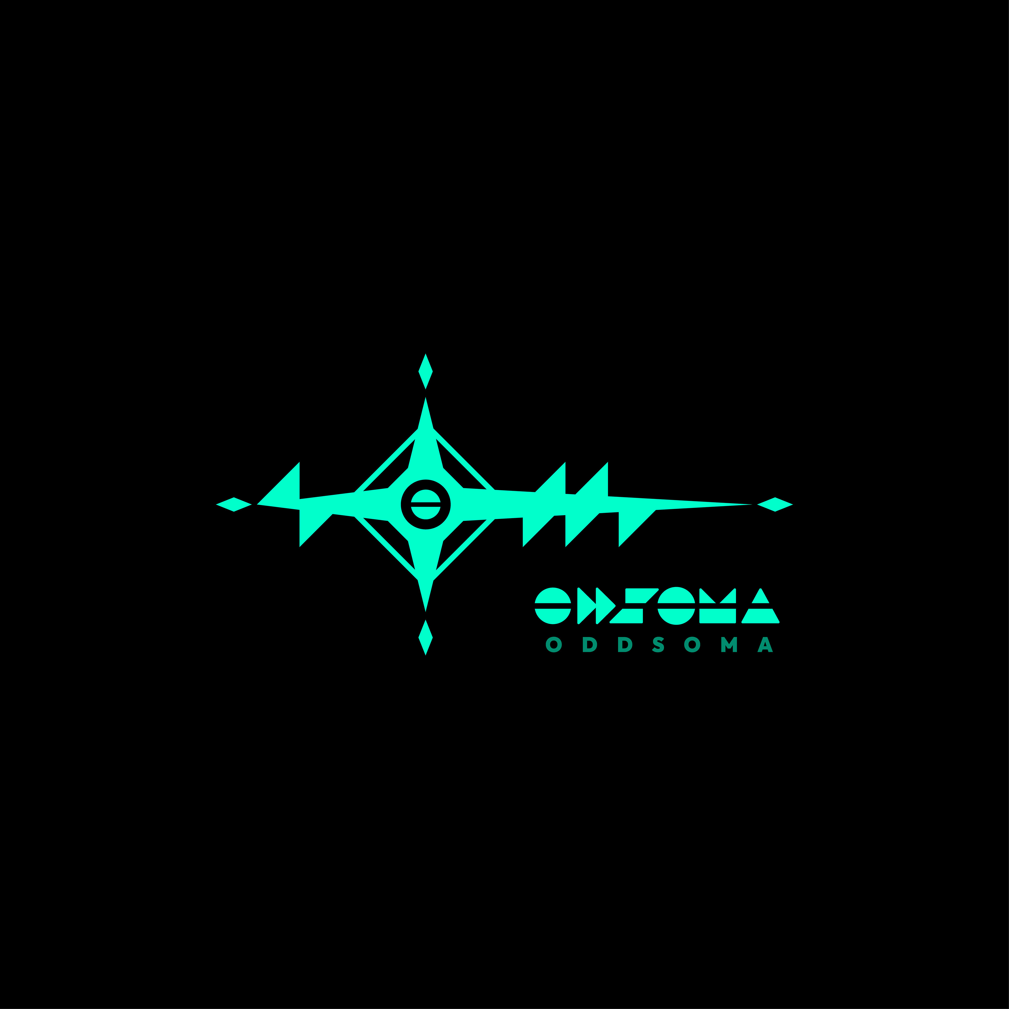
올더스 헉슬리의 《멋진 신세계》에서 ‘소마(Soma)’는 무비판적 순응과 인공적 안식을 주입하는 통제 약물입니다. 밴드는 여기에 ‘odd(이상한, 겉도는)’를 붙여 시스템에 균열을 내는 태도를 드러냅니다. 네이밍 자체에 이미 시각화의 단서가 분명하게 들어 있었습니다. 밴드 리더가 전달한 러프 스케치에서 출발했습니다. 마법진(Sigil)을 연상시키는 4방향 방사형 축과 십자 형태의 반복 구조를 사이버펑크 감성의 기하 조형으로 풀어내는 작업이었습니다. 이를 바탕으로 두 가지 방향을 전개했습니다. 1안: 원안 스케치의 구조를 정교화한 형태. 중앙의 원(O)을 축으로 상하에 다이아몬드 포인트를 두고, 좌측은 역방향 창(spear) 형태, 우측은 삼각형의 연속 확장 구조로 짰습니다. 좌우 끝의 미세한 다이아가 수평축의 긴장감을 유지하며, 'odd'와 'soma'가 좌우로 갈라지면서도 중심 기호에서 하나로 맞물립니다. 2안: 방사형 실루엣 위에 '약물'이라는 모티프를 직접 투영한 형태. 평화 기호(Peace symbol)를 변형한 'O'를 알약 타블렛 형태로 감싸고, S·M·A를 각각 기하 도형으로 추상화해 배치했습니다. 텍스트 없이 마크 자체만으로도 이름 속 개념이 읽히도록 의도했습니다. 메인 컬러는 블랙과 일렉트릭 시안(Electric Cyan). 시길 특유의 날카로운 선형 구조가 시안 컬러와 맞물리며 기계 회로도 같은 인상을 만듭니다. 결과물은 메인 심볼, 심볼+워드마크 조합, 워드마크 단독, 서브 심볼, 스파인(Spine) 형태의 5가지 타입에 각 4종 컬러 시스템으로 정리해 납품했습니다.
In Aldous Huxley’s Brave New World, "Soma" is a state-issued narcotic engineered for painless compliance. By adding "odd," the band establishes a posture of deliberate friction against the default. The visual direction was already set within the name. The project began with a rough pencil sketch from the band's frontman—a four-axis layout built on occult sigils and repeating cross motifs. The task was to translate this esoteric syntax into a precise, cyberpunk visual language. Two distinct directions were explored. Direction 01: A direct structural refinement of the original sketch. Anchored by a central circle (O), diamond points extend along the vertical axis, while a reverse-spear form on the left balances repeated triangles on the right. Terminal micro-diamonds lock in horizontal tension, allowing "odd" and "soma" to split visually yet resolve into a unified central glyph. Direction 02: A conceptual translation of the pharmaceutical motif within a starburst silhouette. A modified peace symbol (the "O") is enclosed within a pill tablet contour, surrounded by geometric abstractions of S, M, and A. The mark itself communicates the underlying narrative without relying on supporting copy. The palette relies on pure black and electric cyan. The razor-sharp linework of the sigil reads like an energized circuit board against the cyan base. Deliverables covered five lockup types (Main Symbol, Combination Mark, Wordmark, Sub-Symbol, and Spine Format) across four production colorways.
Category: Brand Identity, Merchandise Graphic
Key Subjects: Band Identity, Sigil System, Cyberpunk Geometry
Visual Elements: Radial Sigil Structure, Geometric Glyphs, Electric Cyan, Pill Tablet Form