

Labor's Perspective — Brand Identity for a Labor Attorney Office
노동의 시선 — 노무사 사무소 브랜드 아이덴티티
Labor's Perspective is a brand identity and stationery design project for a labor attorney office located in Changwon, South Korea.
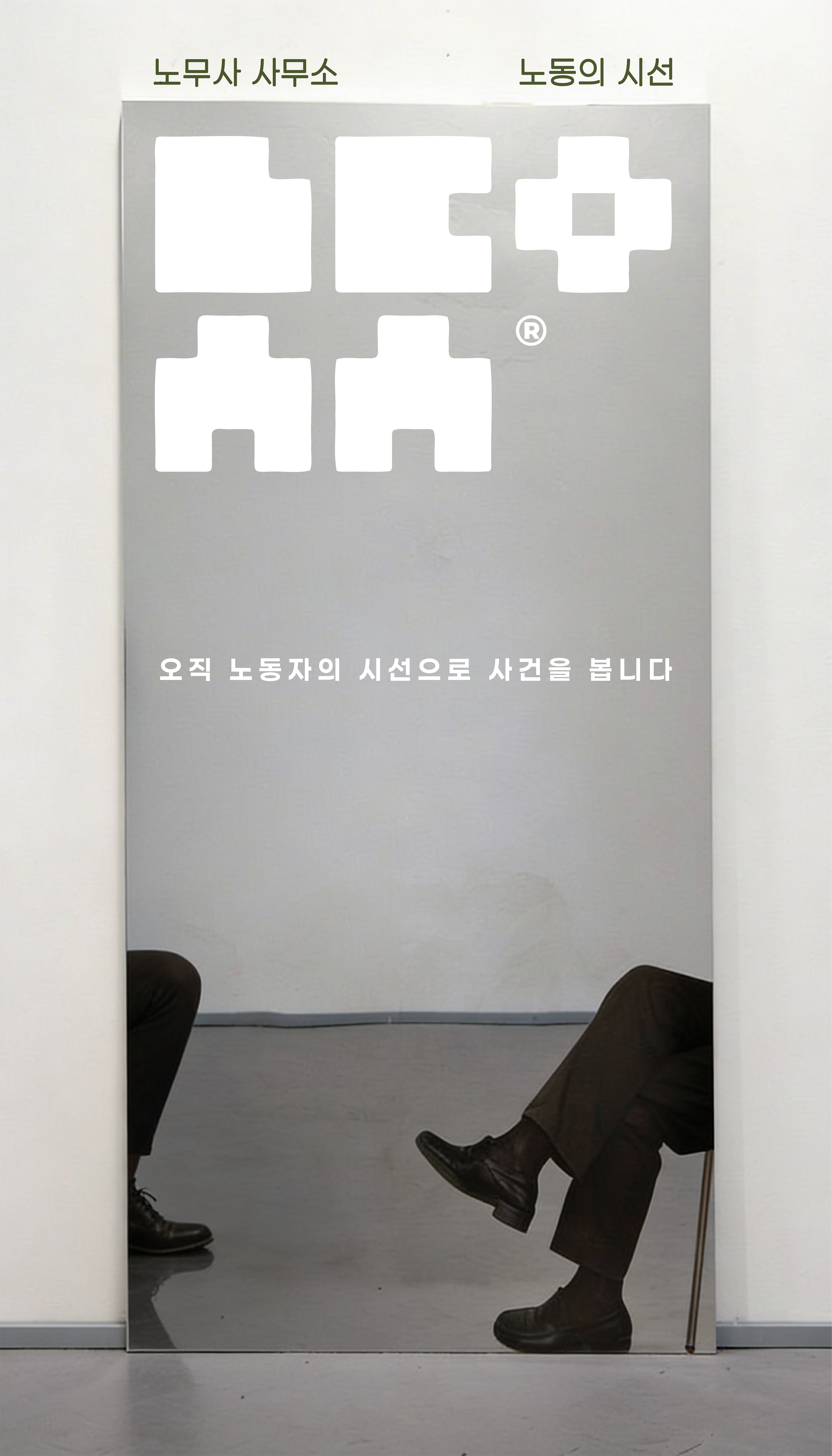
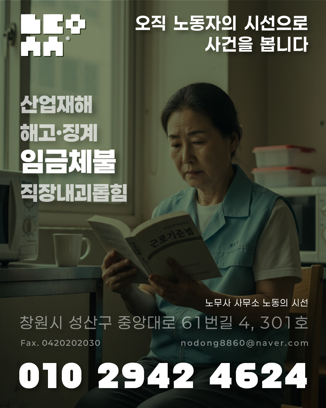
The brand's core value is captured in its name — "We see every case solely through the eyes of the worker." This singular perspective, always from the laborer's side rather than the employer's, is embedded throughout the entire identity system.
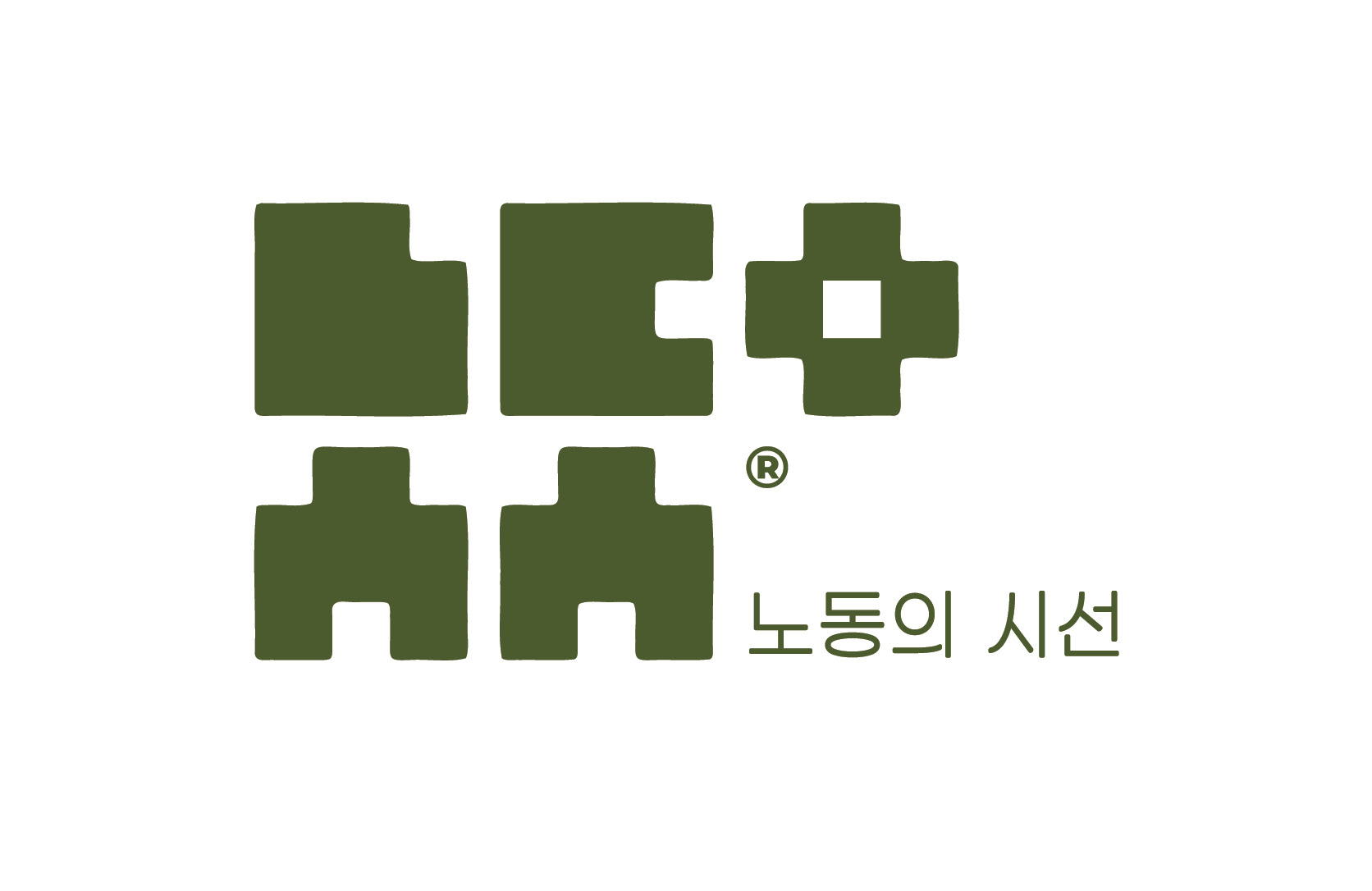
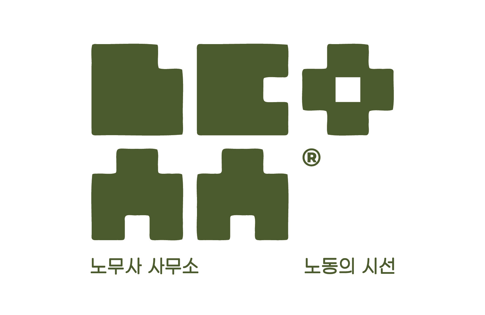
The symbol is designed to be read two ways simultaneously.
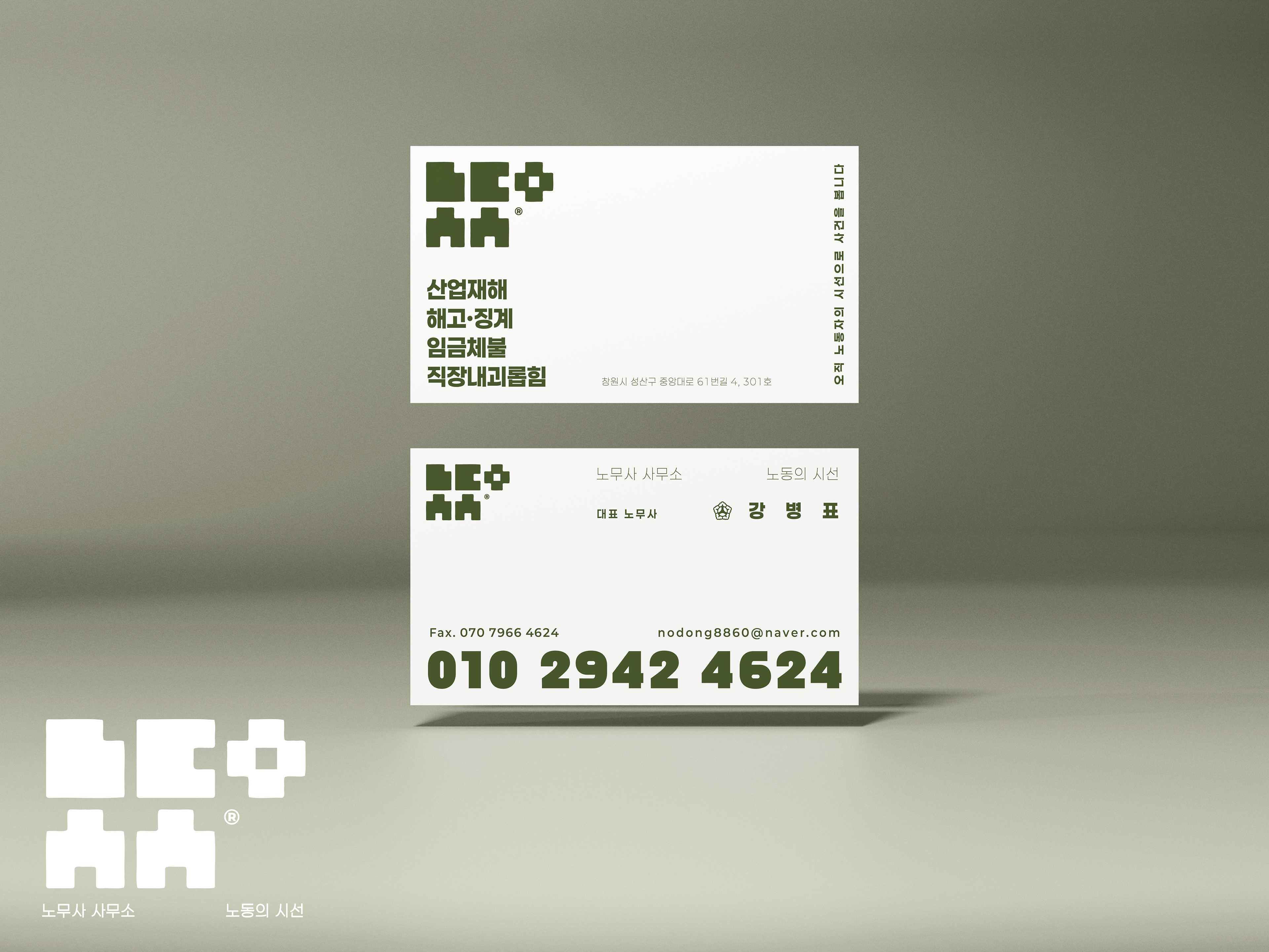
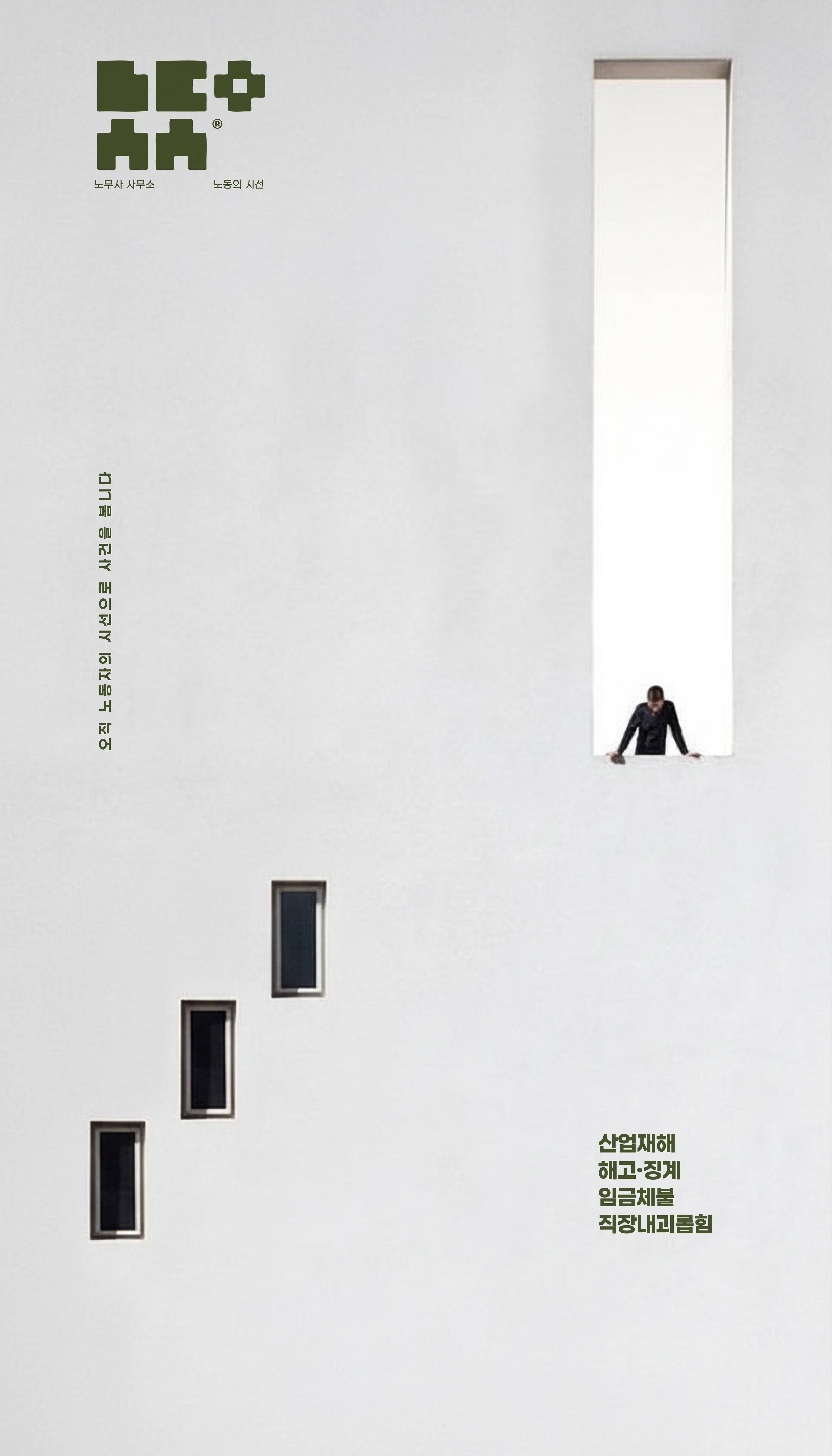
The four block forms — ㄴㄷ / ㅅㅅ — visually resemble the Korean word "노동 (labor)" at a glance. Add the ㅇ on the right, and the five shapes become the initials of the brand's full name: ㄴ·ㄷ·ㅇ·ㅅ·ㅅ for "노동의시선." A single mark that functions as both a word and an acronym — its meaning only reveals itself the moment you look.

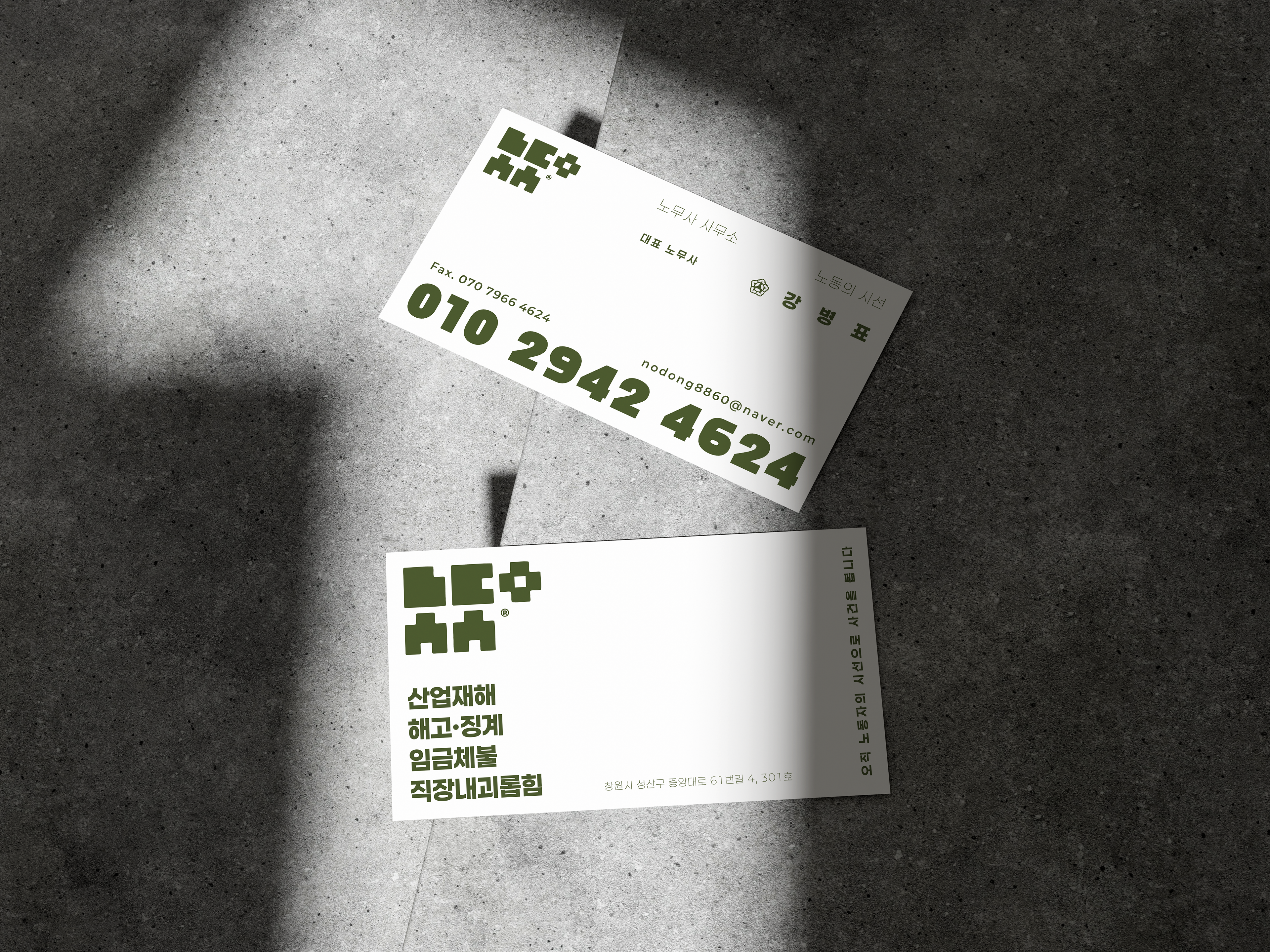
Business cards were designed for both the representative and the director.
The phone number is set at a dominant scale, prioritizing immediate clarity of contact information above all else.
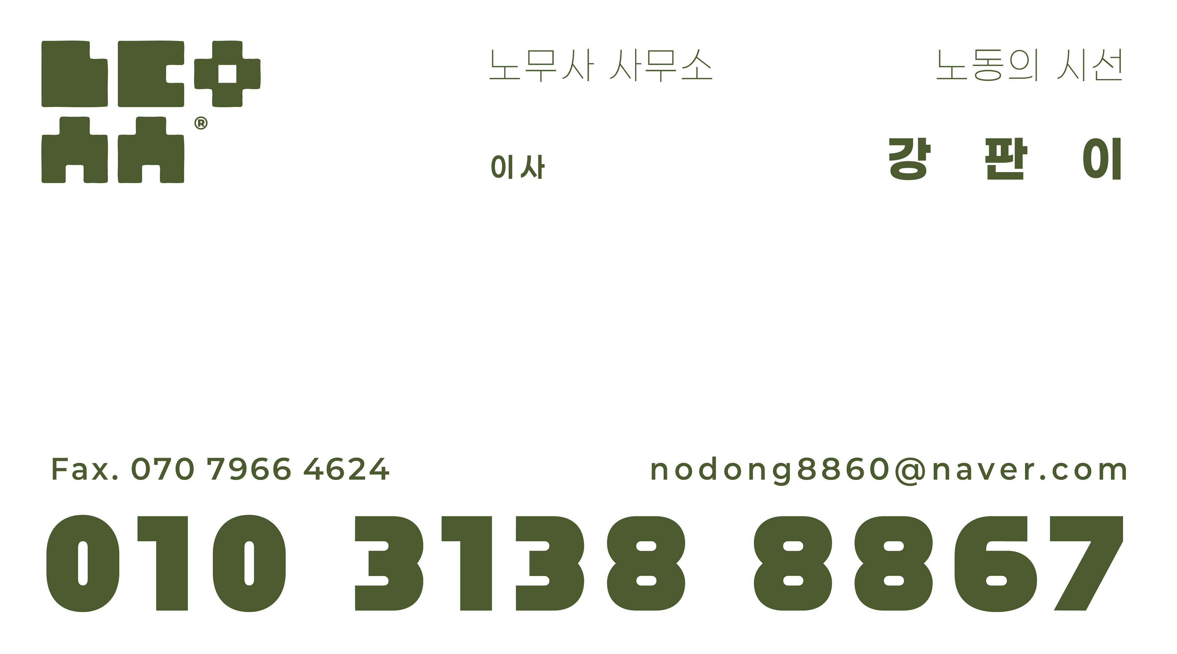
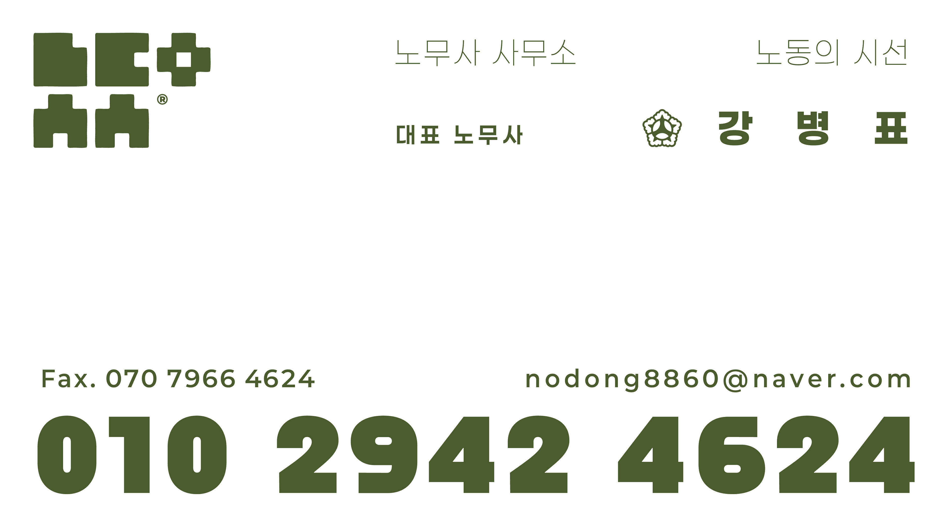
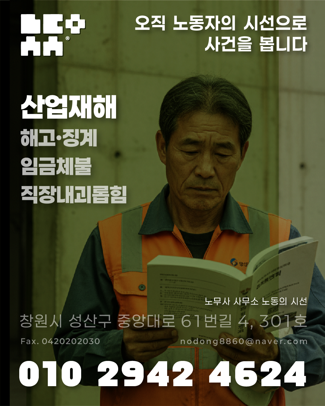
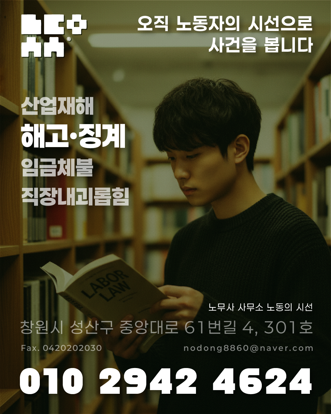
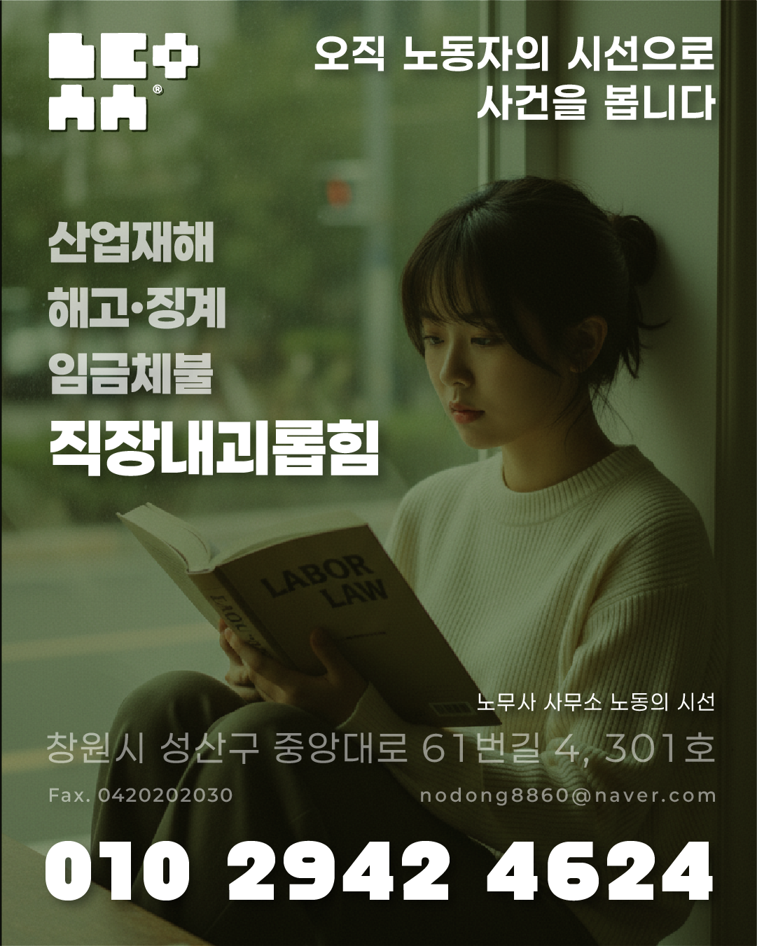
A deep olive green is used as the sole color, conveying trust, stability, and the weight of the labor environment.
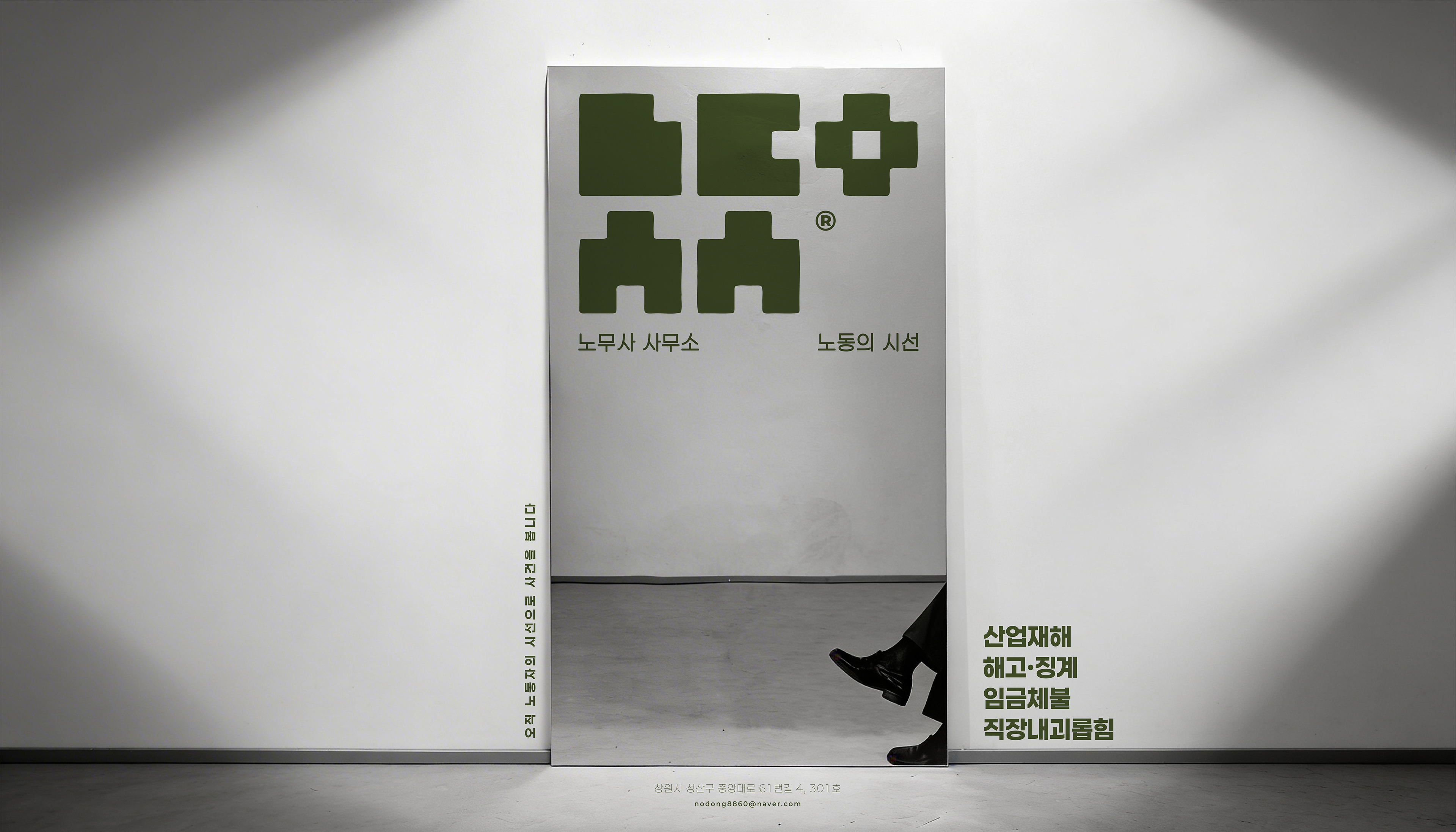

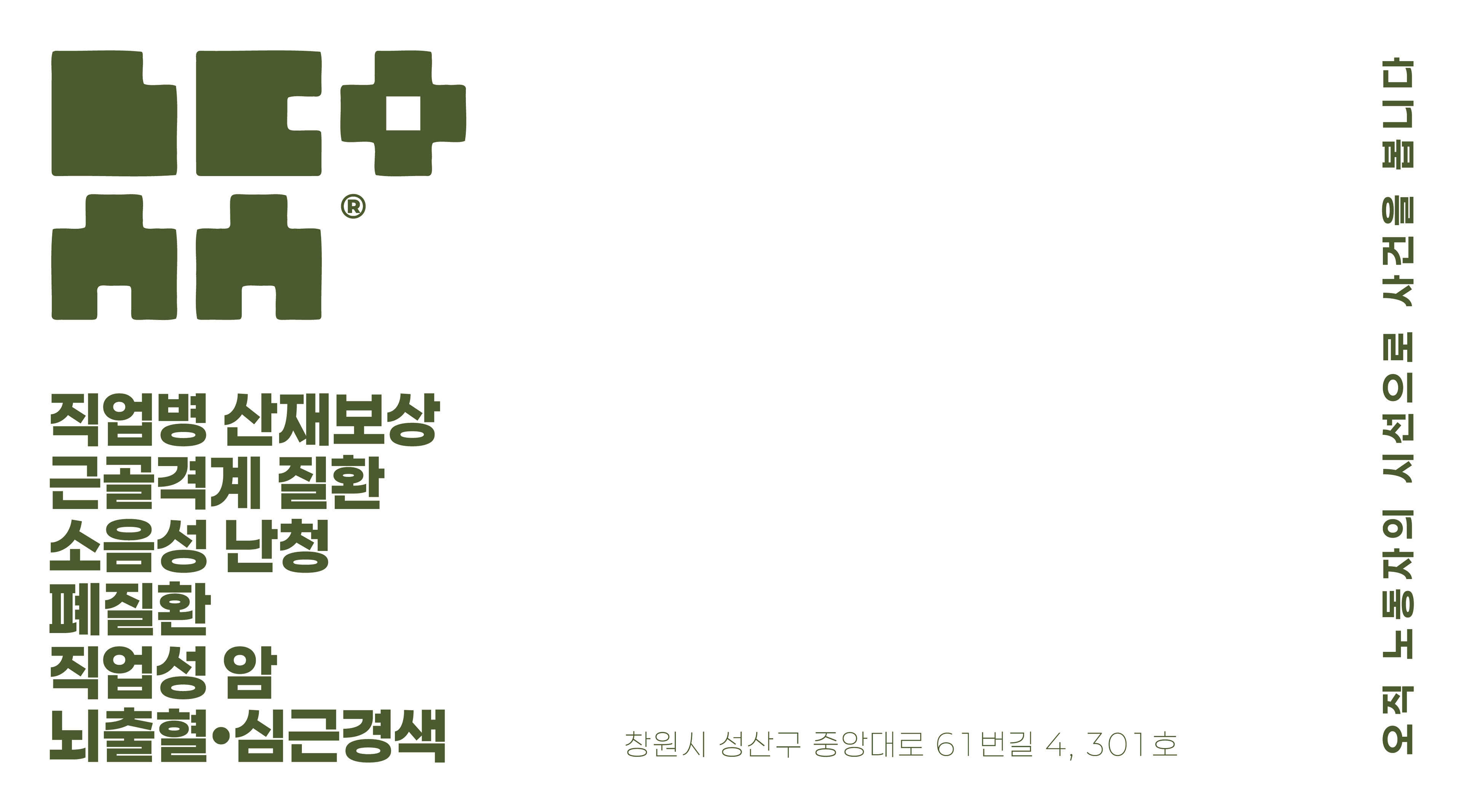
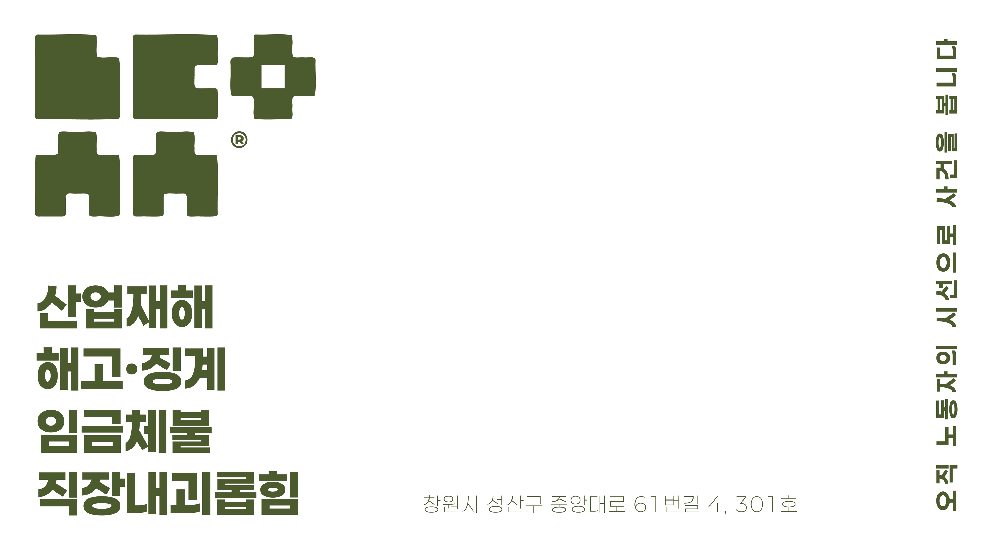
Ad creatives feature a diverse range of workers — young professionals, middle-aged laborers, female office workers — covering cases of industrial accidents, unfair dismissal, unpaid wages, and workplace harassment, so that anyone can see themselves reflected in the work.
Labor Attorney Office — Labor's Perspective | 301, 4, Jungangtaero 61beon-gil, Seongsan-gu, Changwon
