

SAYONARA ARCHIVE — Visual Identity System
Functional Aesthetics for Silent Exploration / A posture of departure that respects the moment of gathering.
SAYONARA ARCHIVE is a gorpcore-rooted outdoor brand built on the philosophy of departure and gathering.
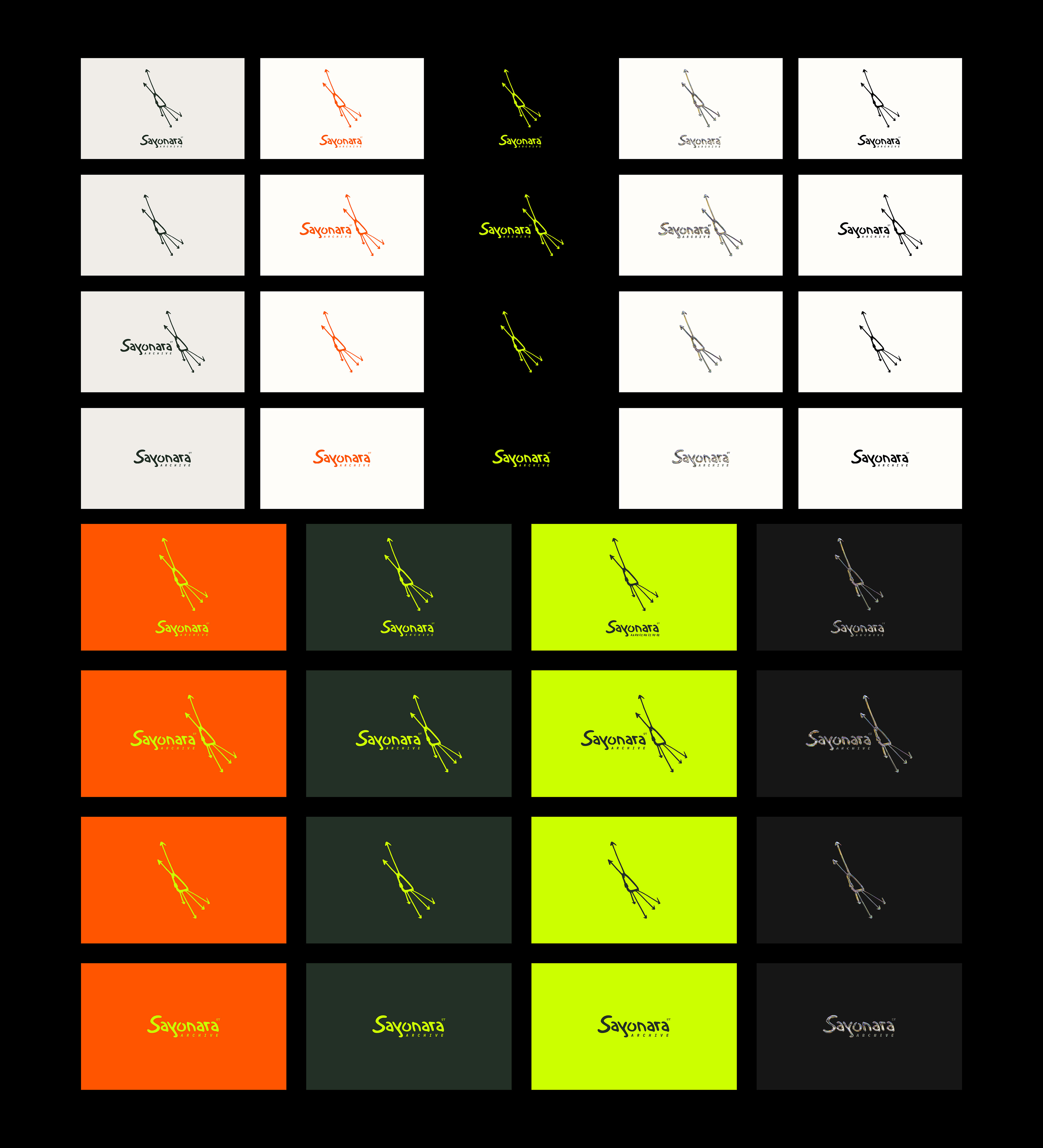
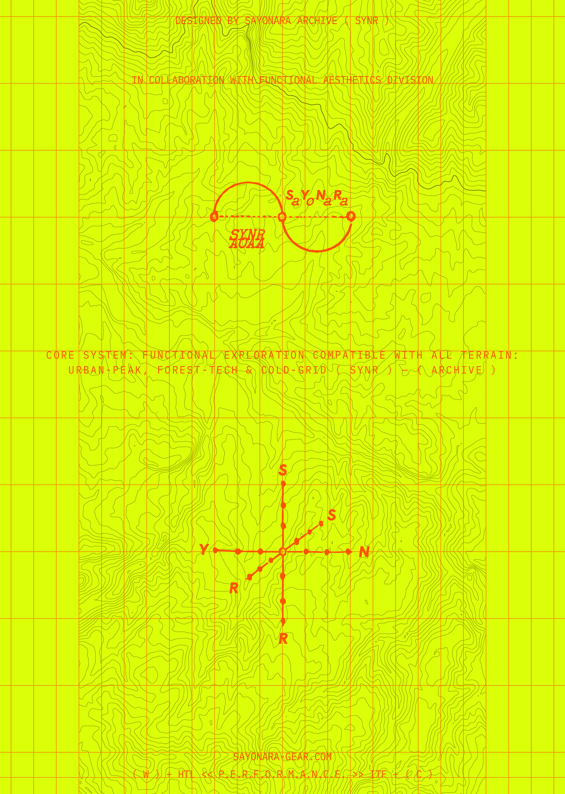
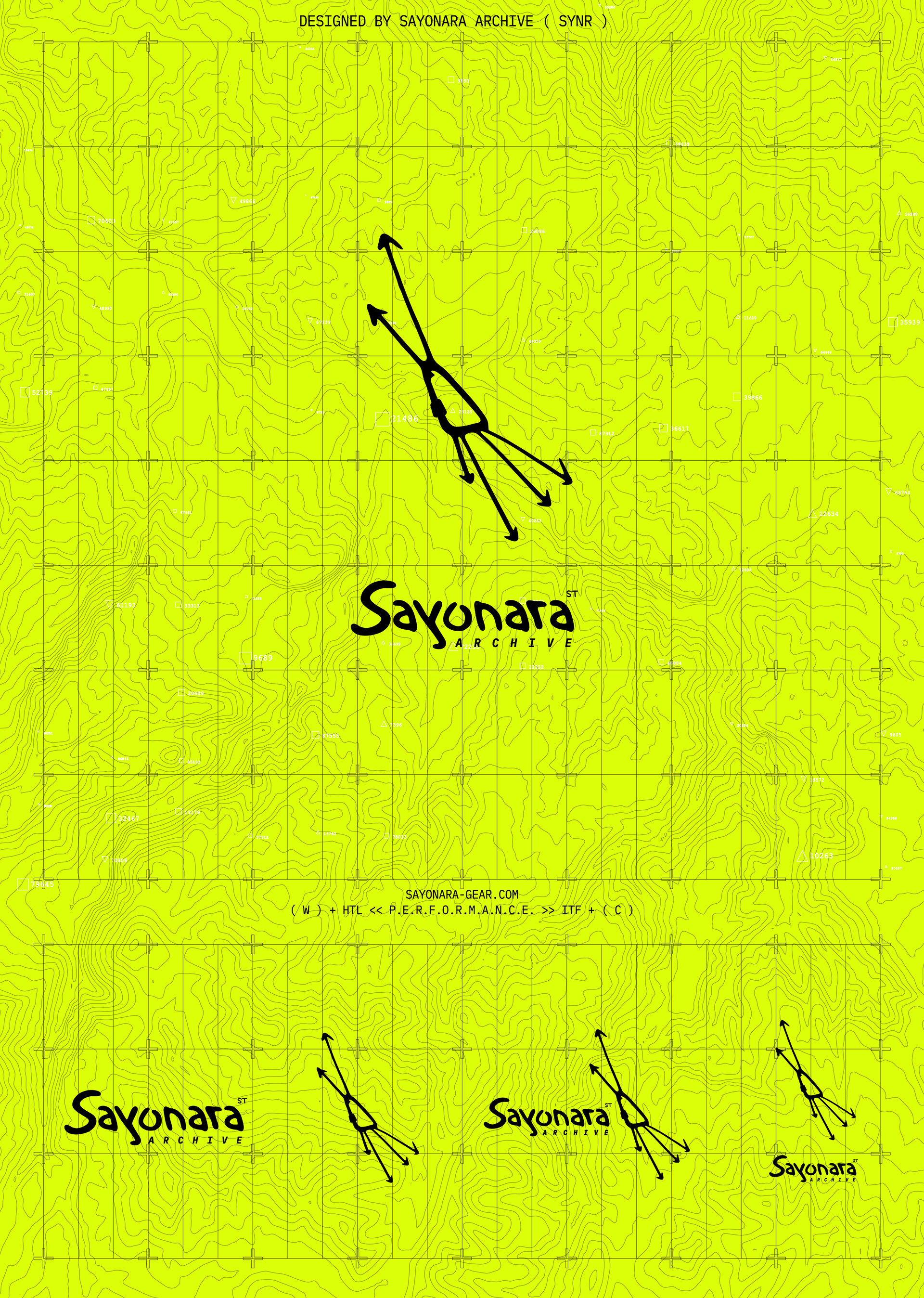
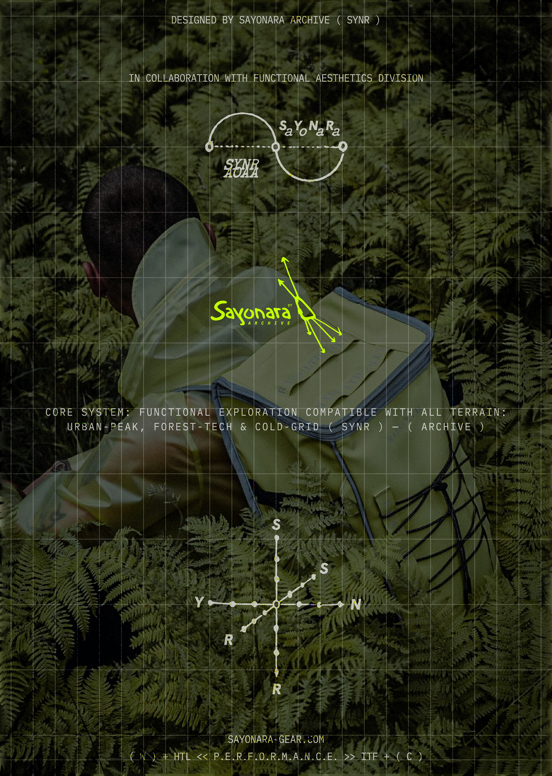
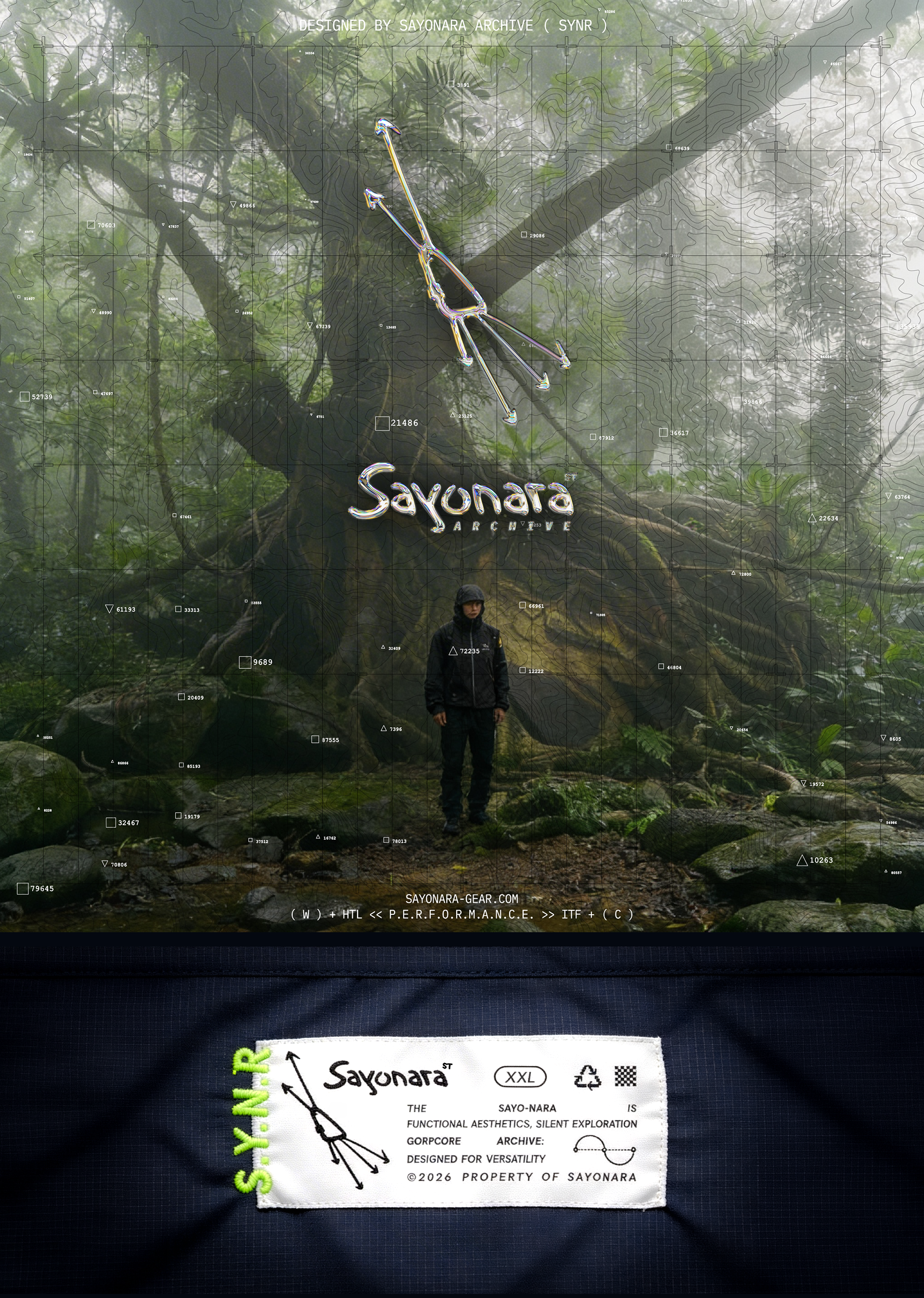
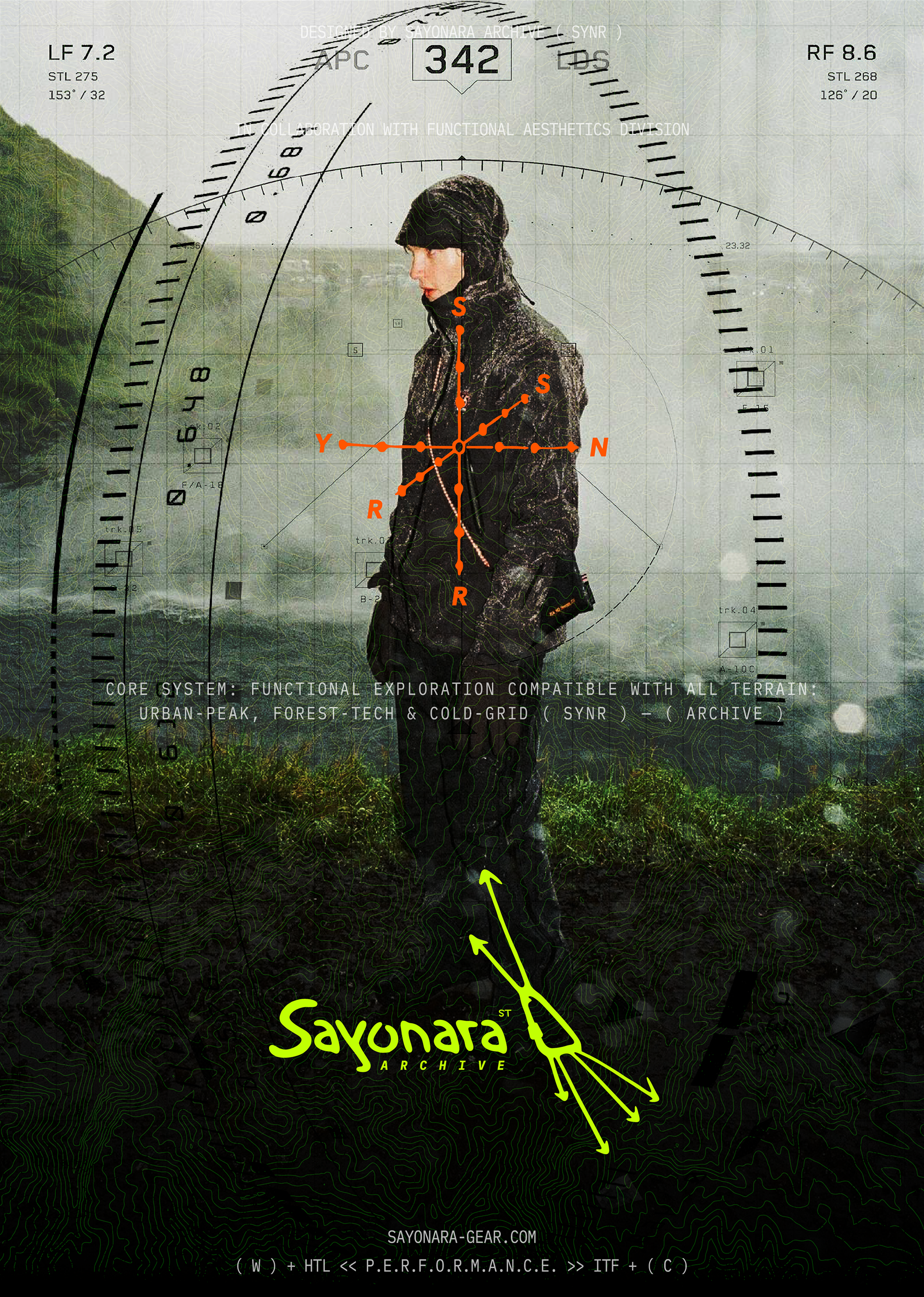
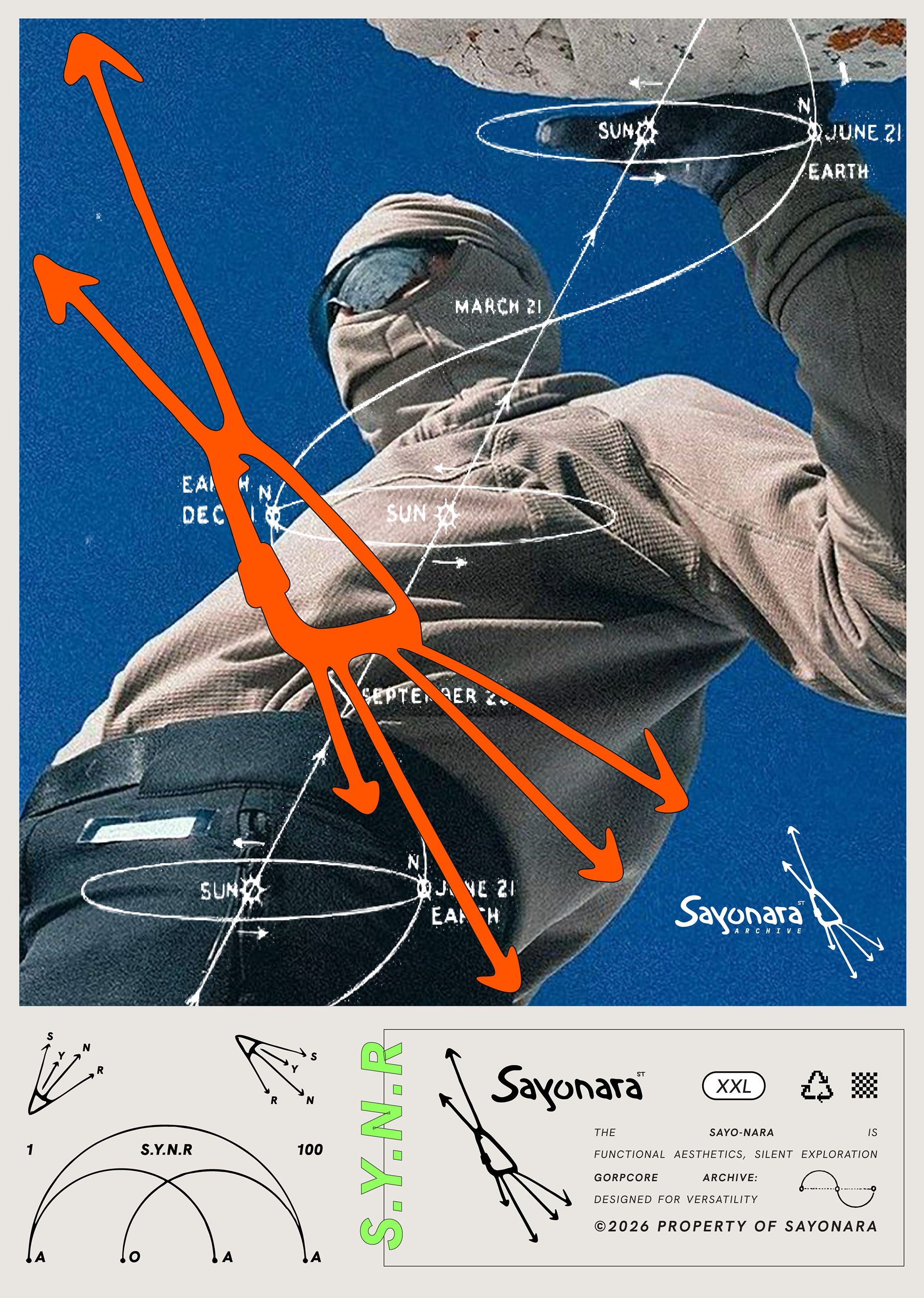
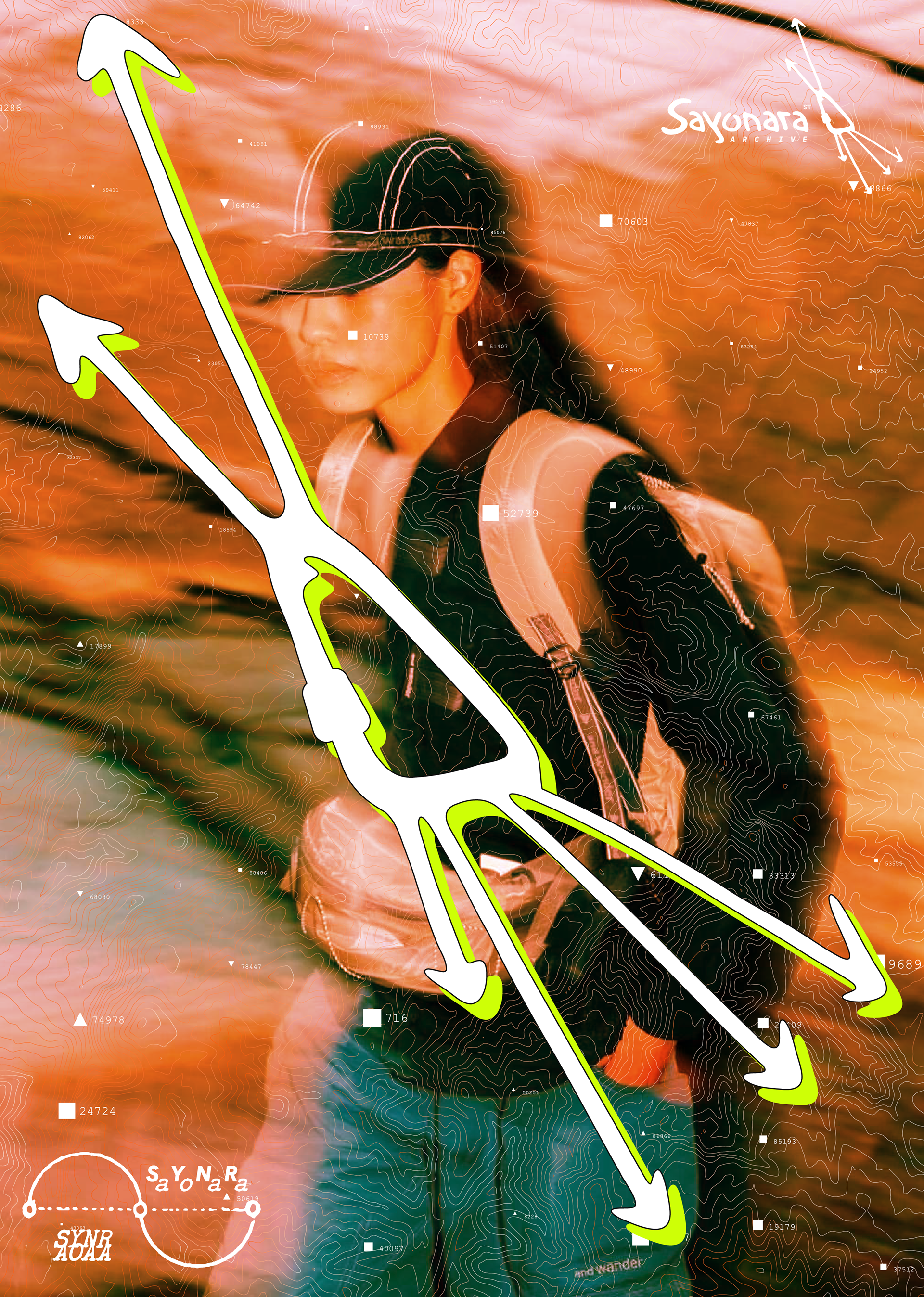
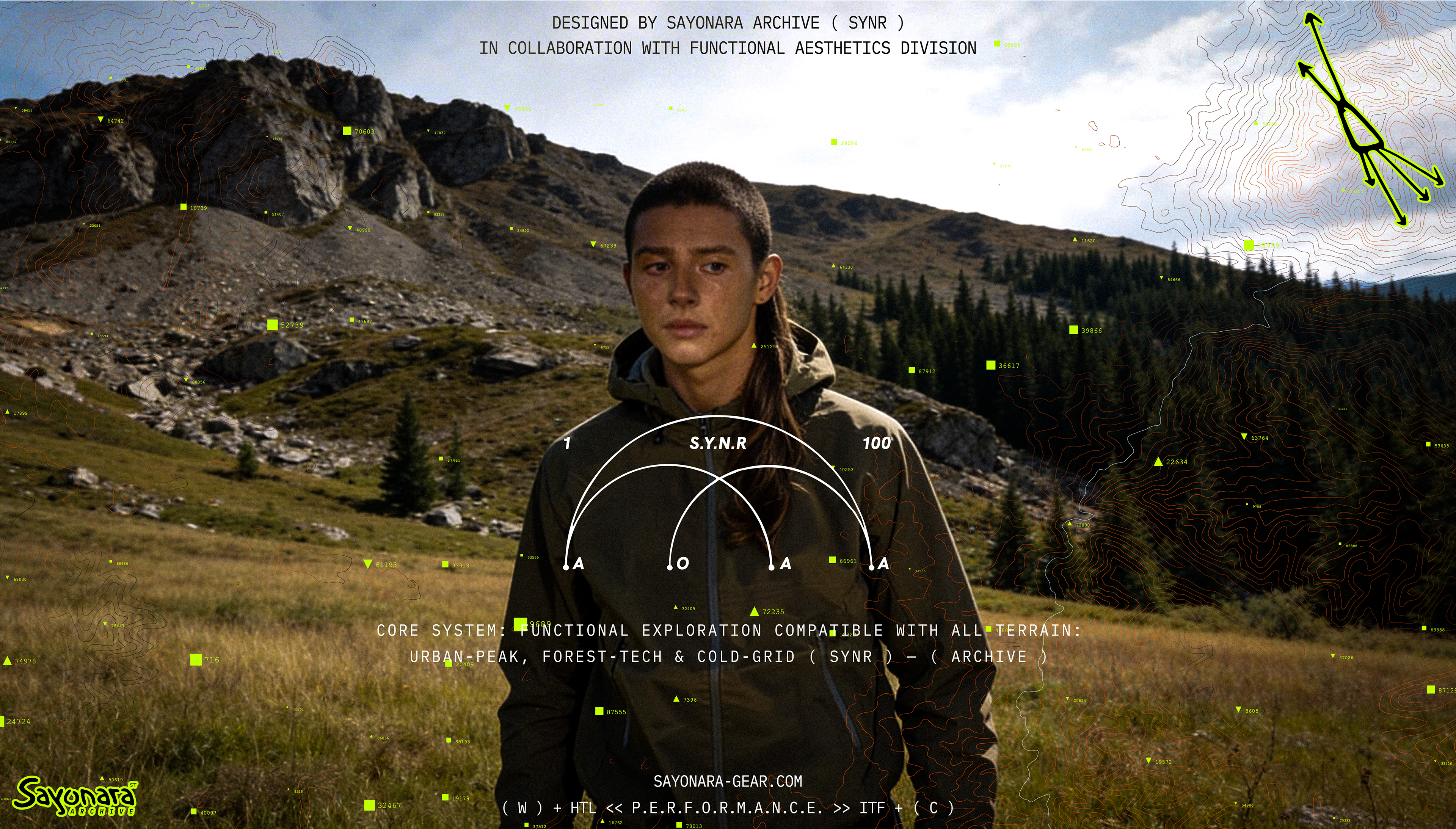
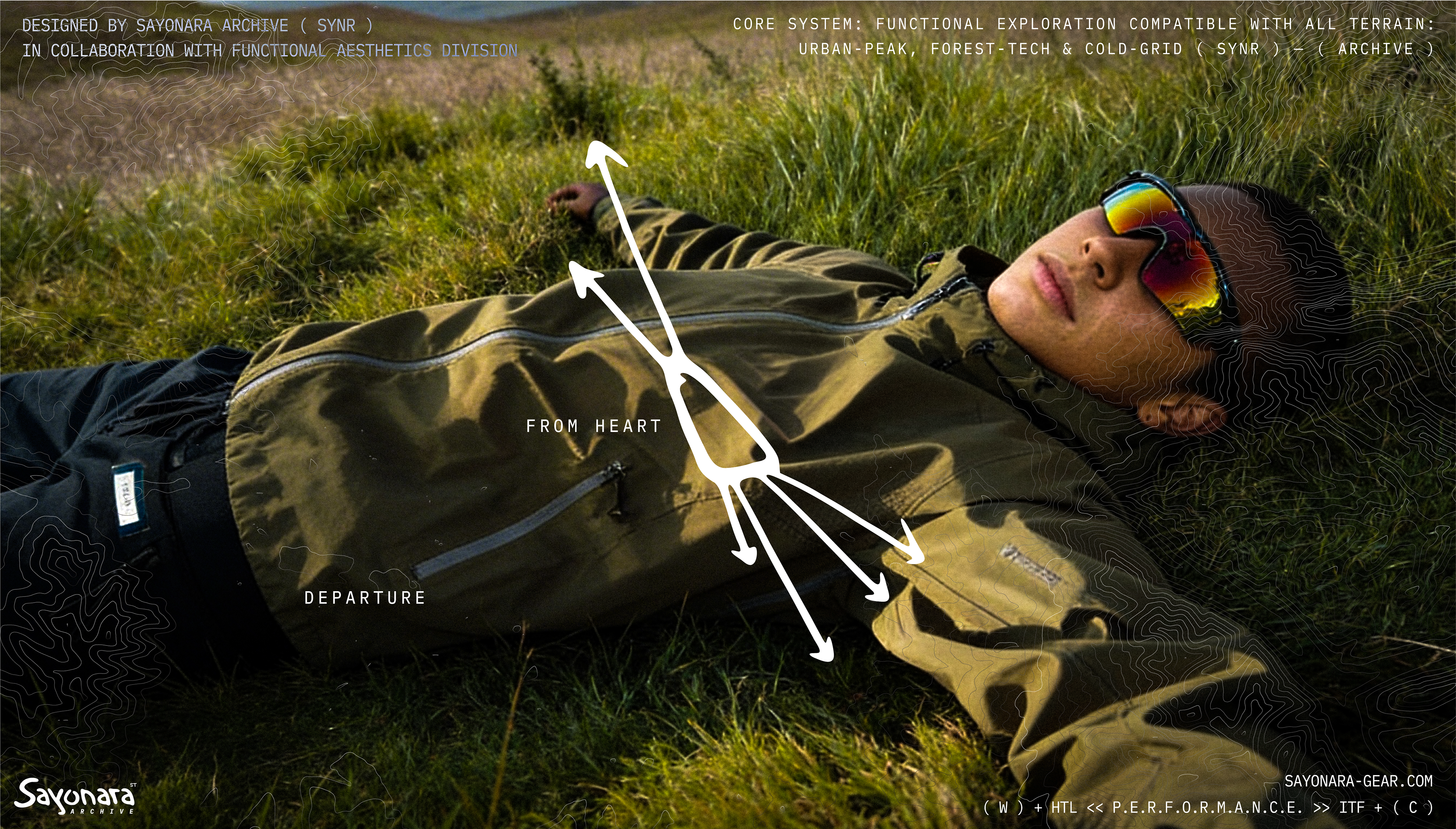
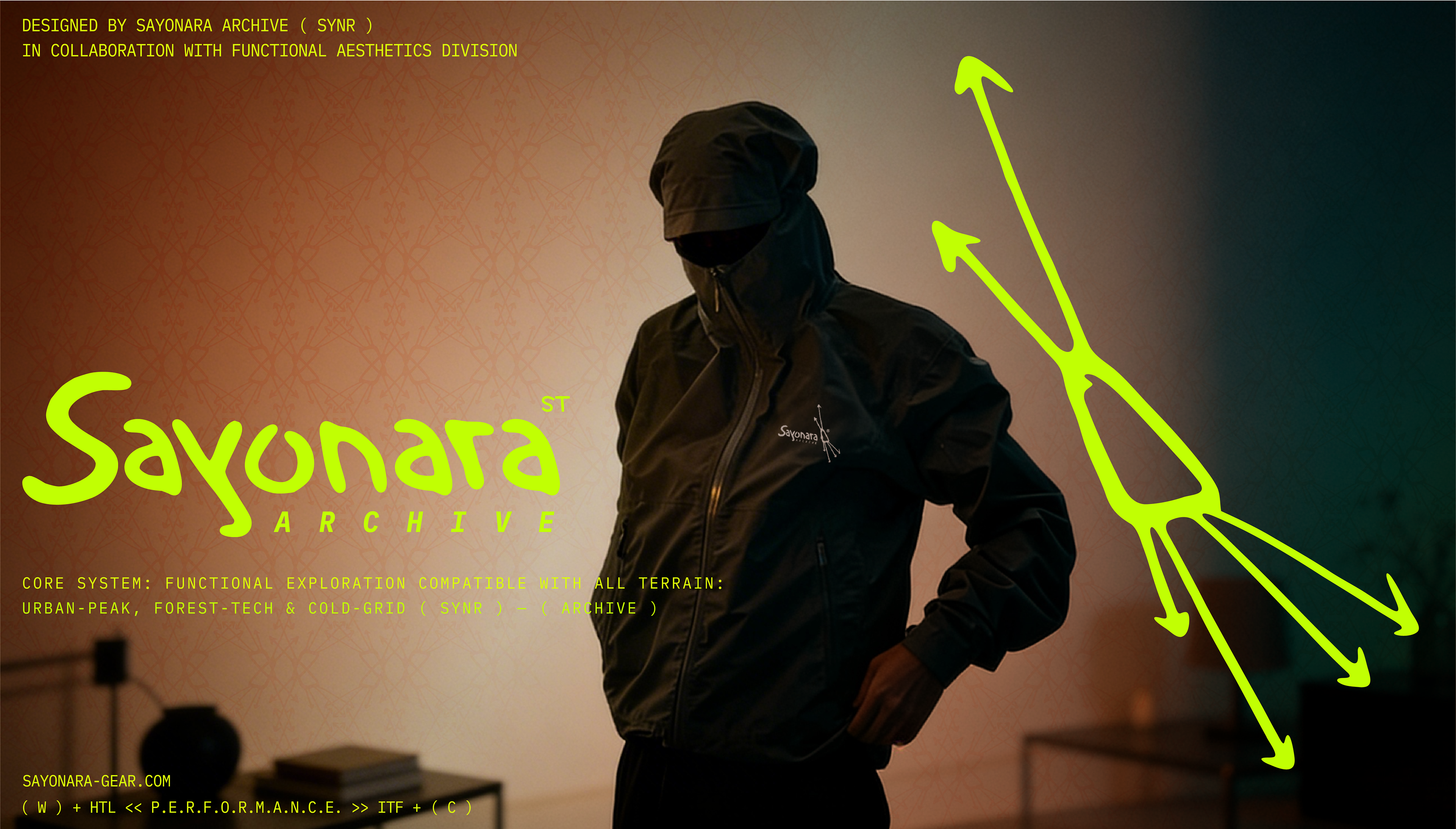
The identity system is derived from a single moment — the instant a carabiner releases and vectors diverge. The logo symbol functions not as a badge, but as a coordinate: a convergence of paths that scatter into individual silences.

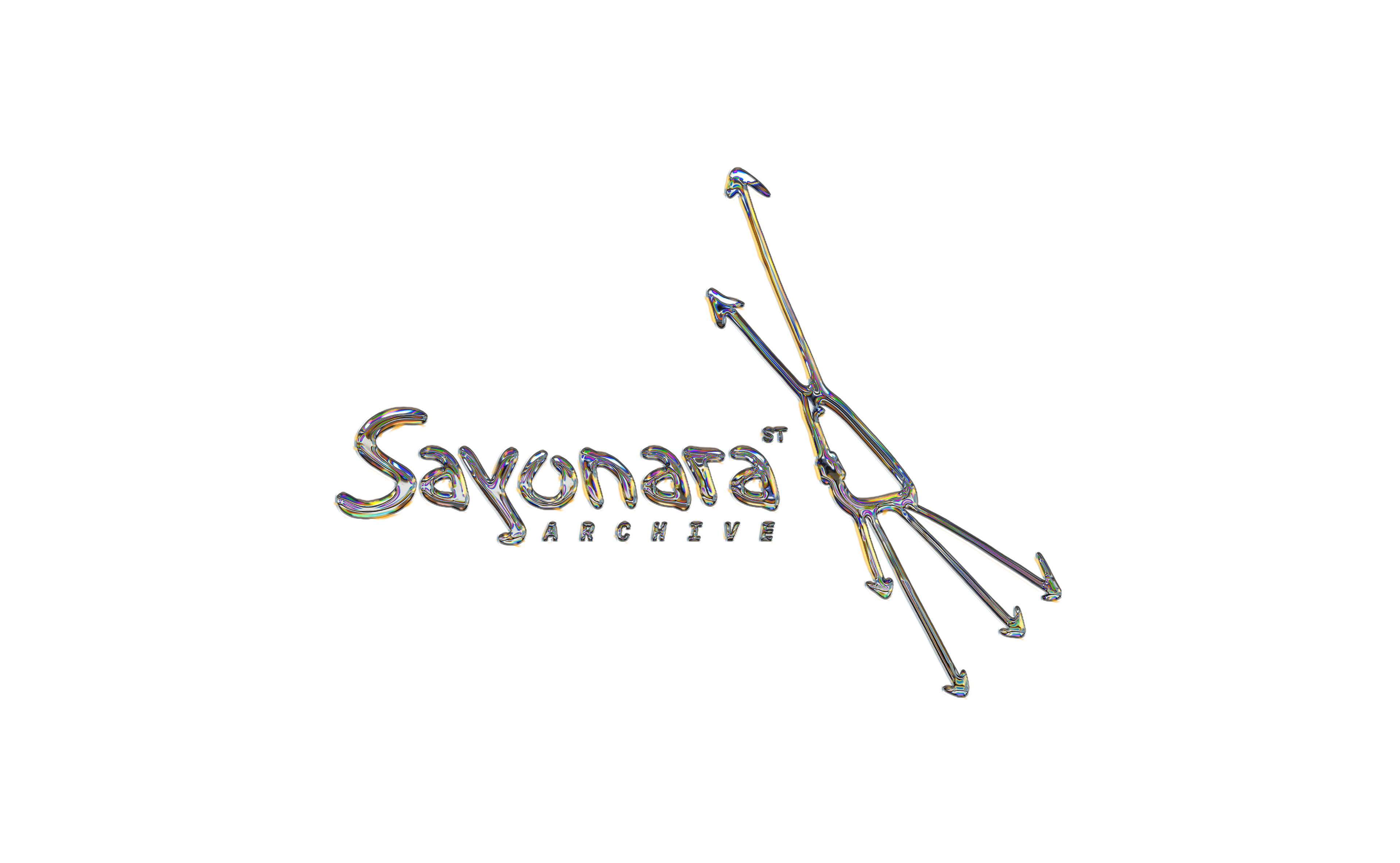
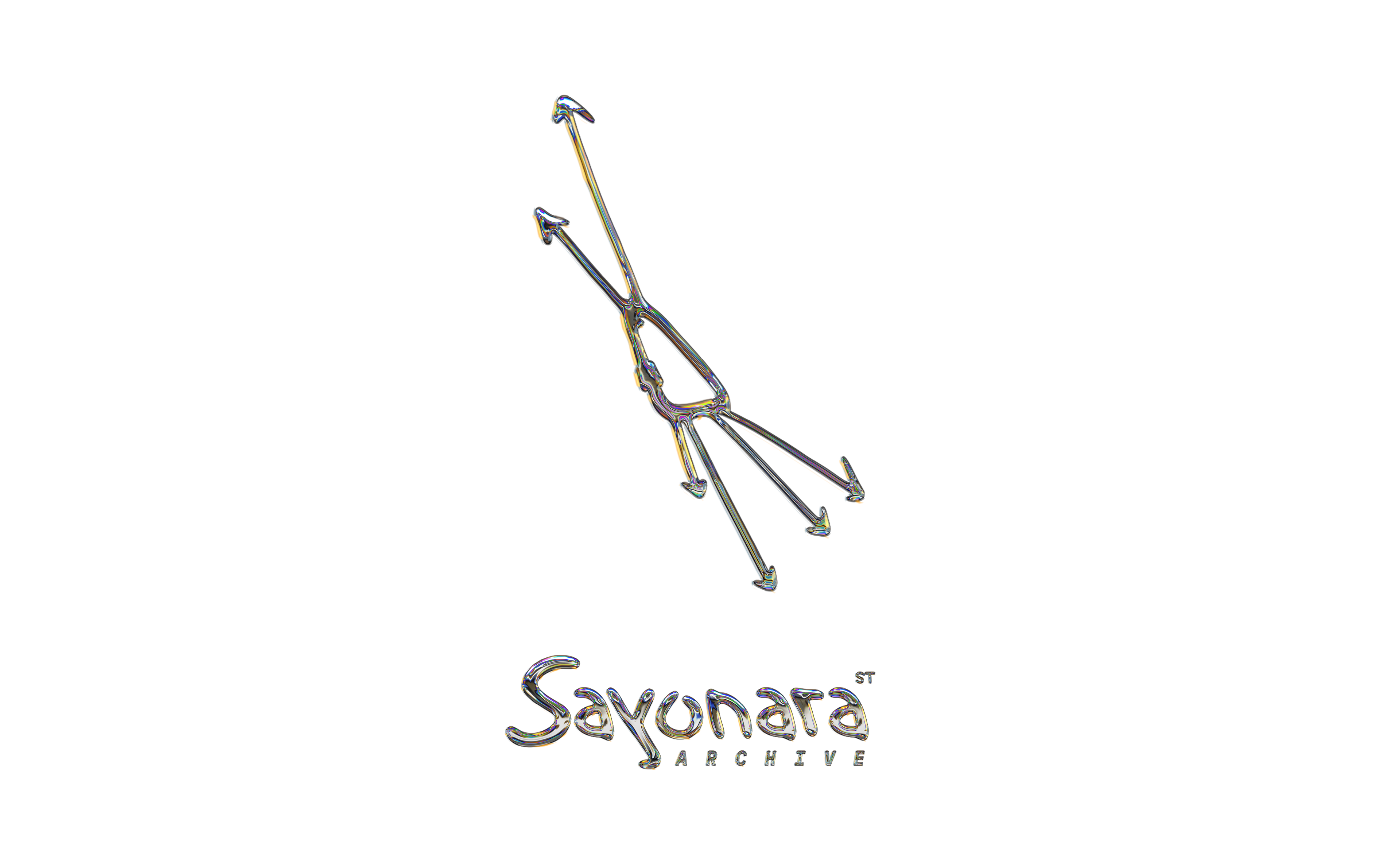
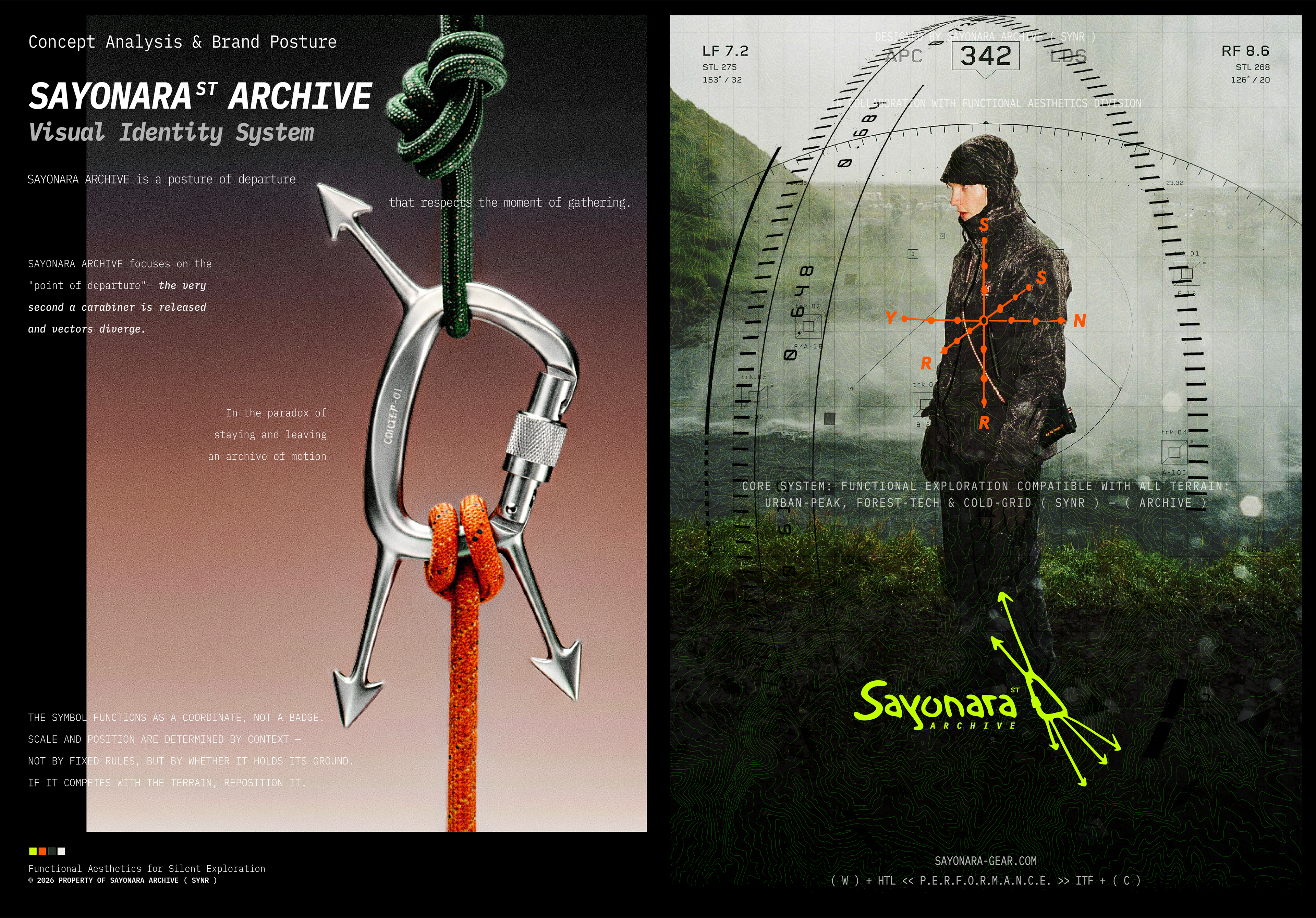
Core Concept: Departure & Gathering The carabiner represents the state of being bound together — prepared, functional, collective. The moment of release becomes the logo itself: arrows pointing outward to S / Y / N / R, each moving toward its own terrain.
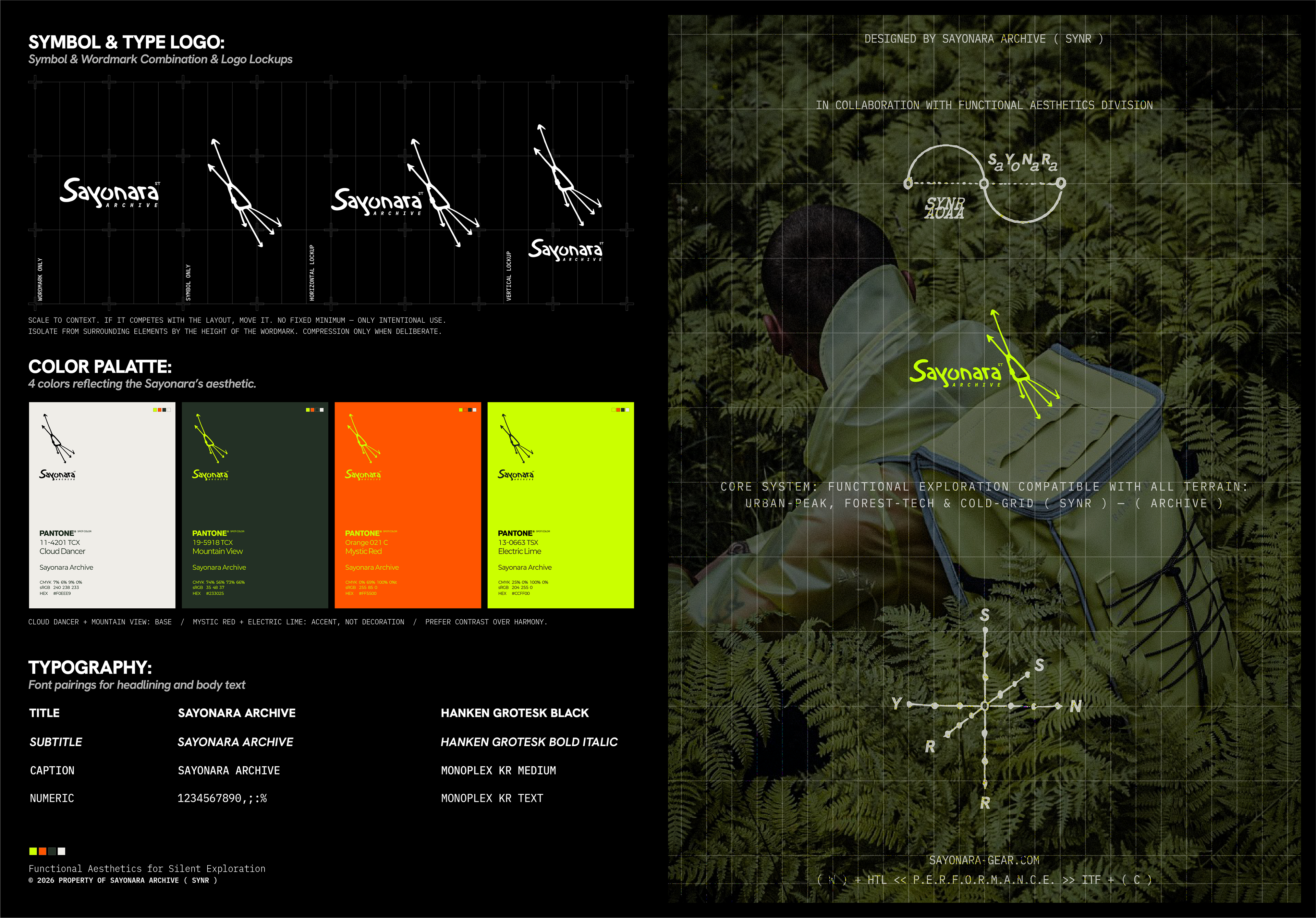
Visual System The color palette draws from four Pantone references — Cloud Dancer, Mountain View, Mystic Red, and Electric Lime — where base tones ground the identity and accent colors cut through the terrain. Typography is anchored by Hanken Grotesk and Monoplex KR, balancing editorial weight with technical precision.
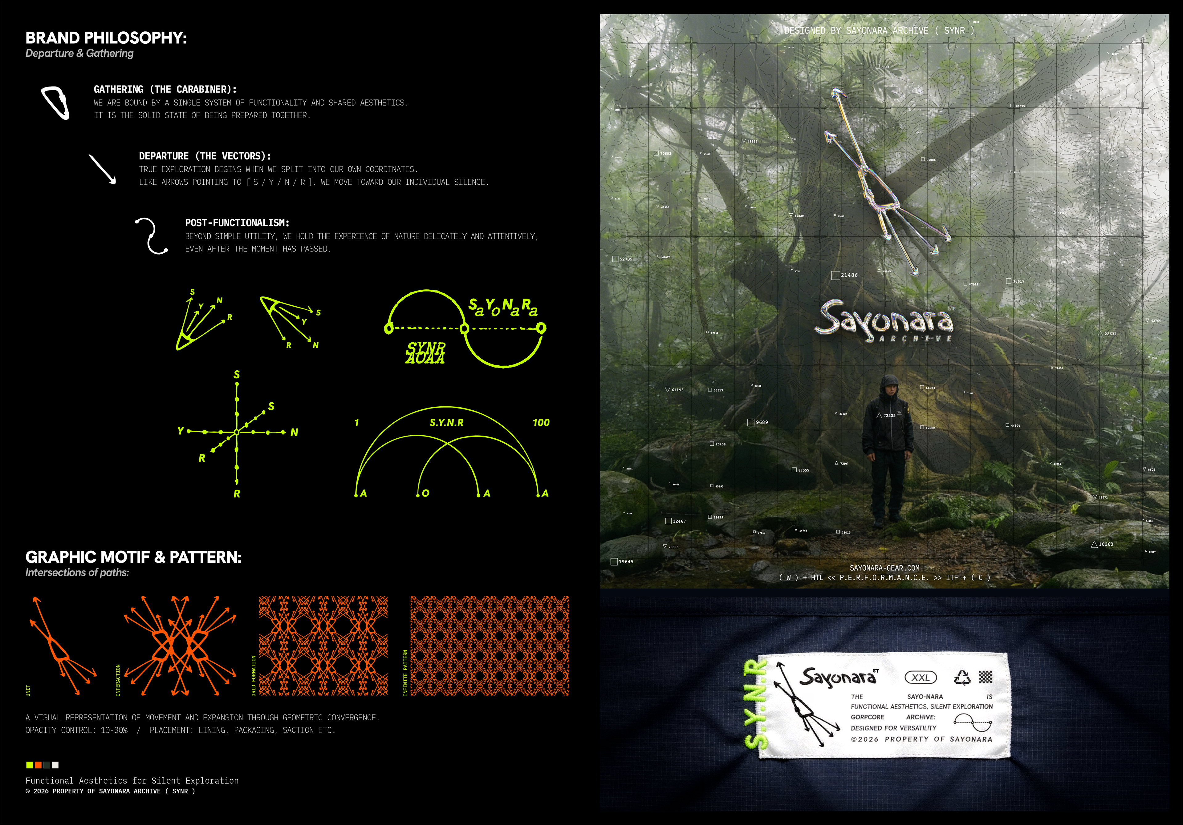
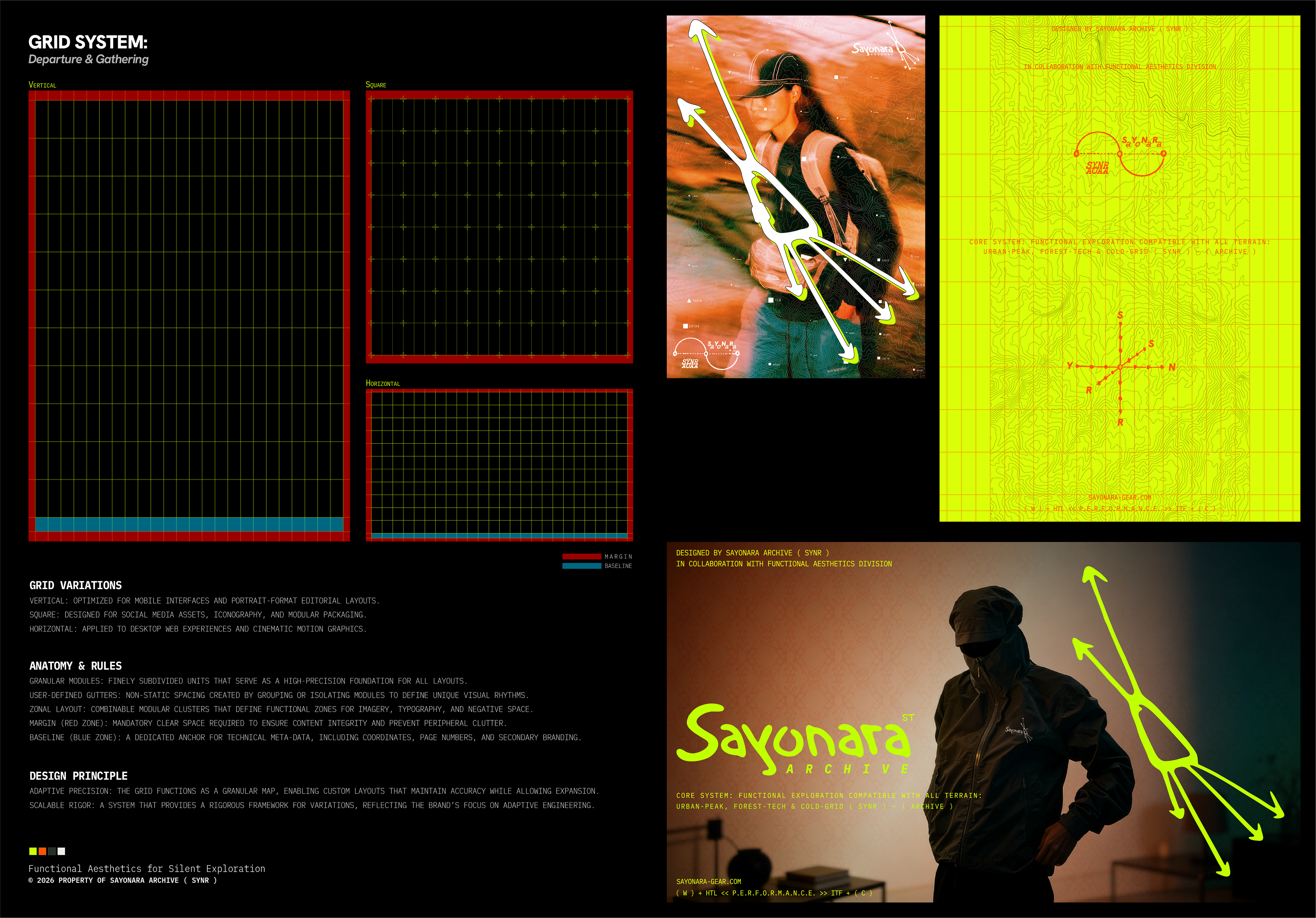
The grid system adapts across three formats designed for mobile interfaces, modular packaging, and cinematic motion. The graphic motif, built from intersecting vectors, expands infinitely as a lining, packaging, and surface pattern at 10–30% opacity.
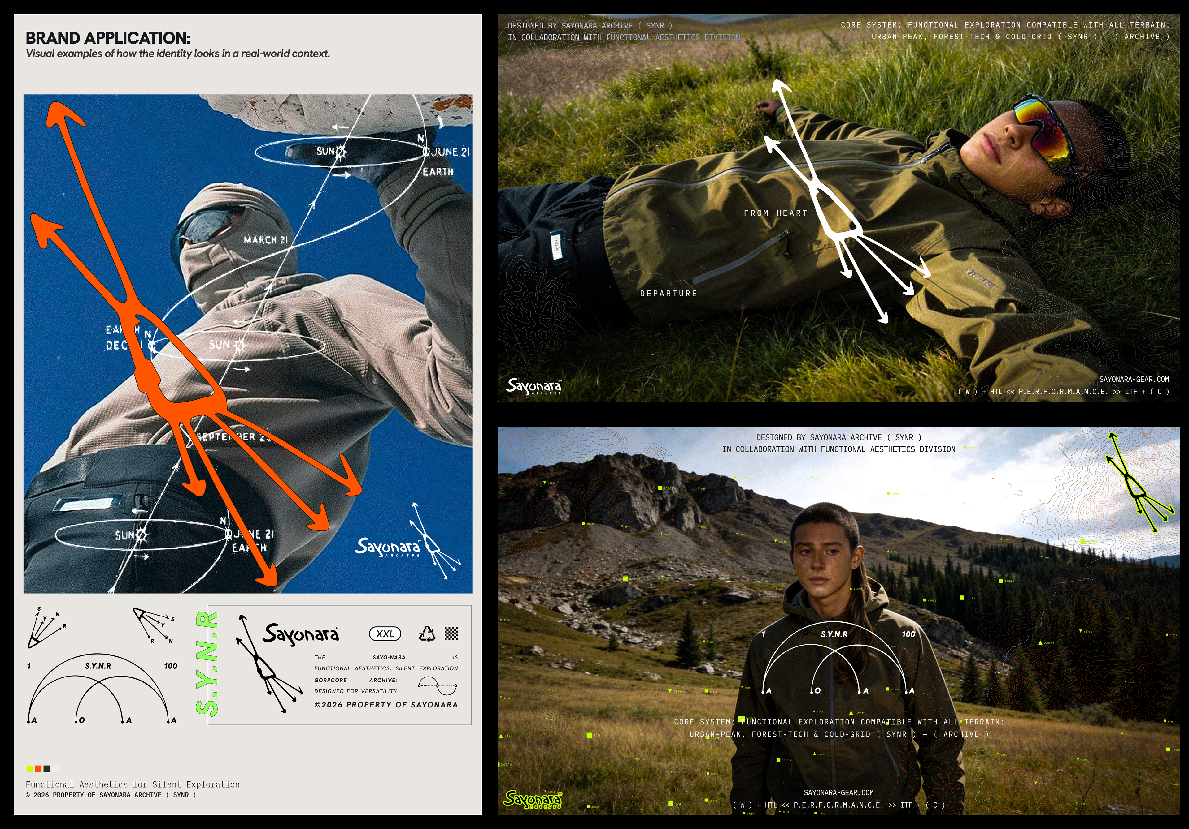
Brand Posture Scale and position are determined by context. If it competes with the terrain, reposition it.
No fixed minimum — only intentional use.
© 2026 PROPERTY OF SAYONARA ARCHIVE ( SYNR ) Designed by Sayonara Archive
— In Collaboration with Functional Aesthetics Division sayonara-gear.com
#BrandIdentity #VisualIdentity #Gorpcore #LogoDesign #OutdoorBrand #Typography #SayonaraArchive #SYNR #FunctionalAesthetics