
HAUSLOW: Brand Identity & Visual Etude
하우슬로우(HAUSLOW): 브랜드 아이덴티티 및 비주얼 에튜드
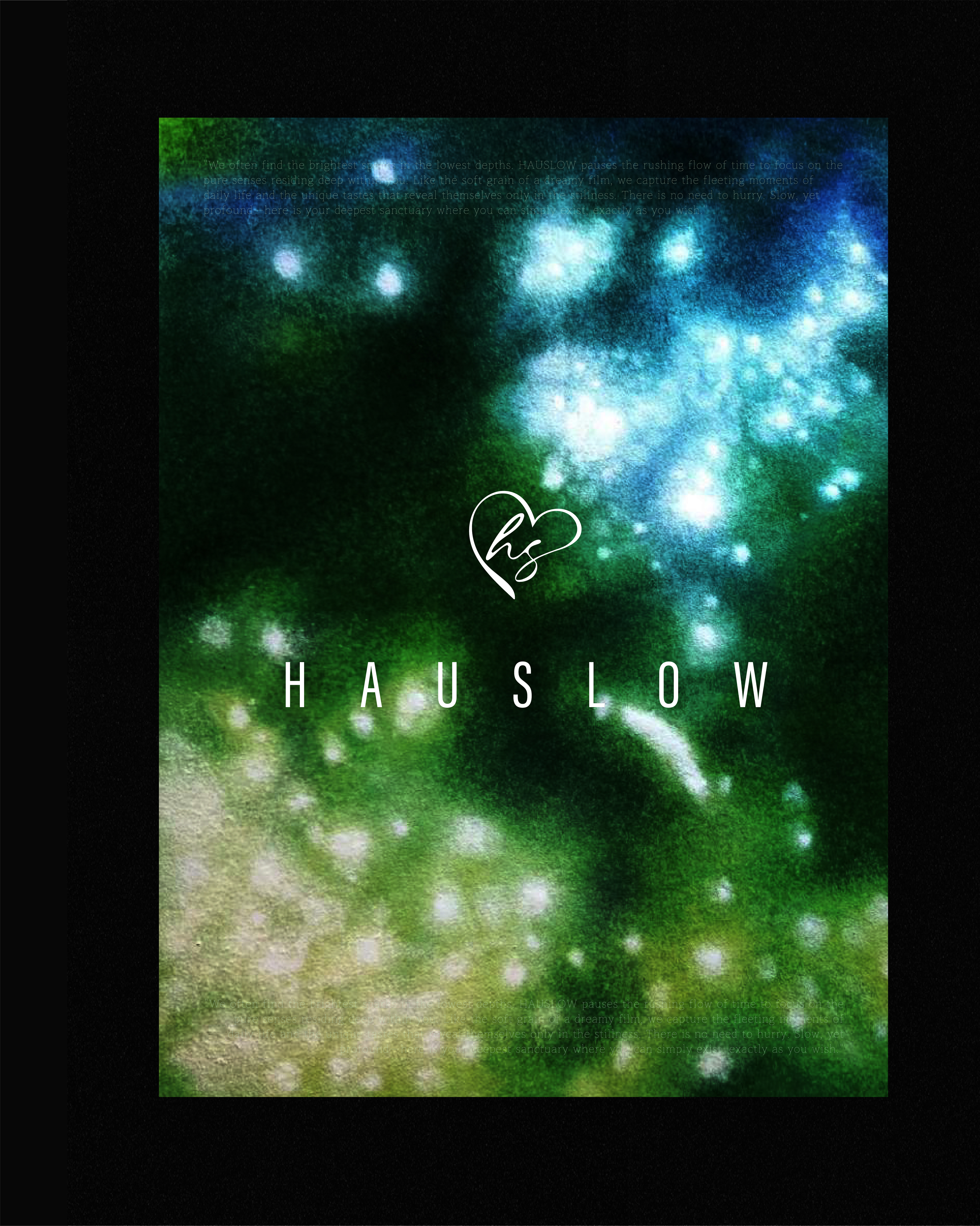
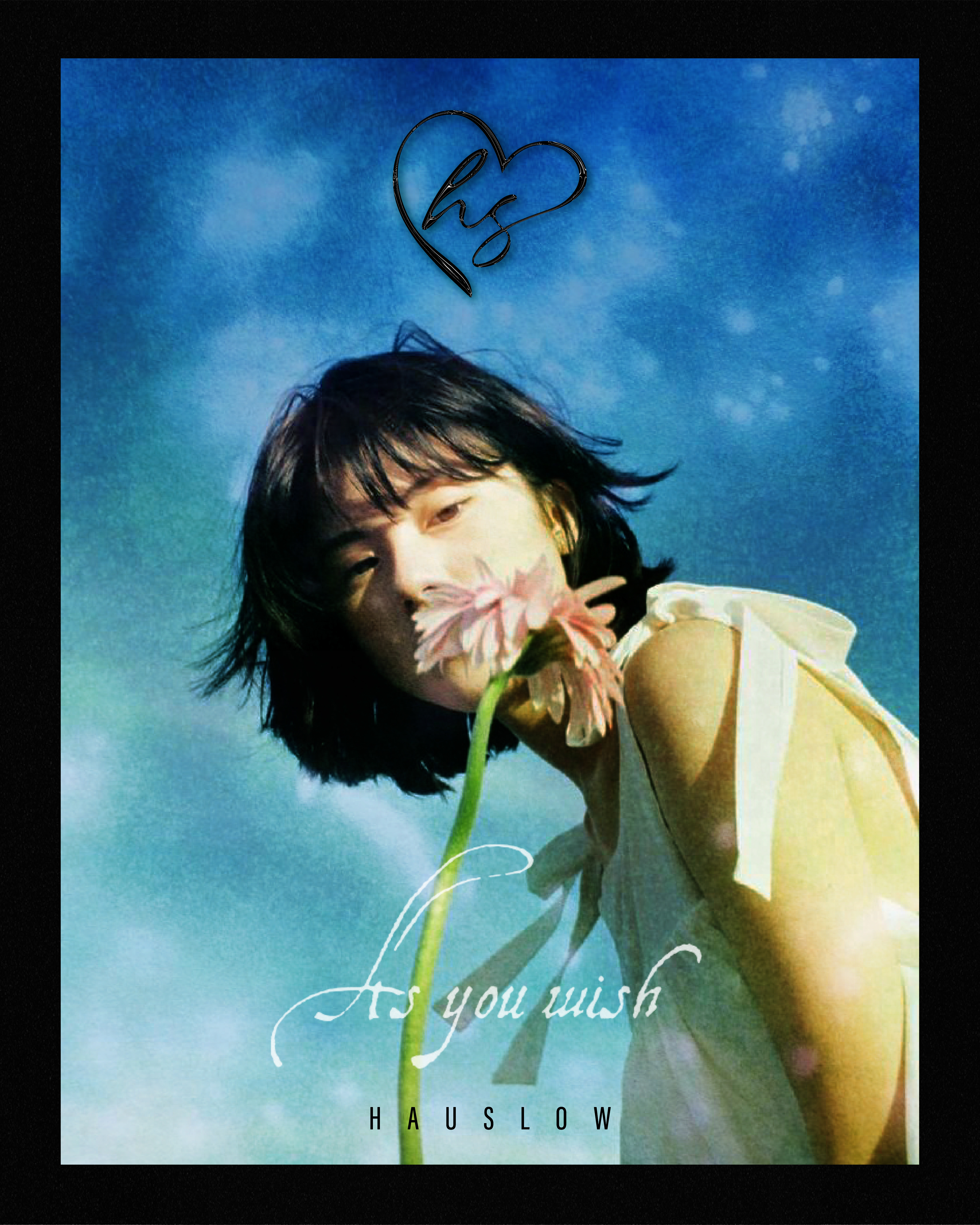
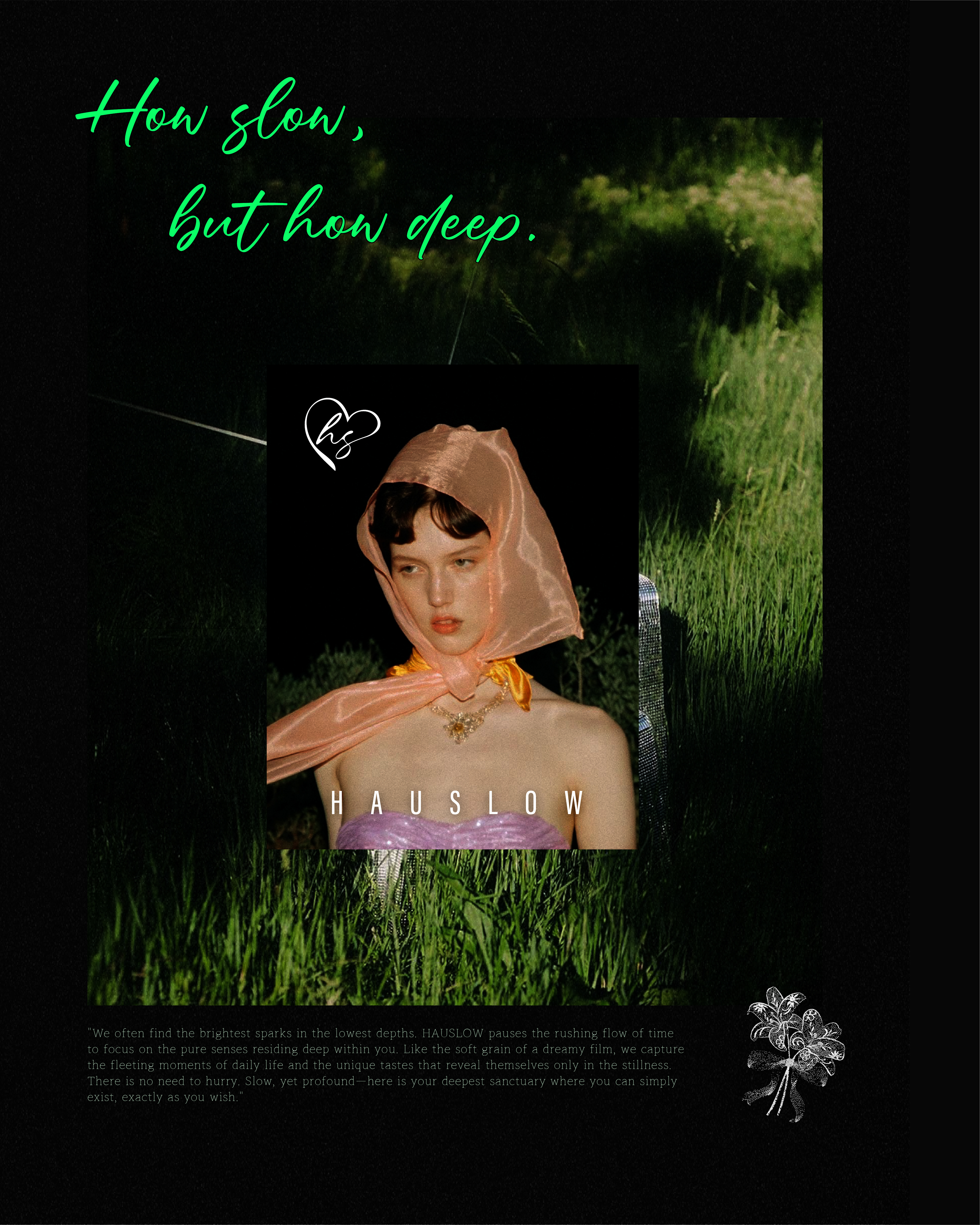
"가장 낮은 곳에서 가장 밝은 불꽃을 발견한다"는 철학을 바탕으로, 바쁘게 흘러가는 시간의 흐름을 멈추고 내면 깊숙이 자리한 순수한 감각에 집중하는 브랜드 '하우스로우(HAUSLOW)'의 아이덴티티 디자인 프로젝트입니다. 심도 있는 감성과 고요한 휴식을 시각화하기 위해 몽환적인 입자감이 느껴지는 필름 텍스처와 깊이감 있는 컬러 팔레트를 활용하였으며, 정제된 타이포그래피와 유연한 필기체 로고를 교차 배치하여 브랜드가 지향하는 '느리지만 깊은(How slow, but how deep)' 감각의 여정을 비주얼 에튜드 형식으로 구현했습니다.
Based on the philosophy that "we often find the brightest sparks in the lowest depths," this project involves the brand identity design for 'HAUSLOW,' a brand that pauses the rushing flow of time to focus on pure inner senses. To visualize profound emotions and serene rest, the design utilizes dreamy film grain textures and a deep color palette. By contrasting refined typography with a fluid script logo, the visual system captures the brand's essence of a "slow yet deep" sensory journey through a series of visual etudes.
Category: Brand Identity, Visual Arts
Key Subjects: HAUSLOW Sanctuary, Pure Senses, Emotional Depth
Visual Elements: Abstract Watercolor Textures, Script Heart Emblem, High-grain Cinematic Photography