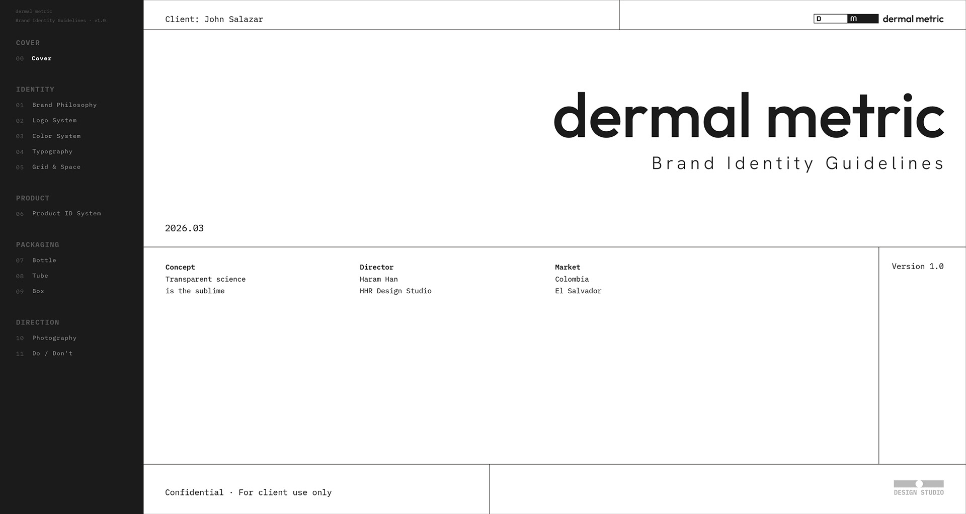


dermal metric: Brand Identity Guidelines & Packaging Design
더말메트릭: 브랜드 아이덴티티 가이드라인 & 패키징 디자인

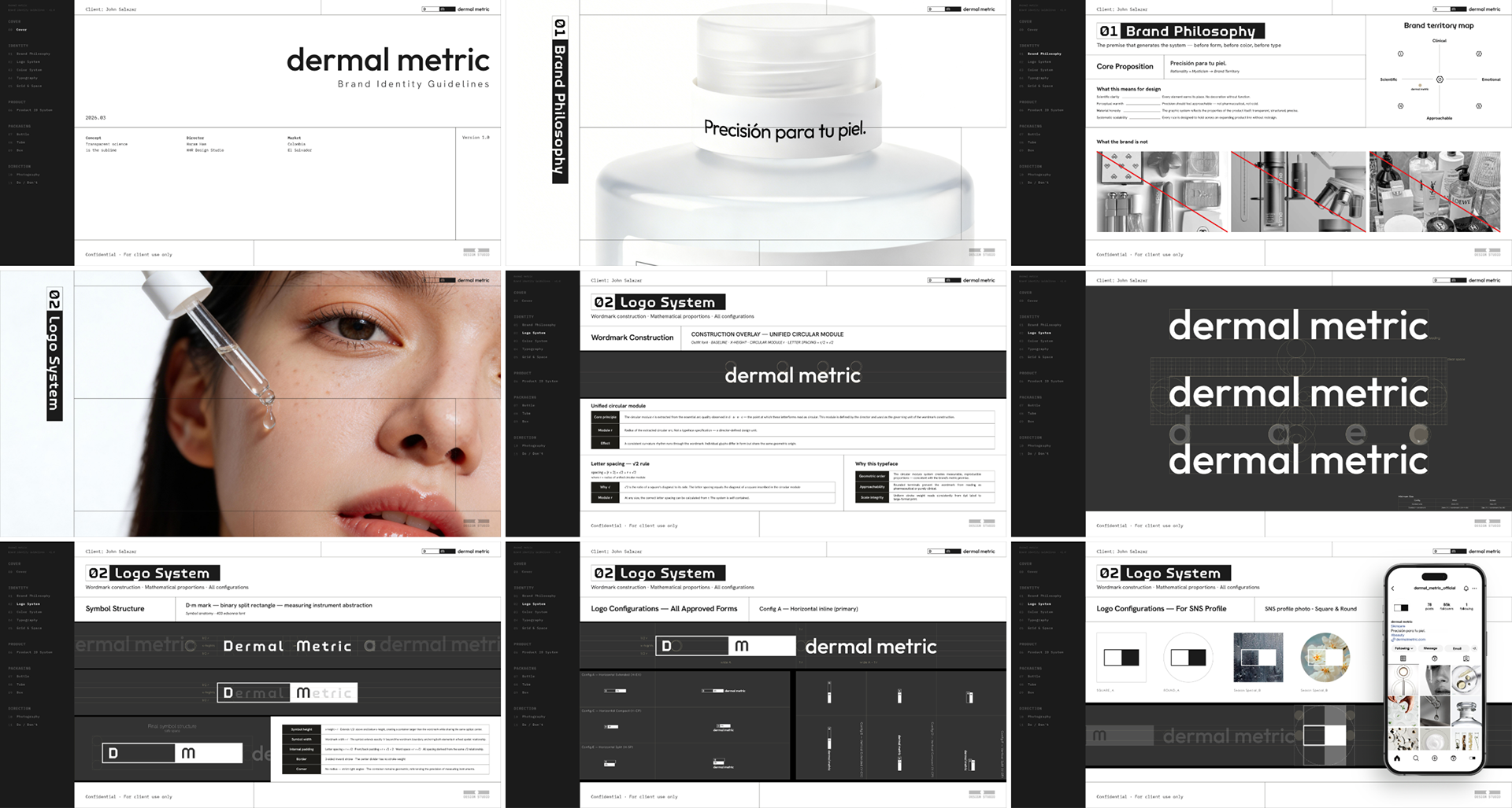
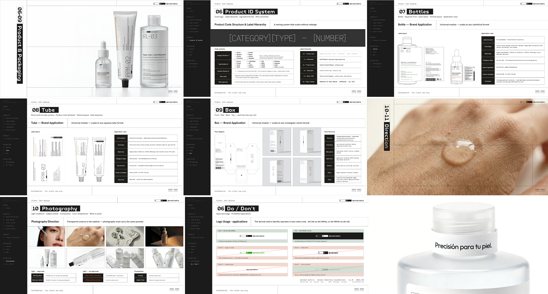
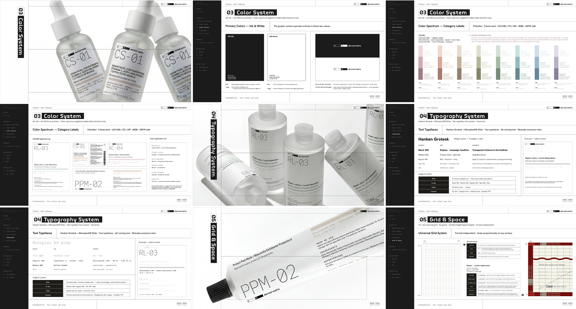
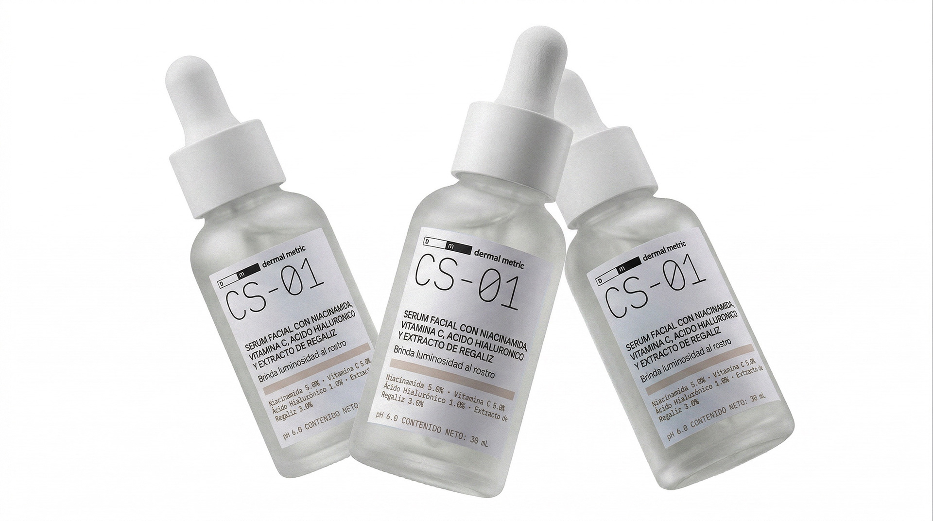
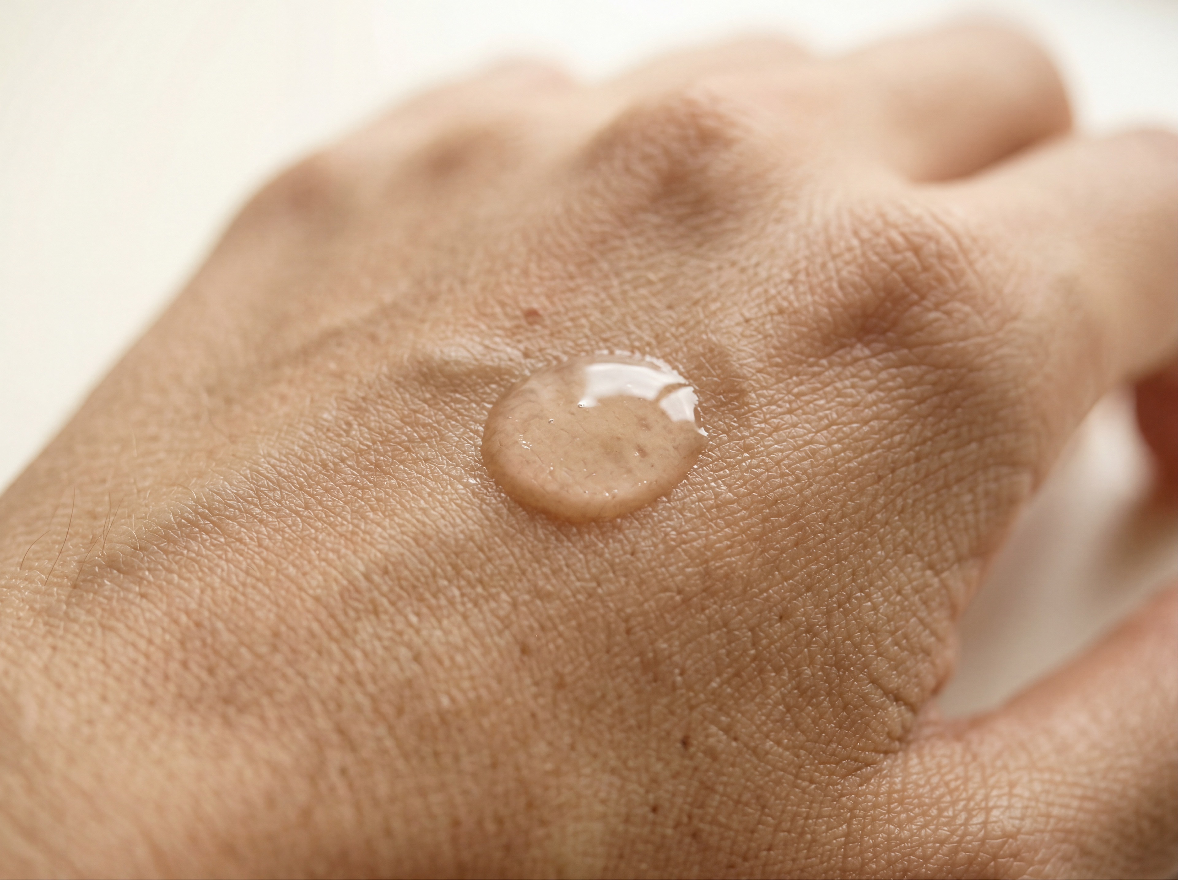
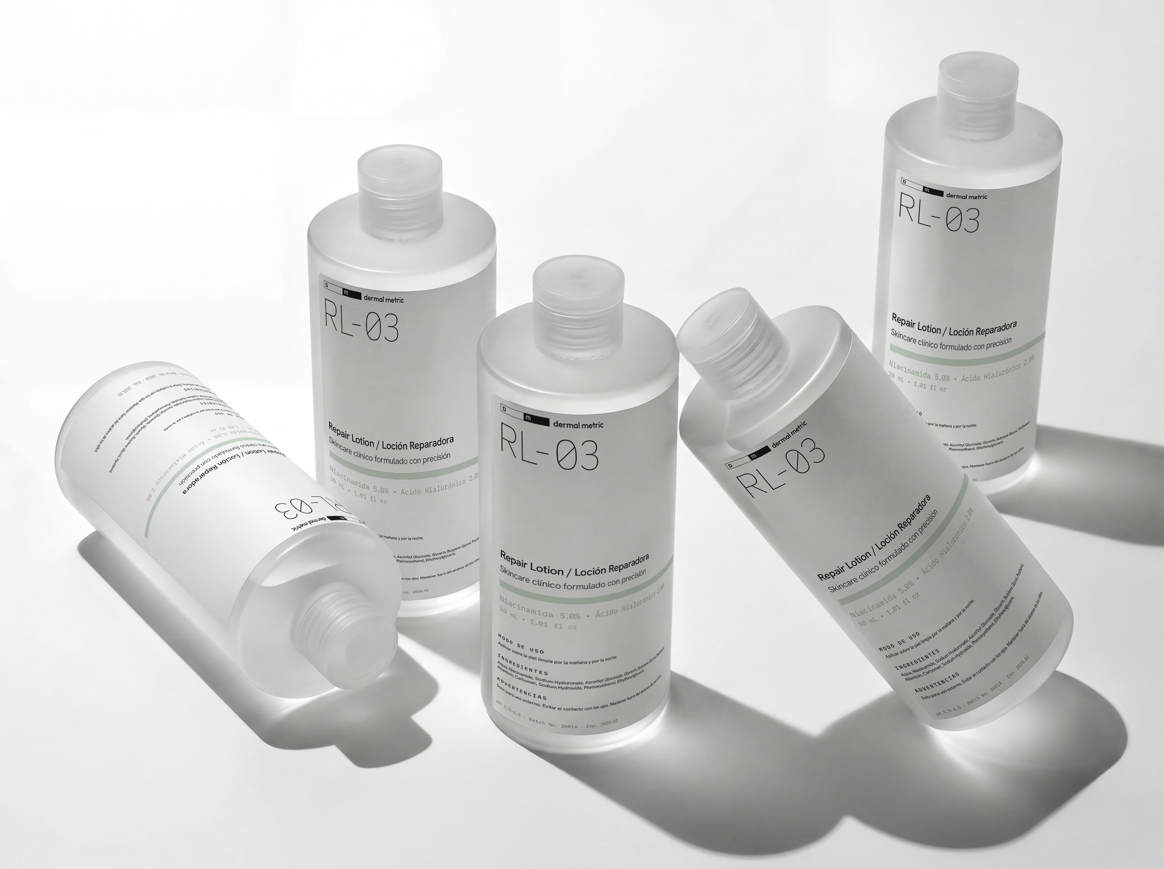
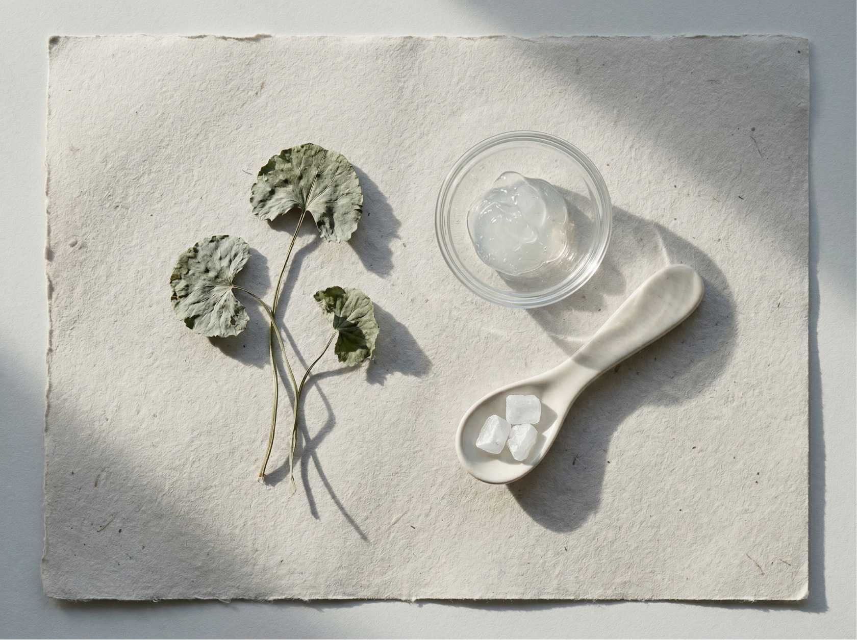
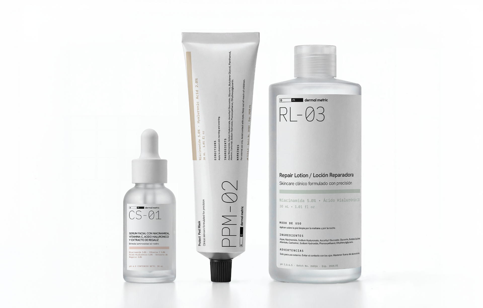
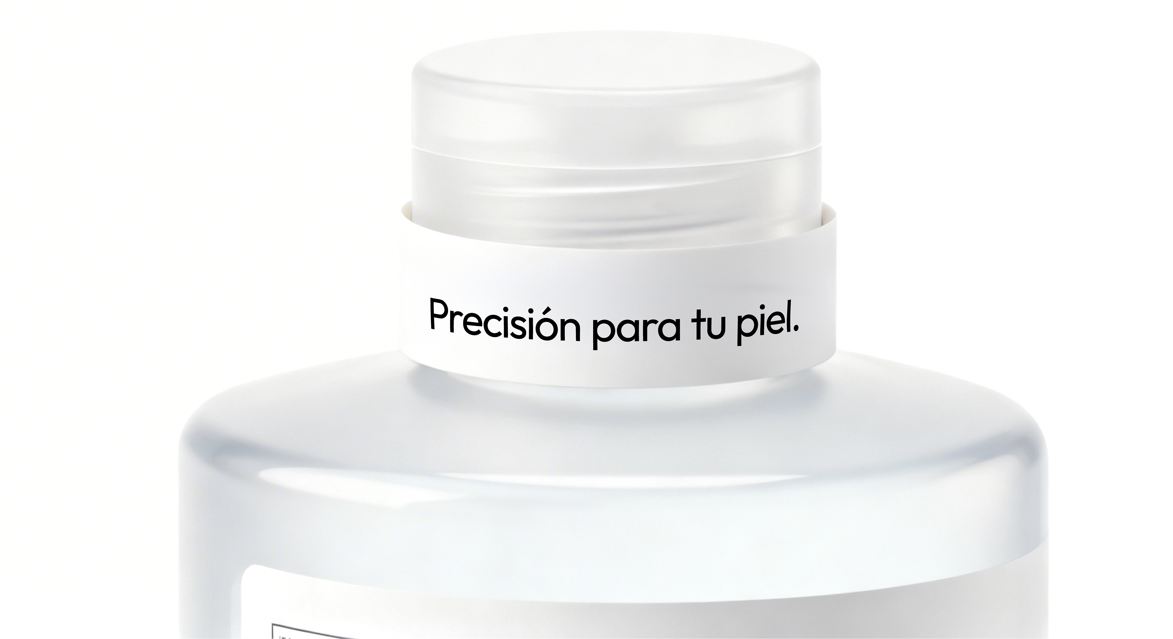
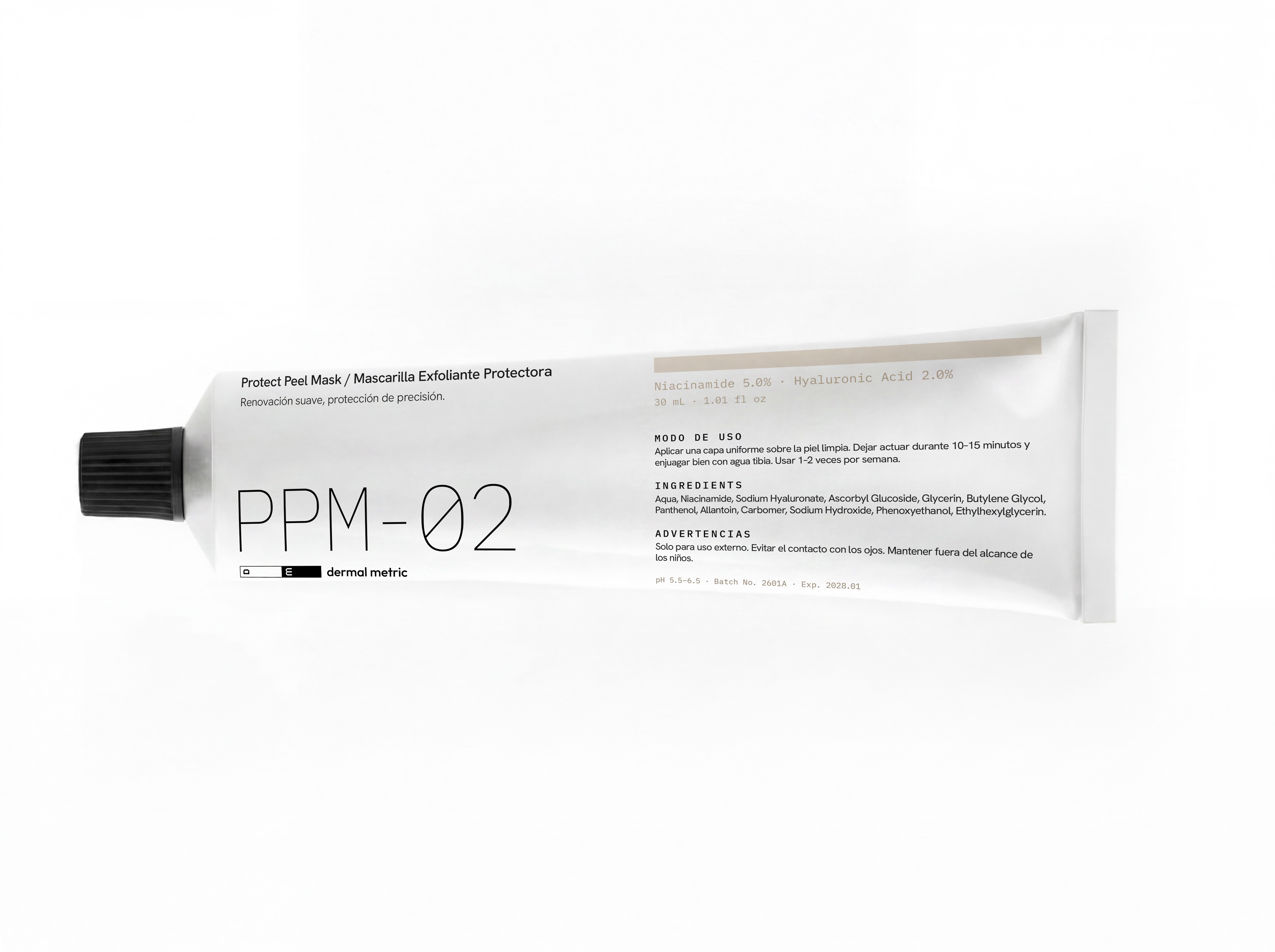
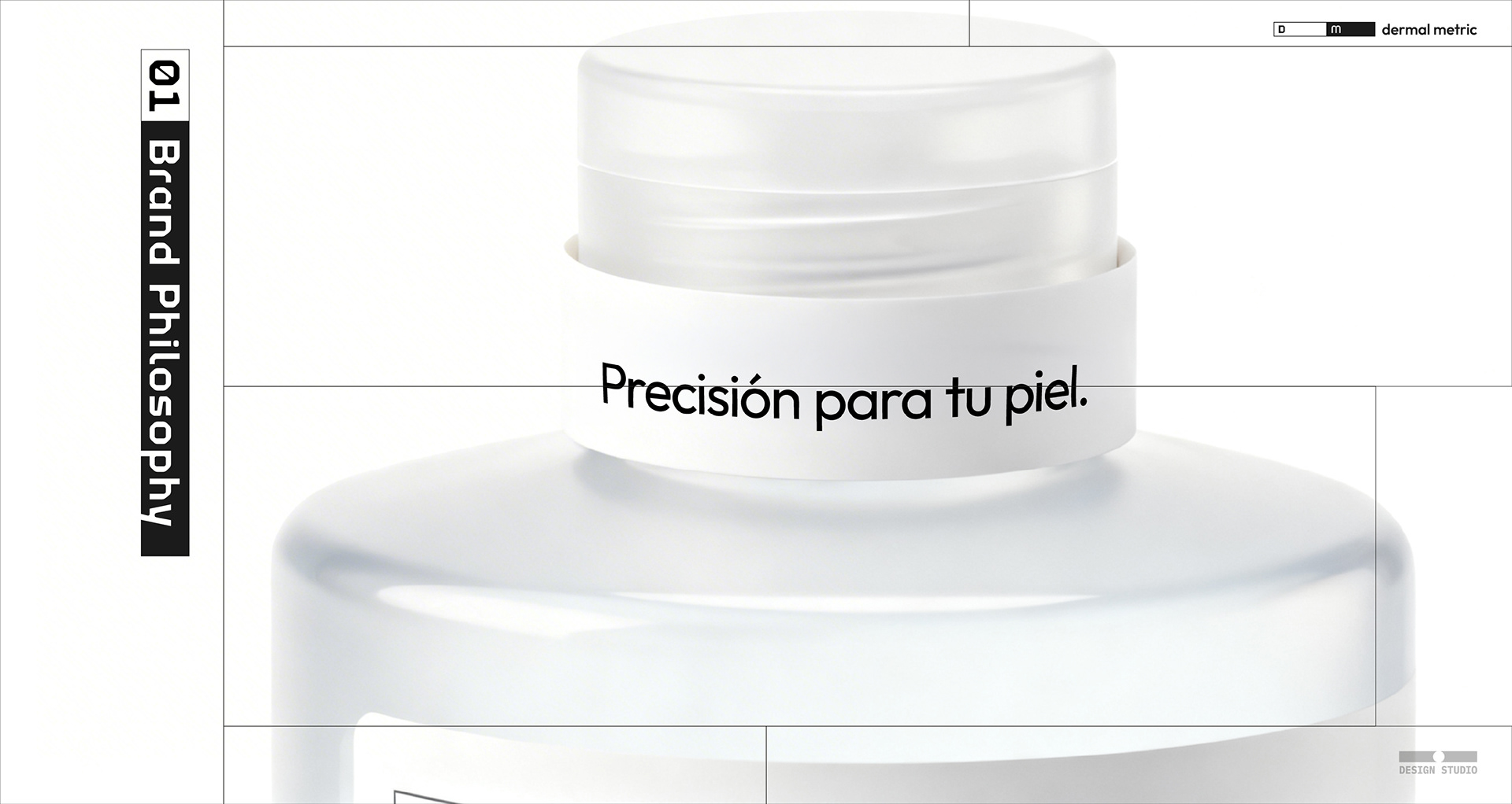
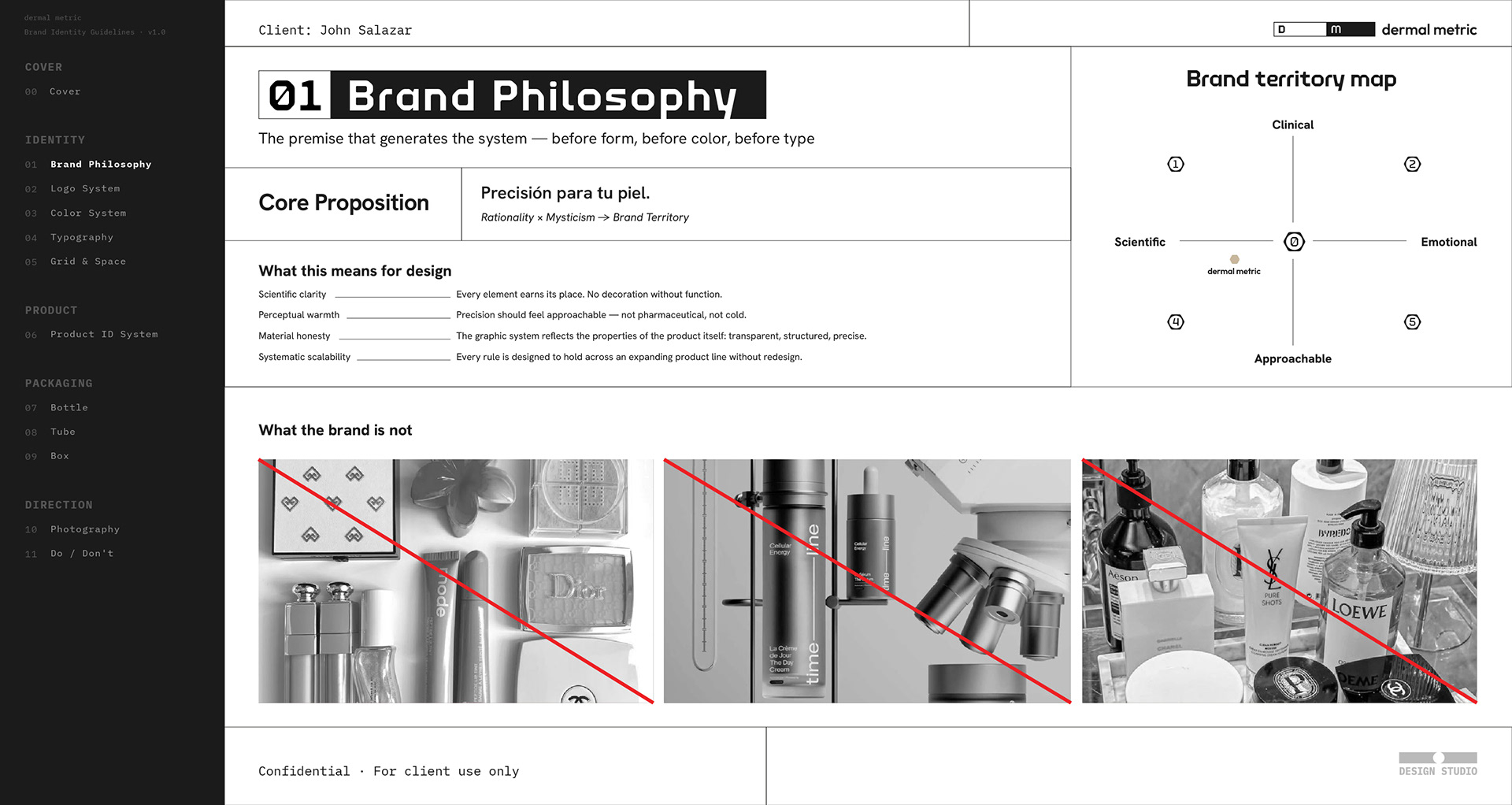
콜롬비아 기반 스킨케어 브랜드 더말메트릭의 브랜드 아이덴티티 시스템 구축 프로젝트입니다. "Transparent science is the sublime"을 컨셉으로, 과학적 정밀함과 인간적 따뜻함 사이의 포지션을 시각 언어로 번역했습니다. Hanken Grotesk와 MonoplexKR Wide의 이중 타이포그래피 시스템, LCH 기반 8개 카테고리 컬러 패밀리, 수학적 비례로 설계된 워드마크와 D·m 심볼, 그리고 Bottle·Tube·Box 3종의 패키징 가이드라인을 포함한 종합 브랜드 아이덴티티 문서로 완성되었습니다.
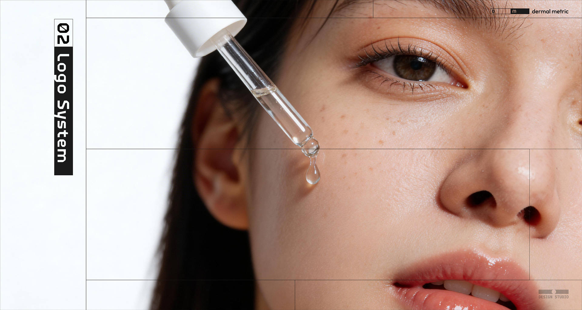
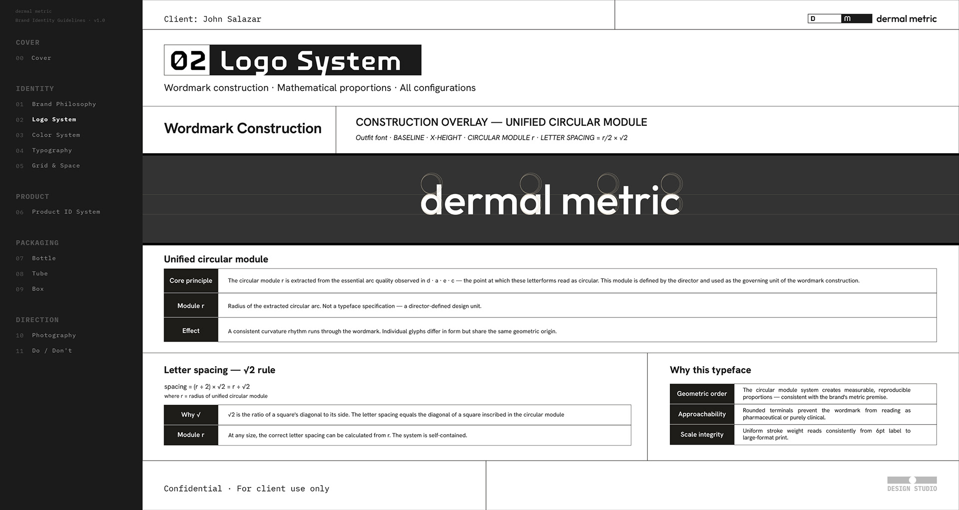
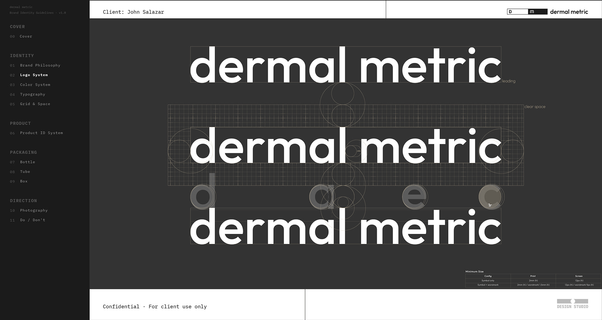
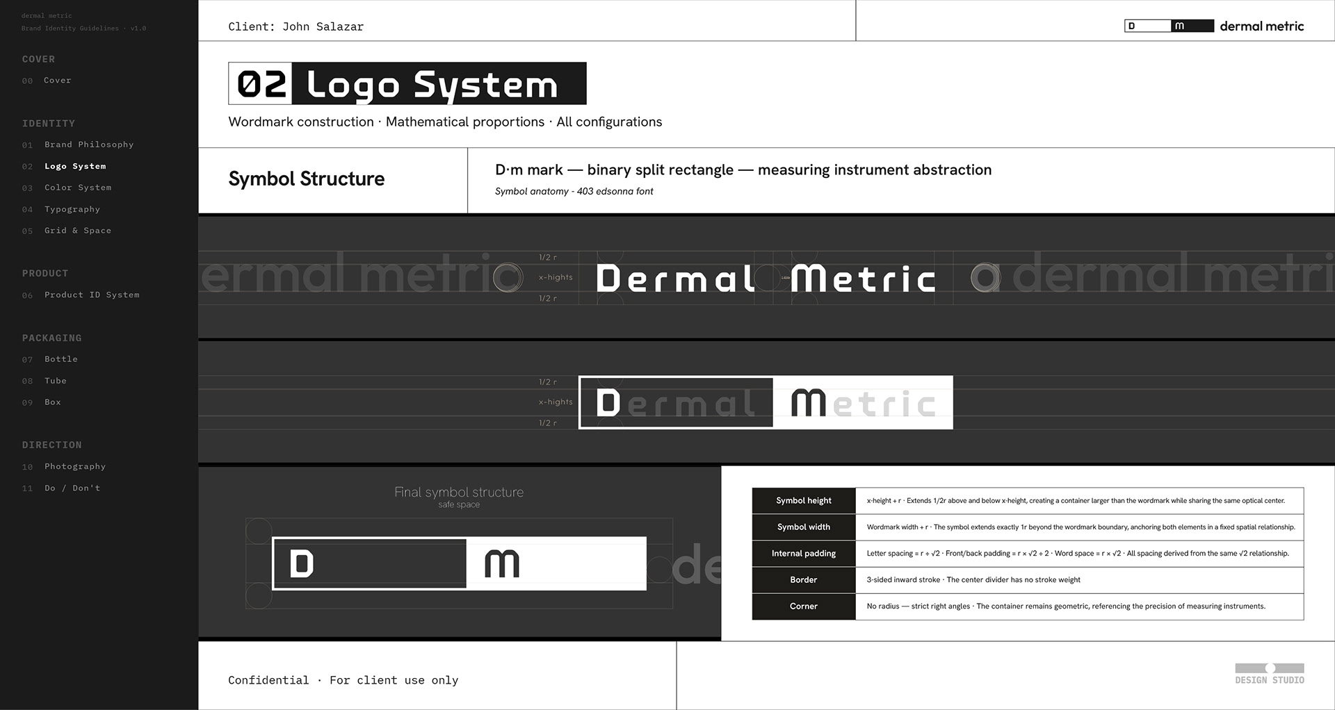
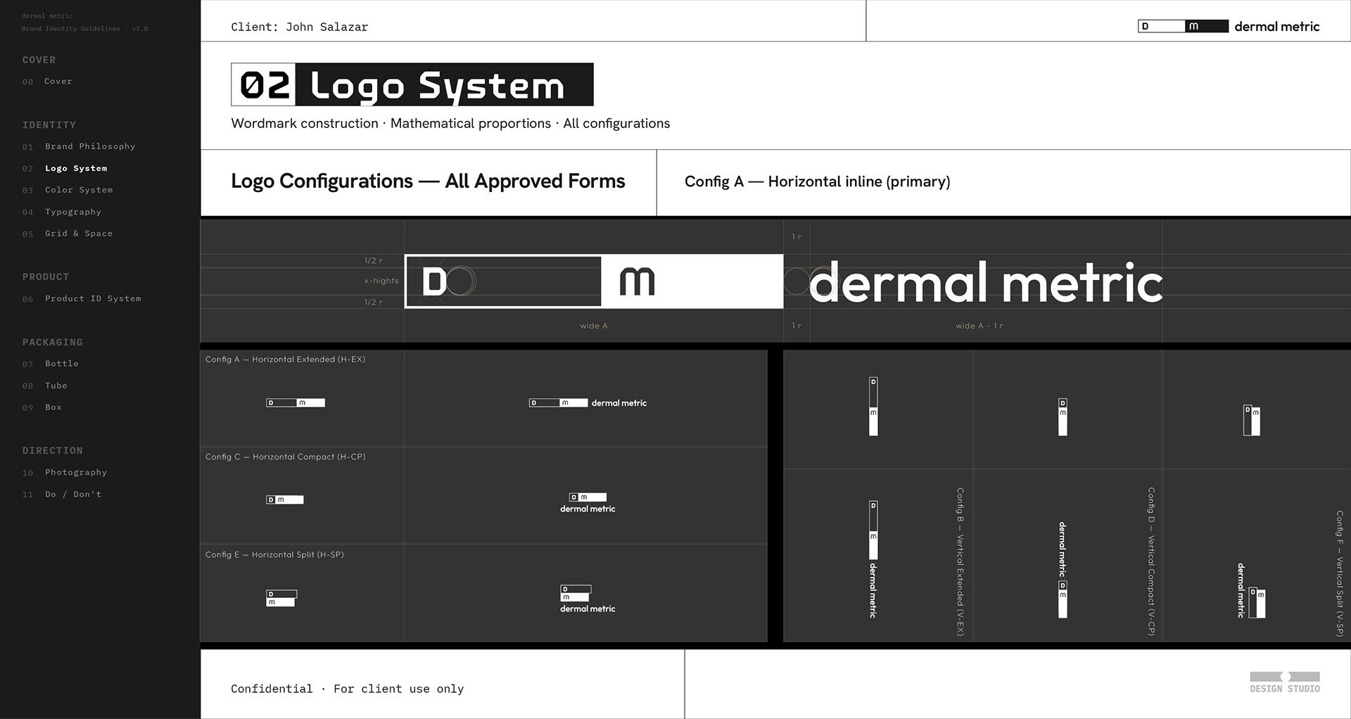
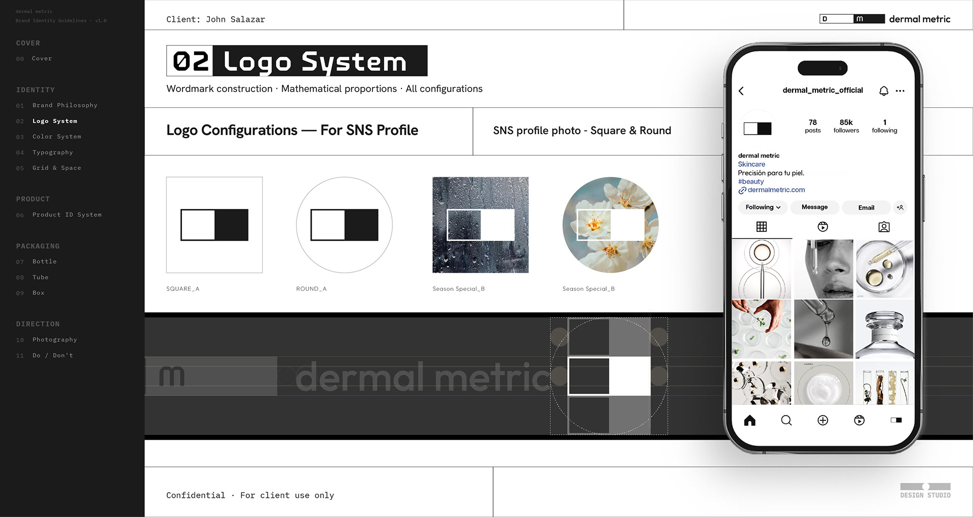
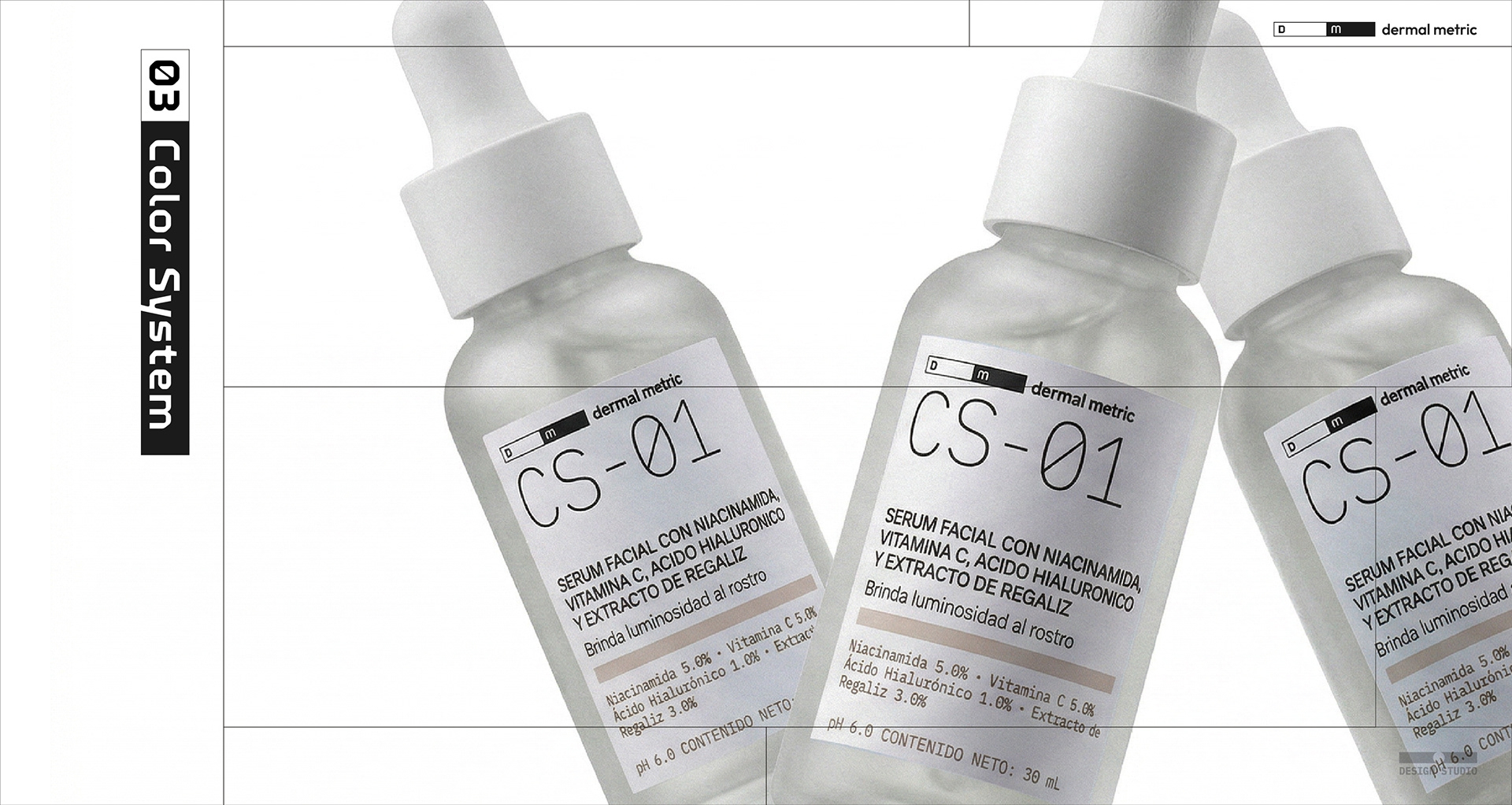
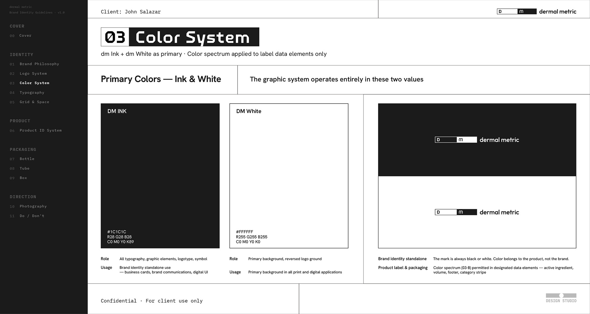
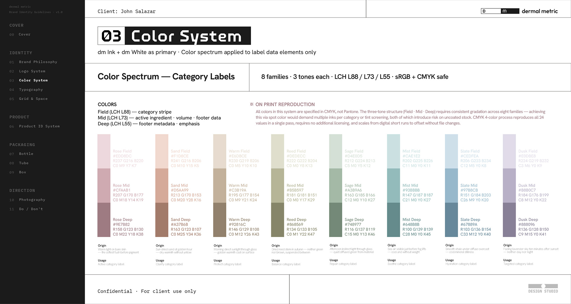
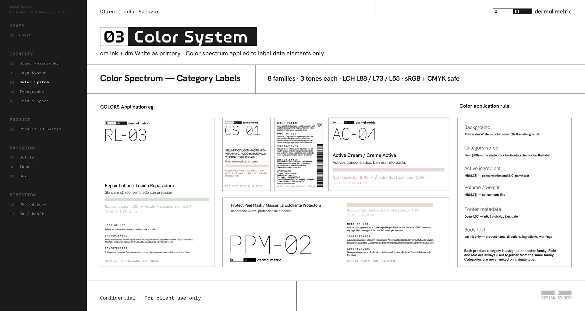
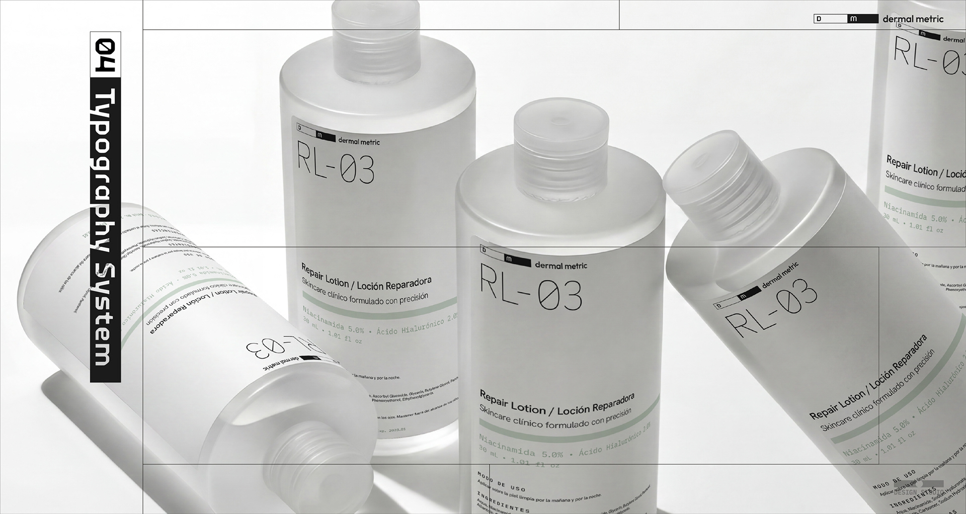
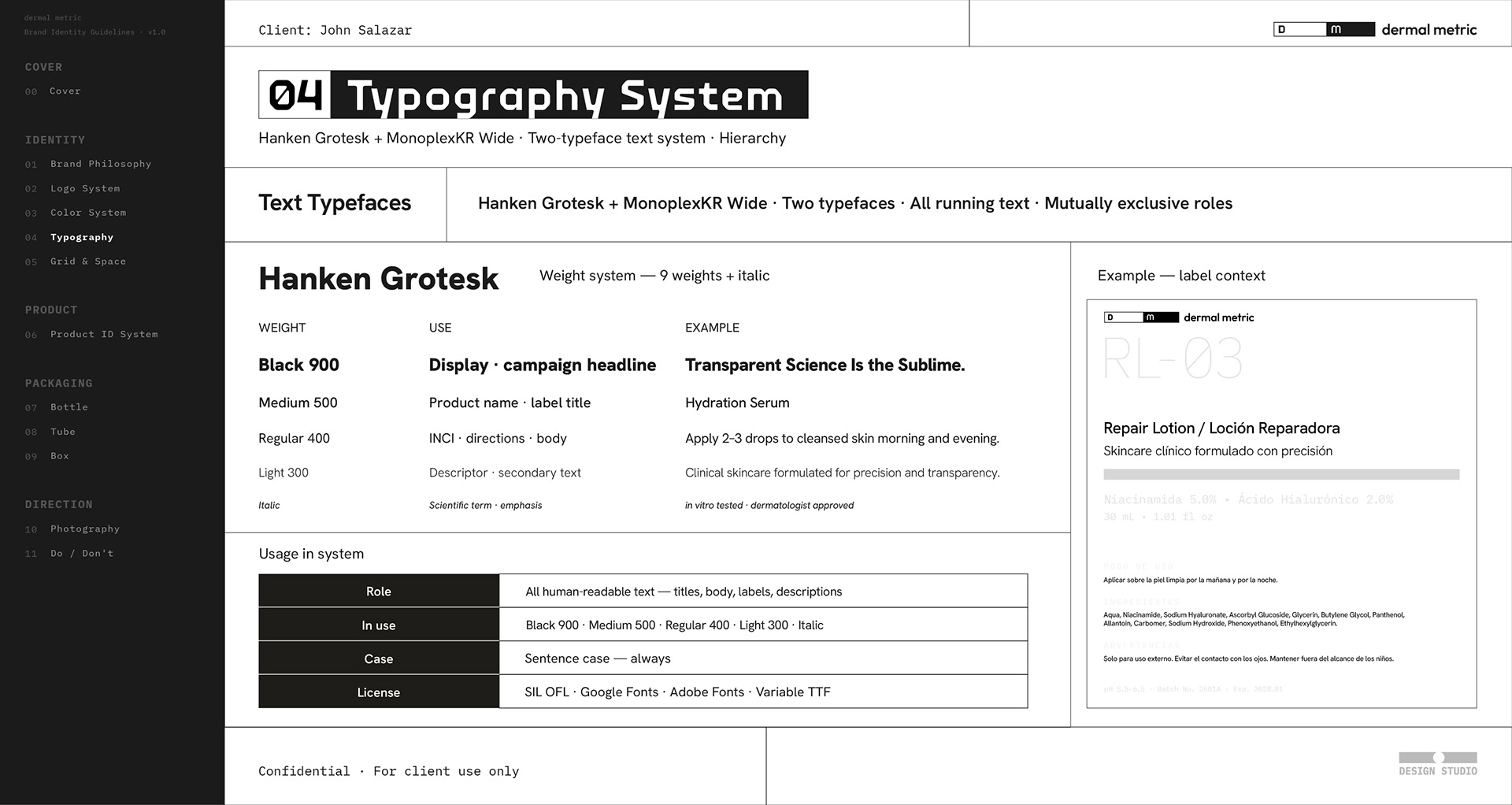
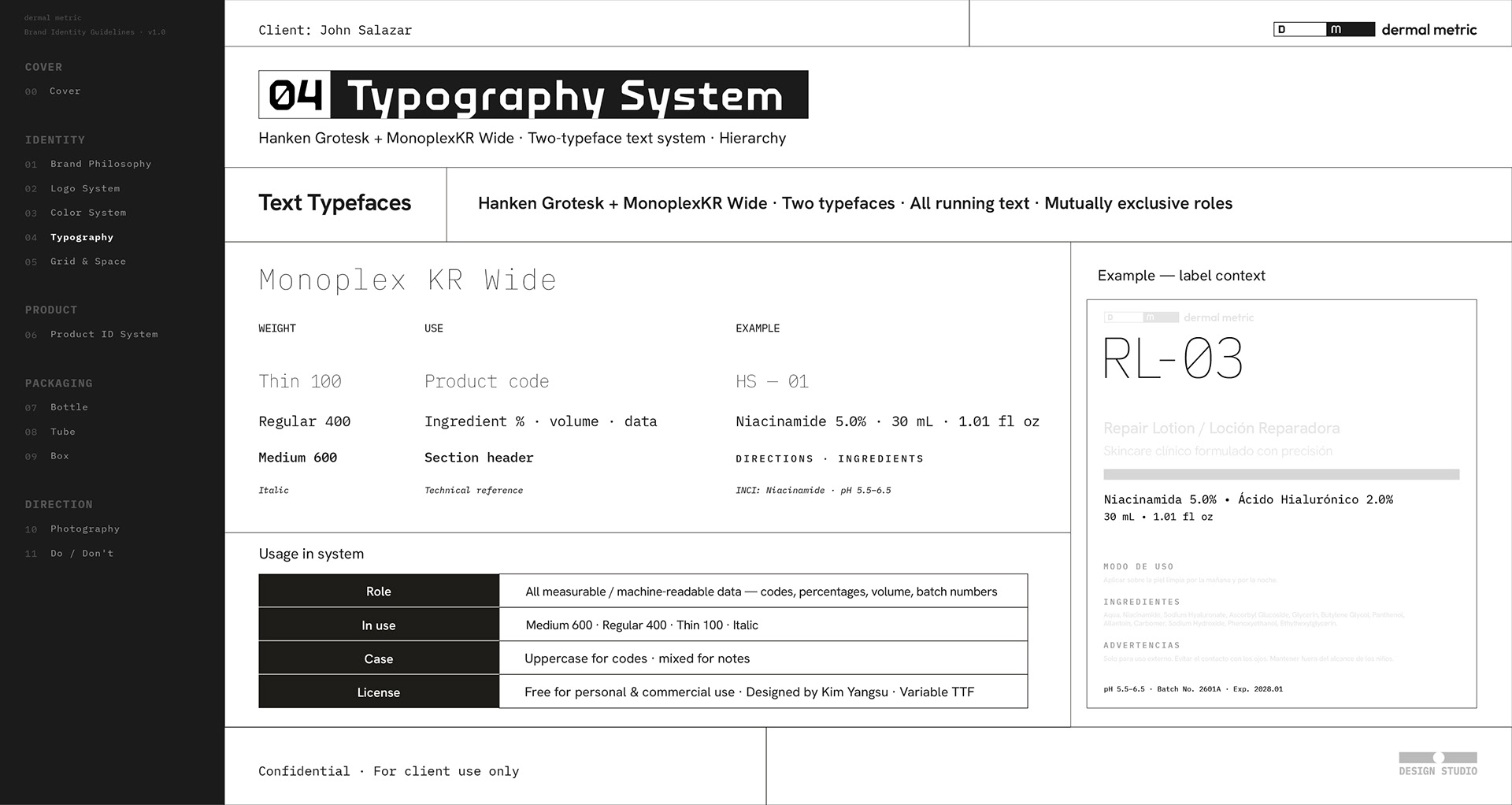
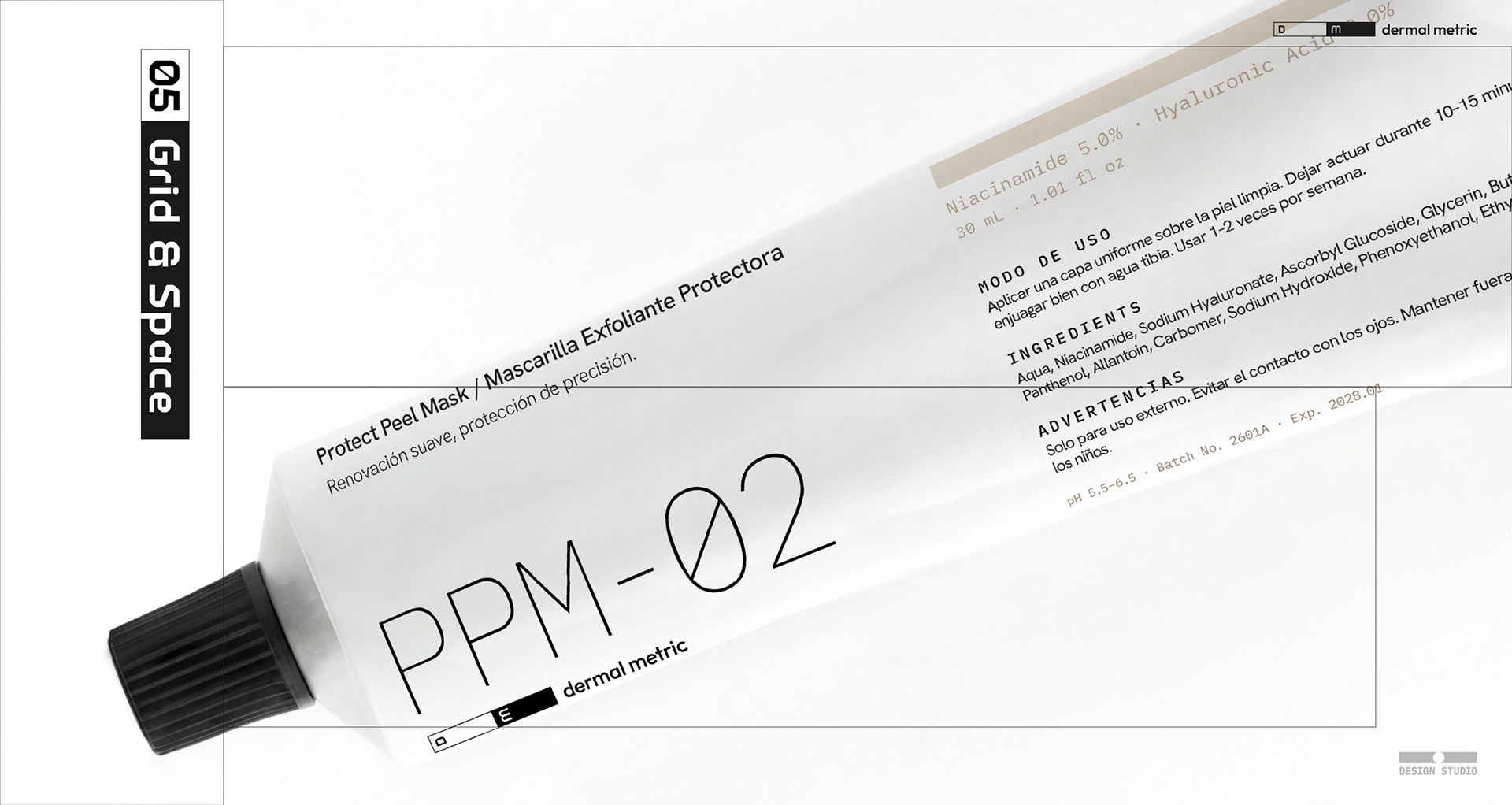
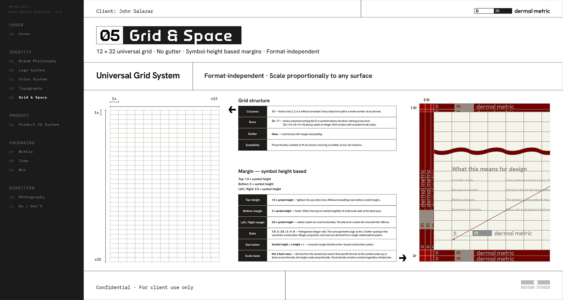
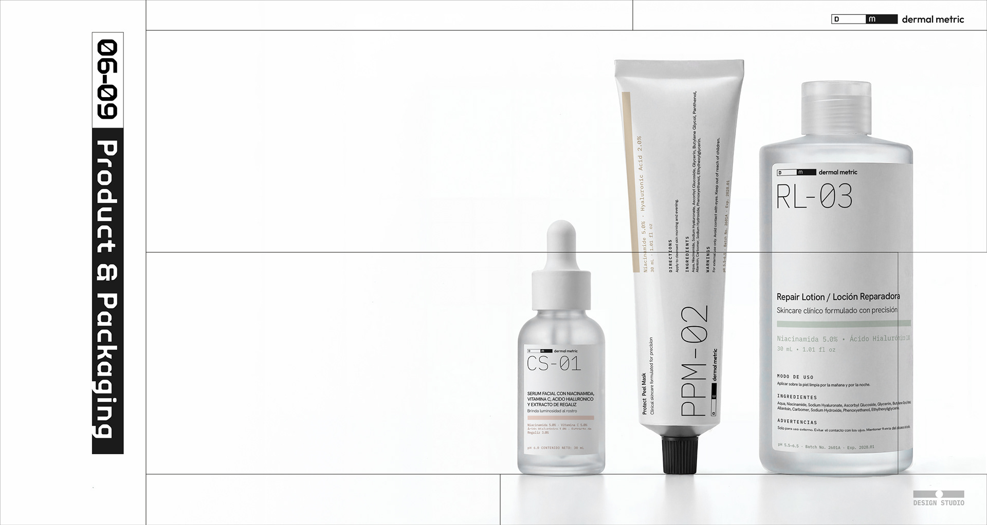
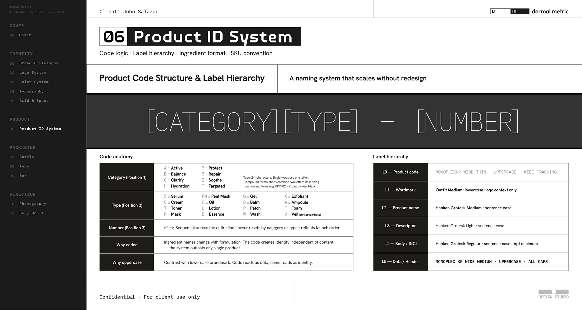
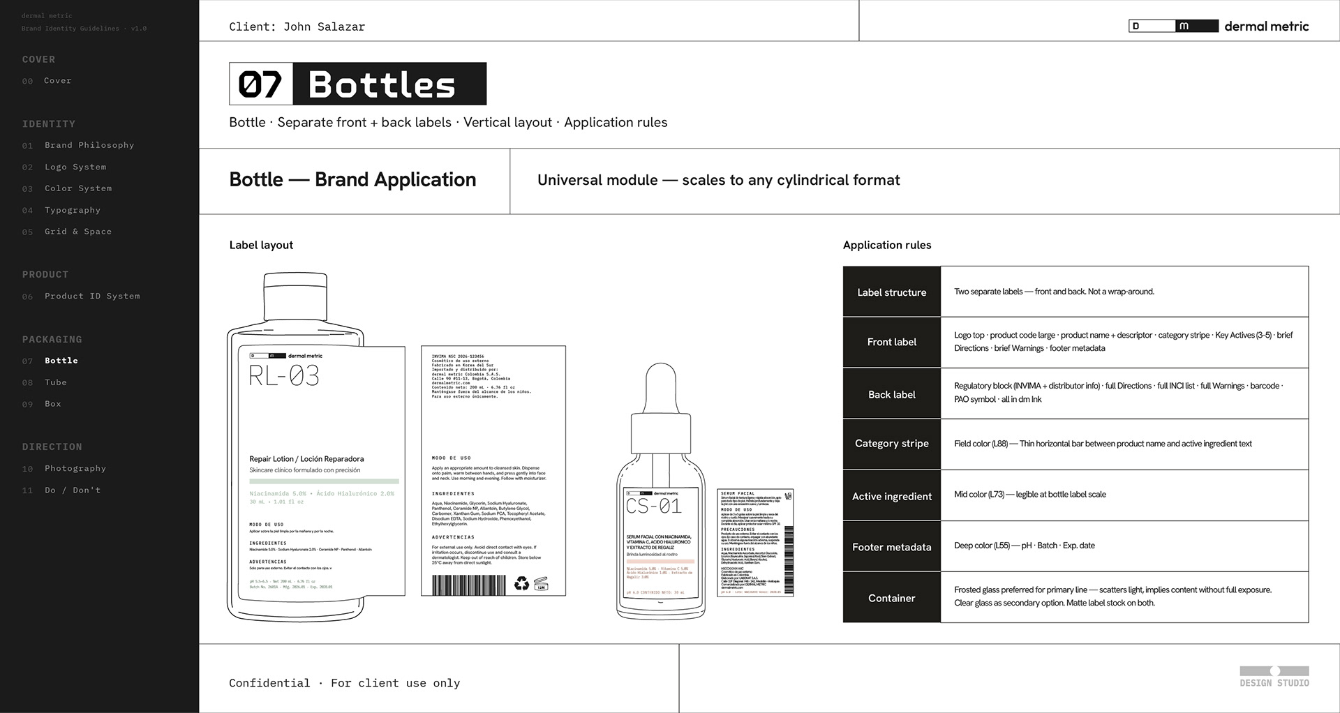
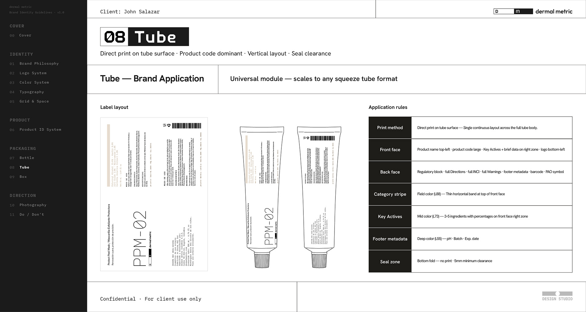
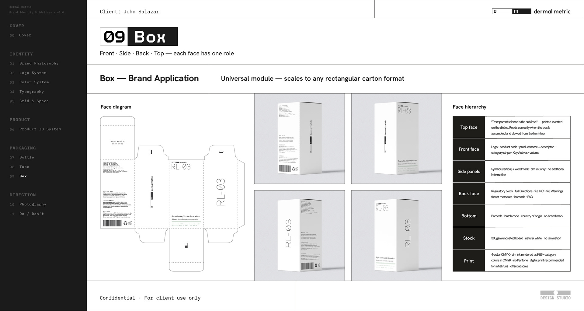
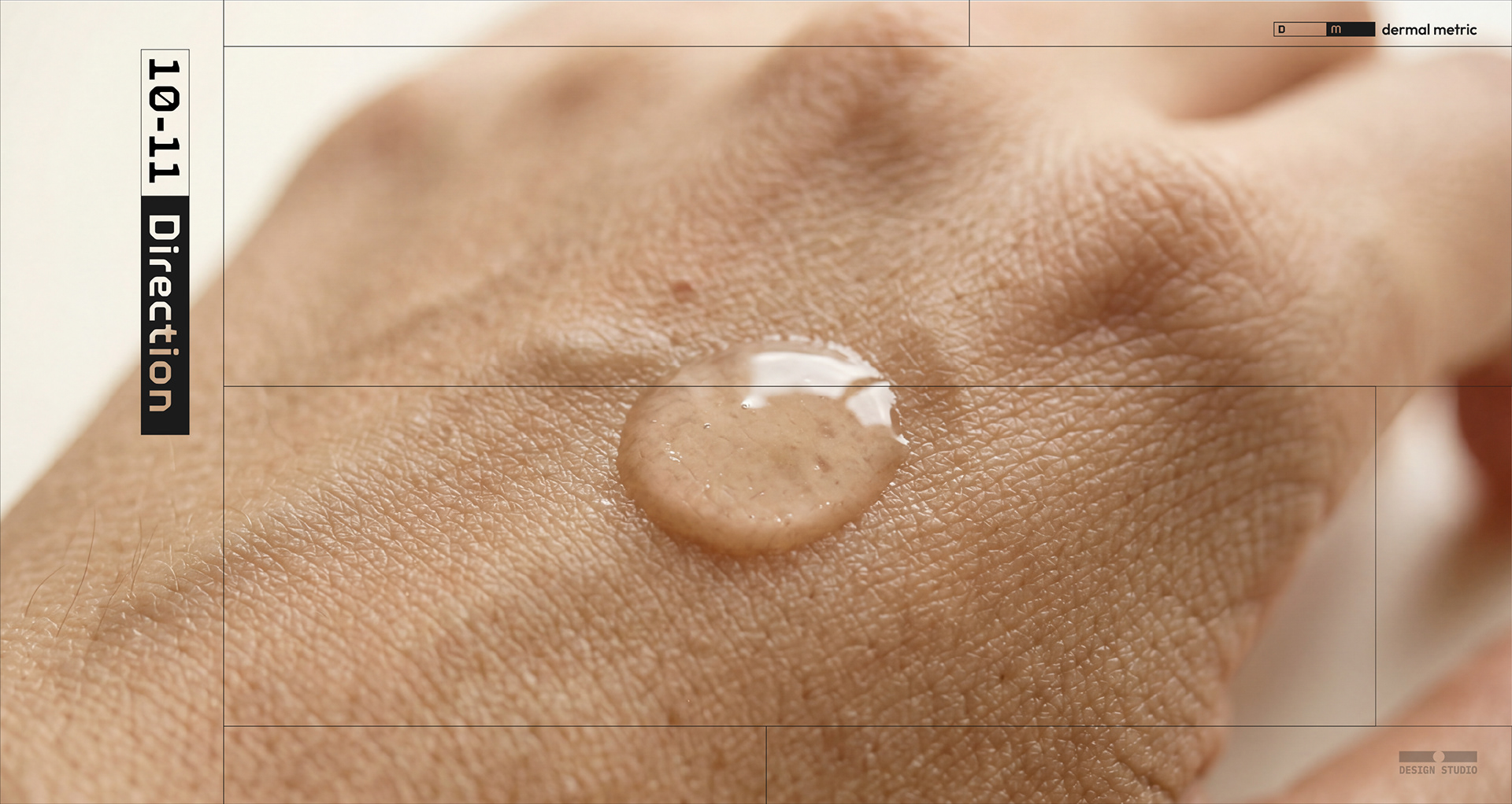
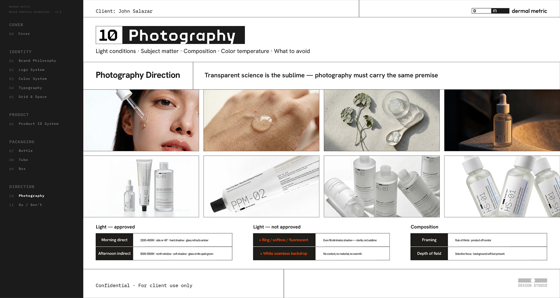
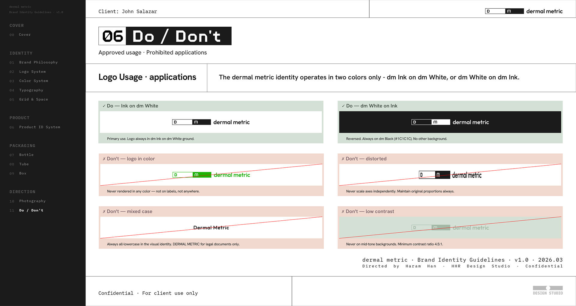
This project involved building a comprehensive brand identity system for dermal metric, a skincare brand based in Colombia. Grounded in the concept "Transparent science is the sublime," the visual language navigates the precise middle ground between clinical clarity and perceptual warmth. The system encompasses a mathematically constructed wordmark and D·m symbol, a dual-typeface hierarchy pairing Hanken Grotesk with MonoplexKR Wide, an LCH-based colour spectrum across eight product categories, and packaging guidelines for three formats — bottle, tube, and box — designed to scale without redesign.
Category: Brand Identity, Packaging Design, Typography System
Key Subjects: Skincare Brand, Colombian Market, Science-Forward Beauty
Visual Elements: Mathematical Proportions, Dual Typeface System, Packaging Guidelines