

Fairysh: Peel-off Pack Package Design
페어리쉬(Fairysh): 필오프팩 패키지 디자인
Art Direction - @jjjjjooooon_n
Flower curation - @suavaje lab / Photography work - @7itaek
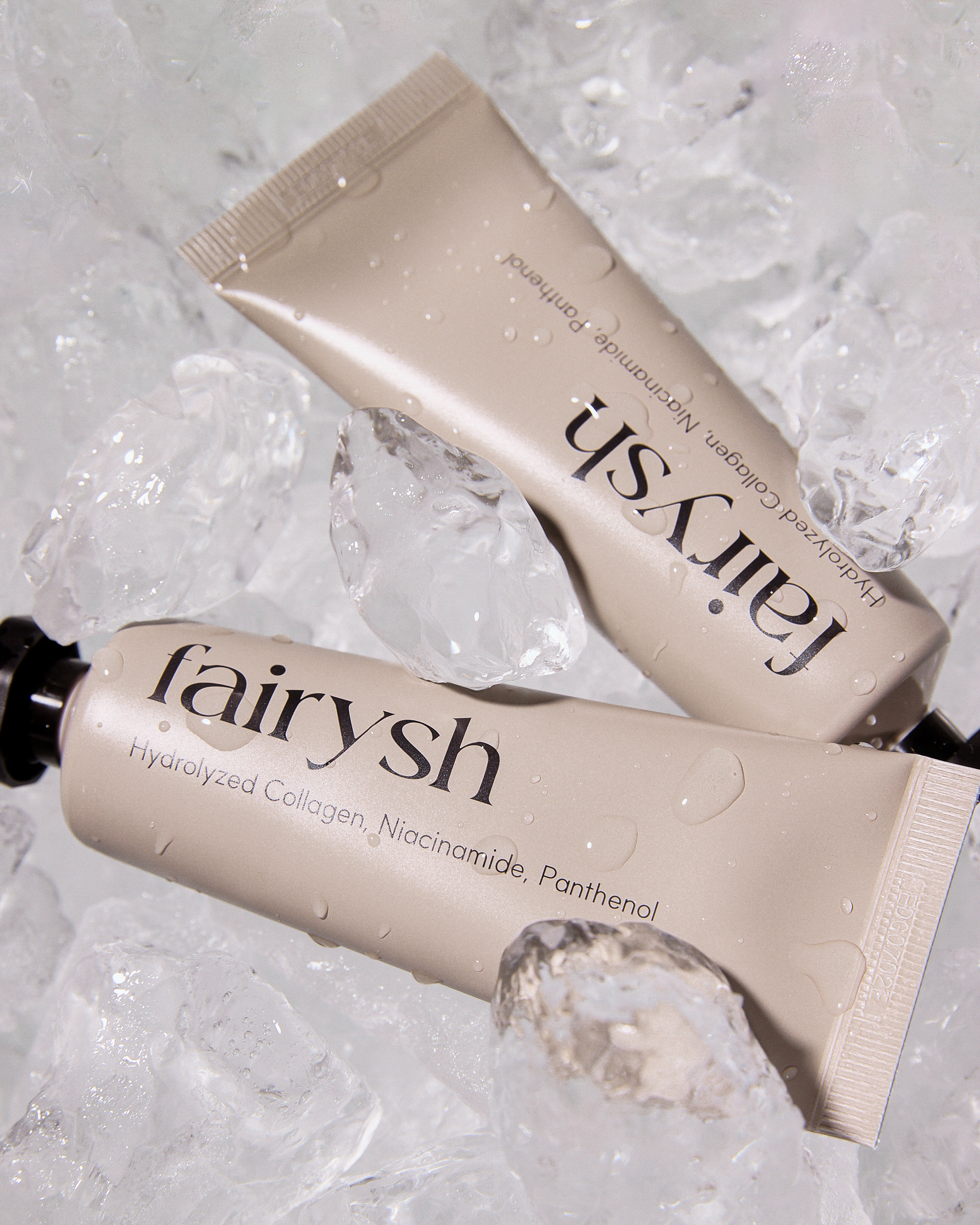
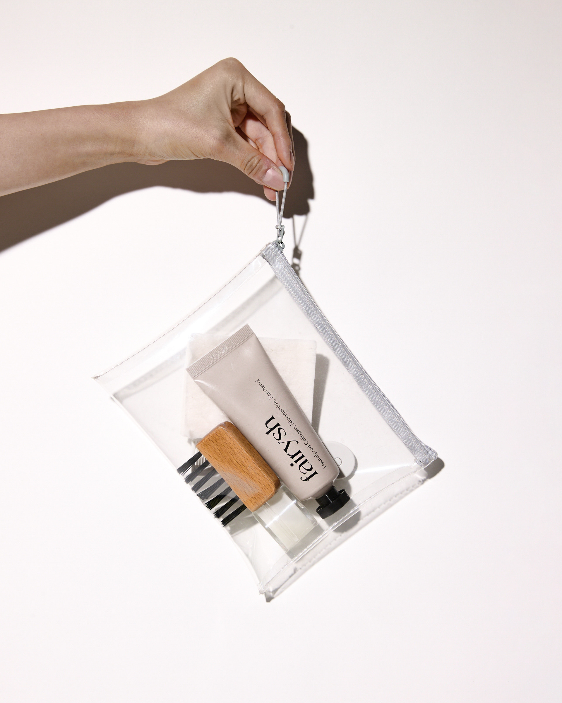
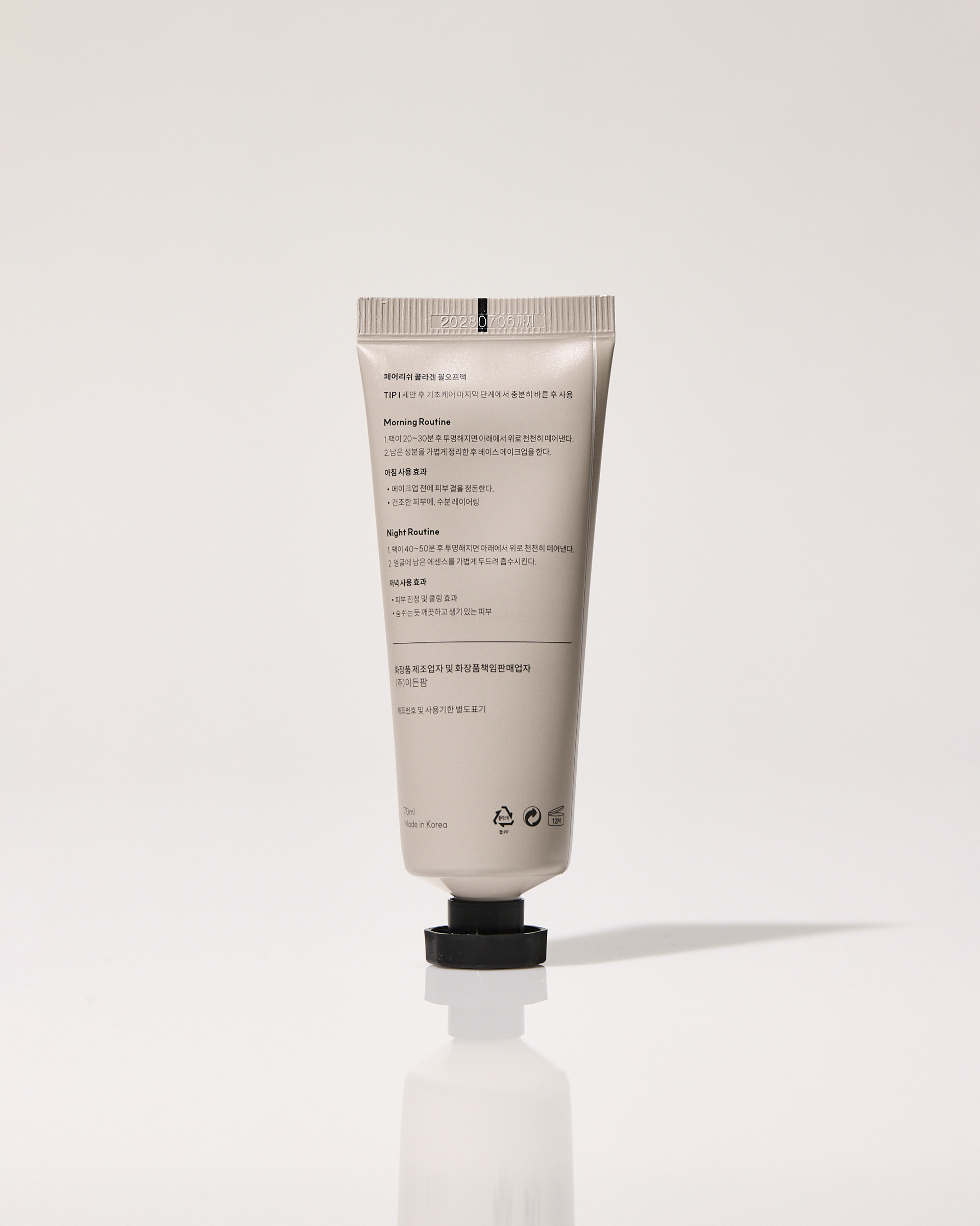
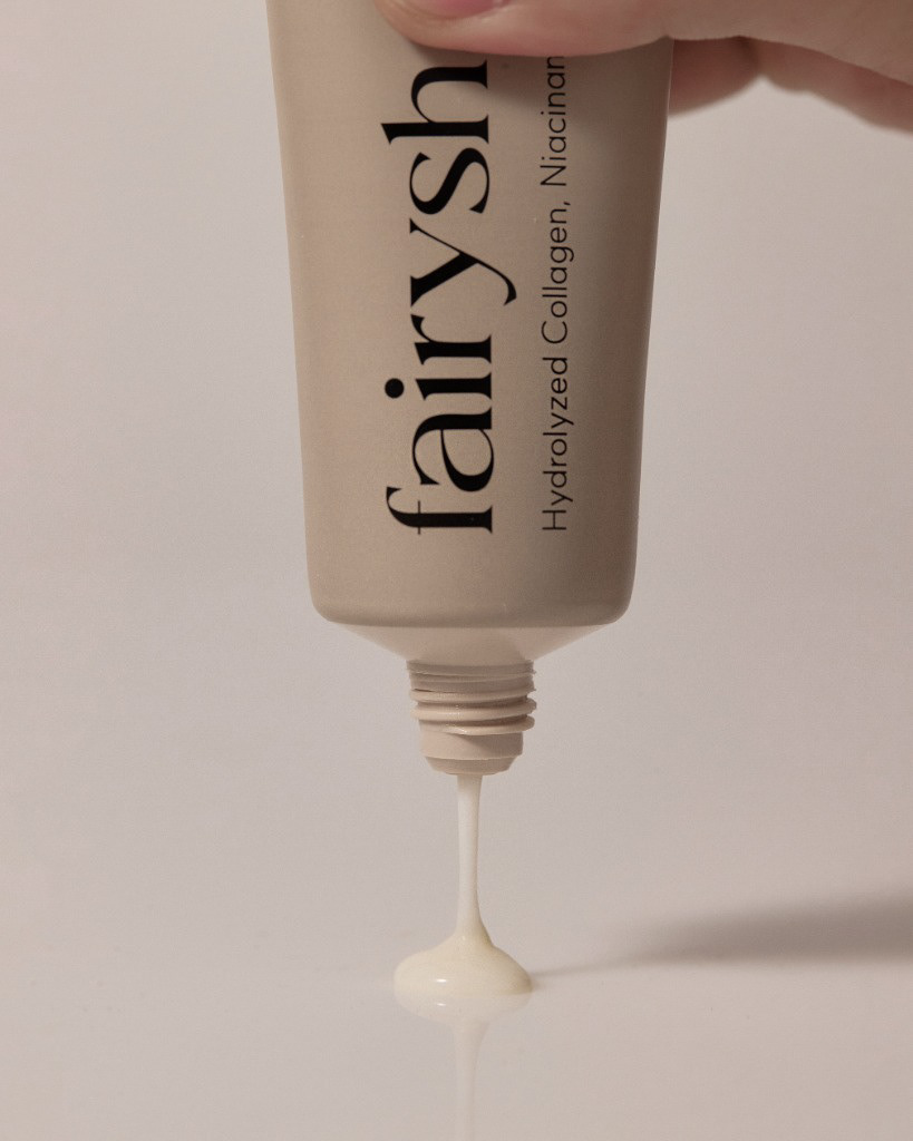
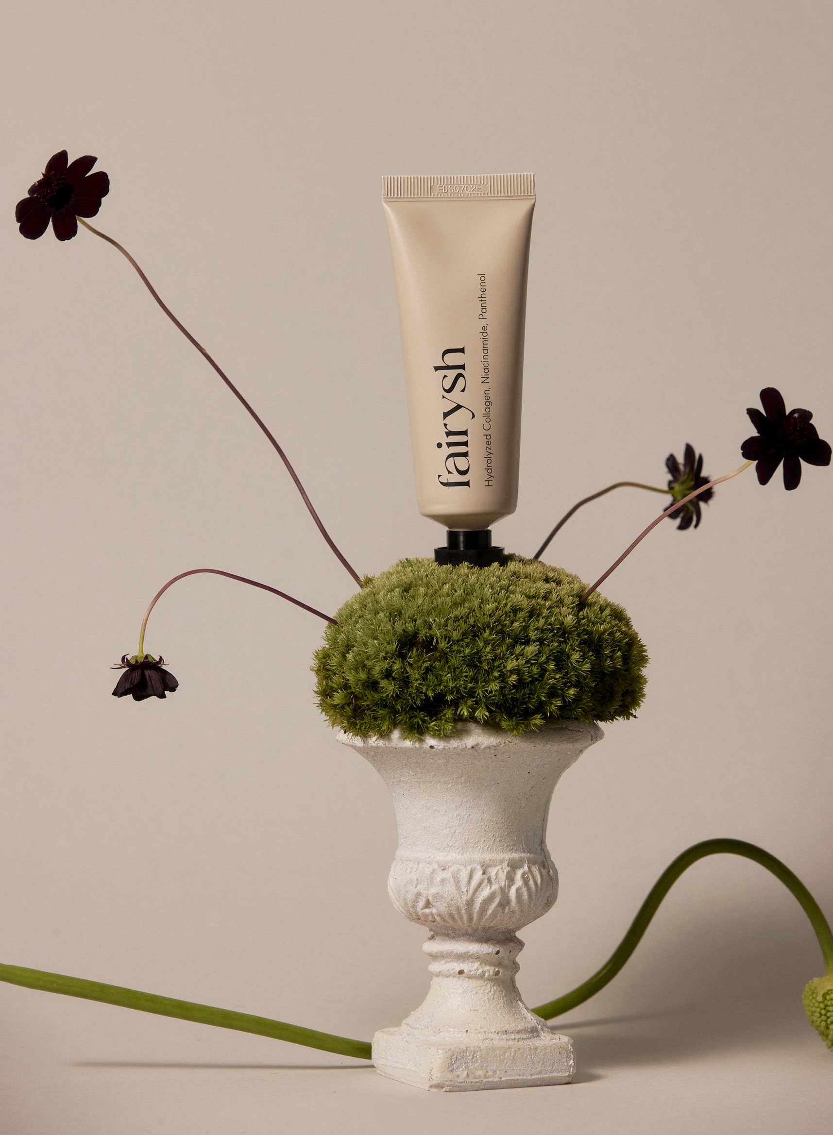
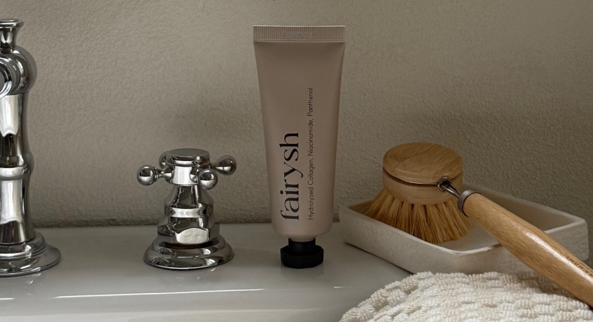
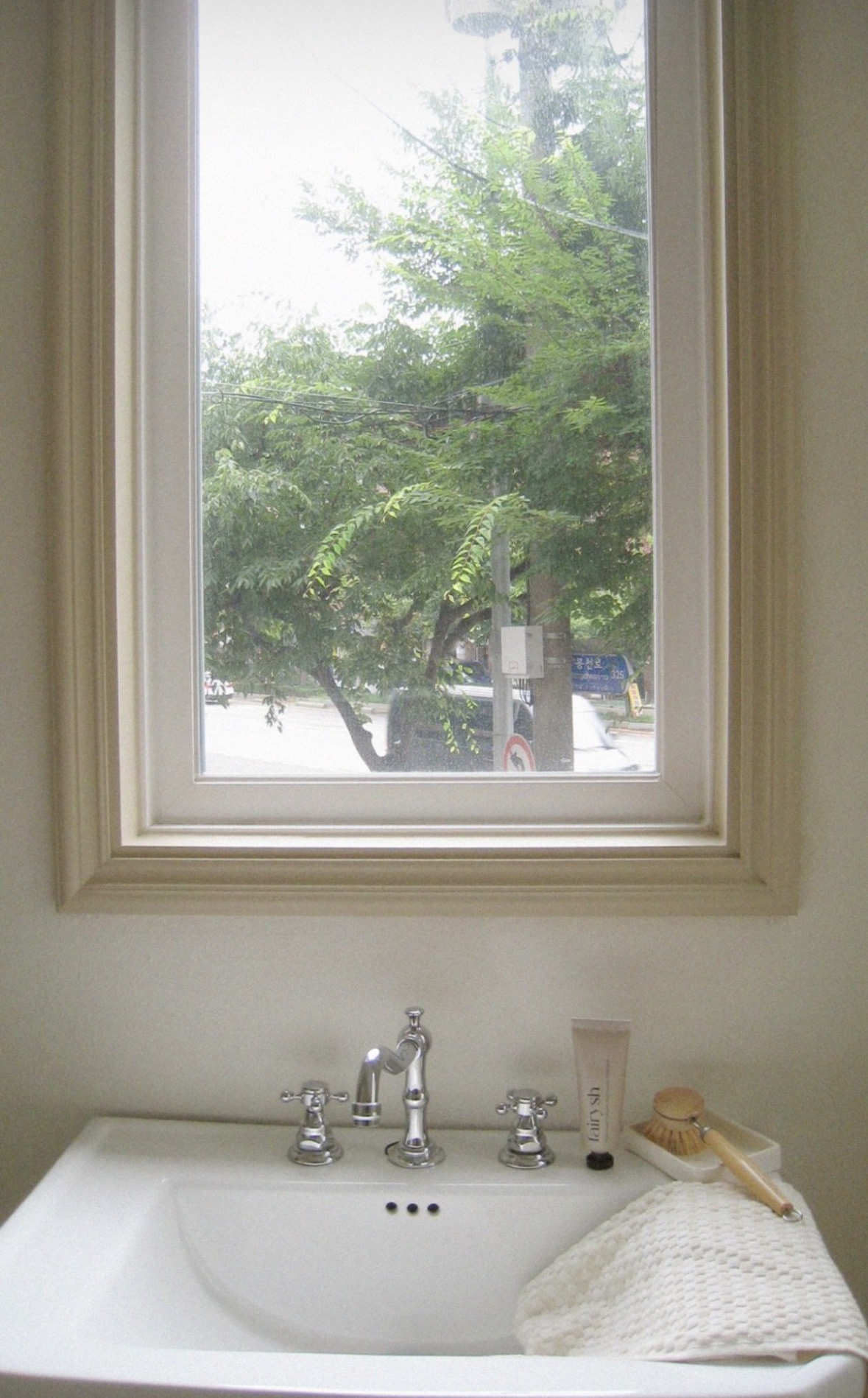
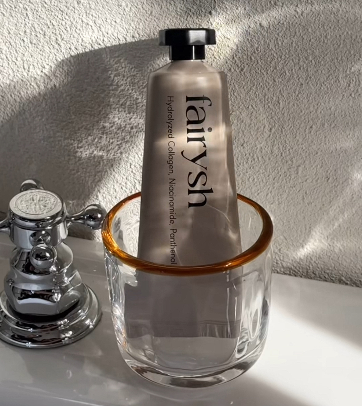
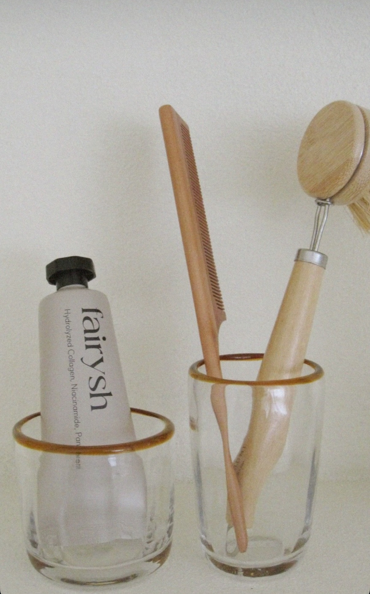
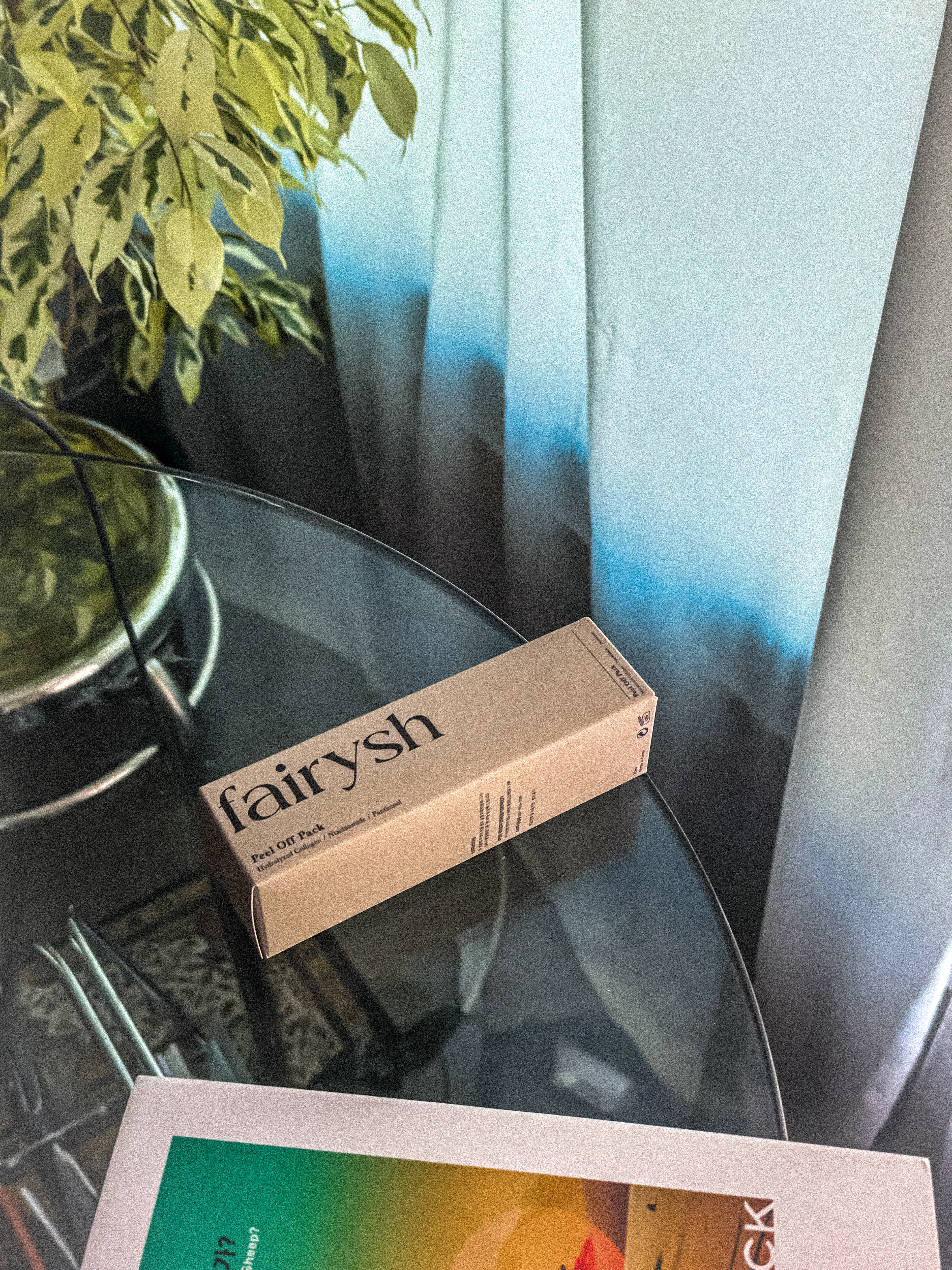
스킨케어 브랜드 '페어리쉬(Fairysh)'의 필오프팩 제품을 위한 통합 패키지 디자인 프로젝트입니다. 브랜드의 순수함과 기능성을 강조하기 위해 차분한 베이지 톤의 뉴트럴 컬러를 메인으로 선정하였으며, 정제된 세리프 타이포그래피를 활용하여 현대적이고 감각적인 인상을 패키지에 담아냈습니다. 튜브 타입의 용기 디자인부터 외부 박스까지 유기적으로 이어지는 비주얼 시스템을 통해 사용자가 일상의 루틴 속에서 미적 만족감과 신뢰감을 동시에 느낄 수 있도록 설계했습니다.
This project involved the integrated package design for skincare brand 'Fairysh's' peel-off pack. To highlight the brand's purity and functionality, a calm beige neutral tone was selected as the main color, paired with refined serif typography to create a modern and sophisticated impression. From the tube container to the outer box, the visual system was designed to provide users with both aesthetic pleasure and brand reliability during their daily skincare routines.
Category: Package Design, Branding
Key Subjects: Skincare Pack, Fairysh Identity, Collagen & Niacinamide
Visual Elements: Neutral Beige Palette, Elegant Serif Logo, Minimalist Information Layout
스킨케어 브랜드 'Fairysh'의 필오프팩 패키지 디자인을 진행하였습니다.