
Re:veil Medical Tattoo Brand Identity
흉터·튼살 커버, 유방암 환자의 유륜 재건, 백반증 커버, 두피 SMP를 다루는 메디컬 타투 브랜드의 아이덴티티 작업이다. Re(다시)와 veil(덮다)의 결합에 reveal(드러내다)의 중의를 겹친 네이밍에서 출발해, 상처를 가리는 행위가 곧 본연의 아름다움을 되찾는 과정이라는 브랜드의 관점을 시각화했다. 일반 반영구 타투샵과 구별되는 전문성과 격을 확보하는 것이 핵심 과제였다.
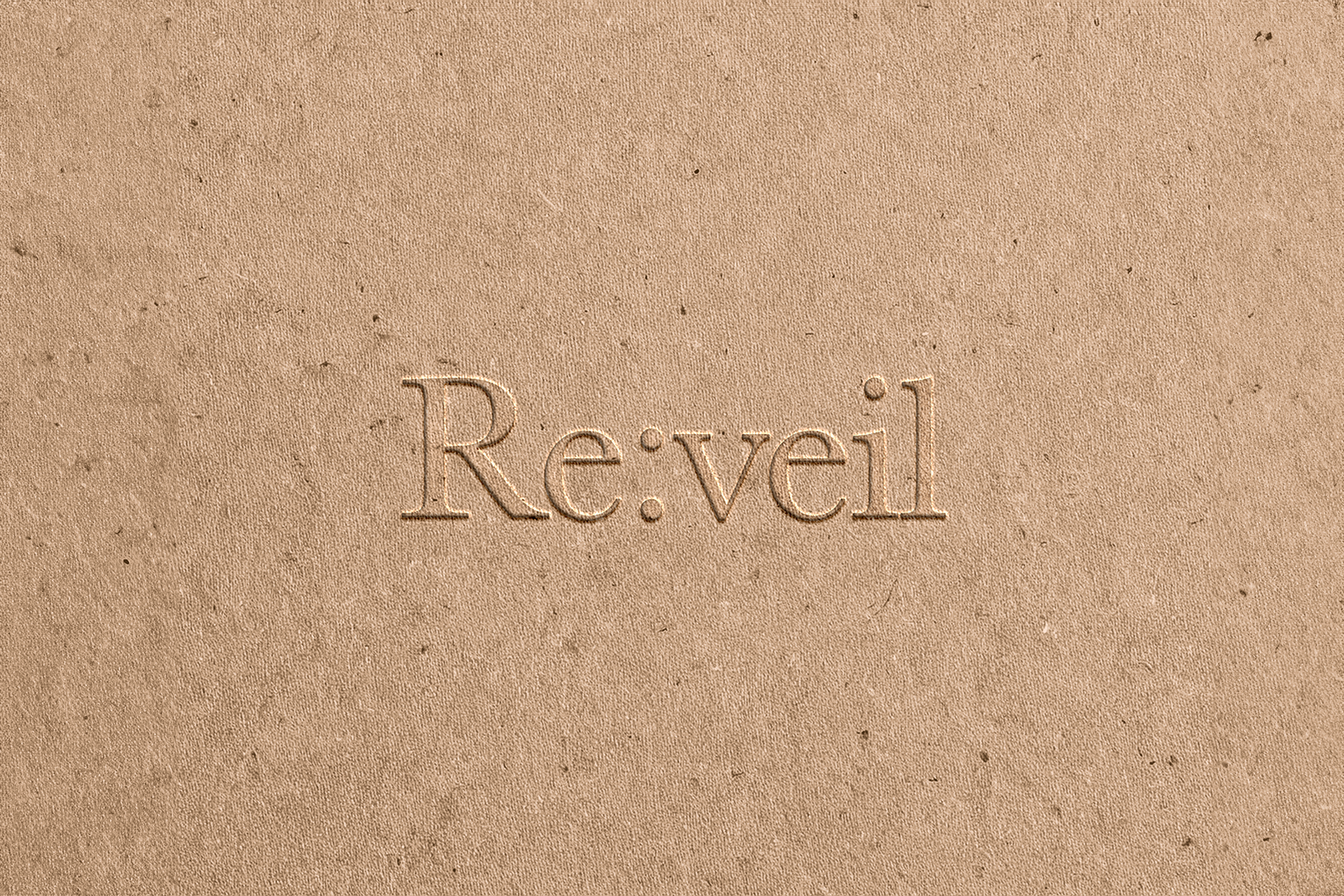
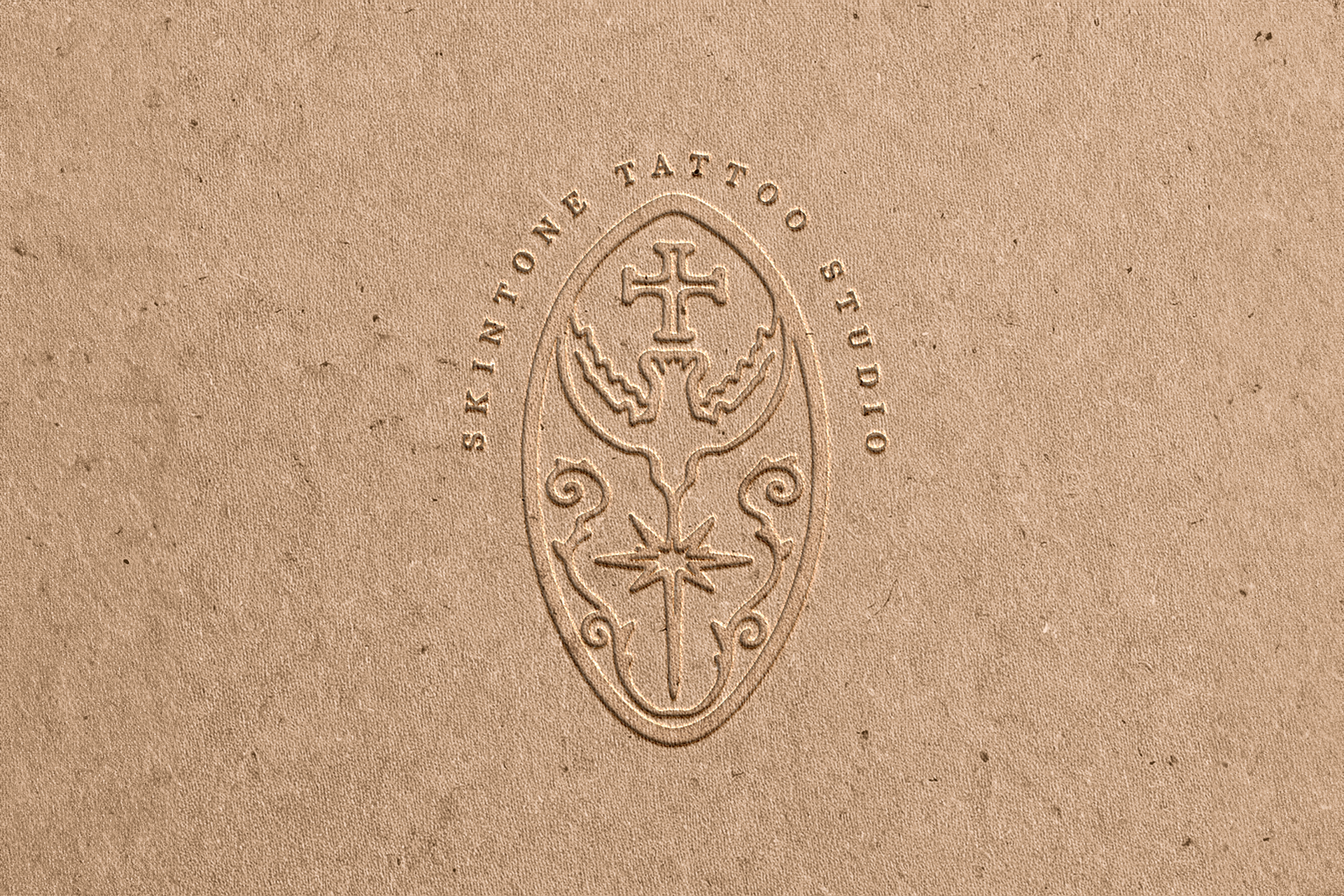
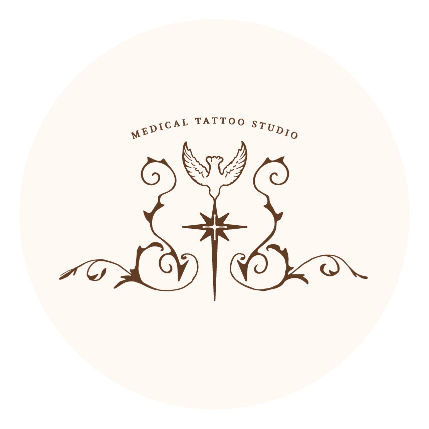
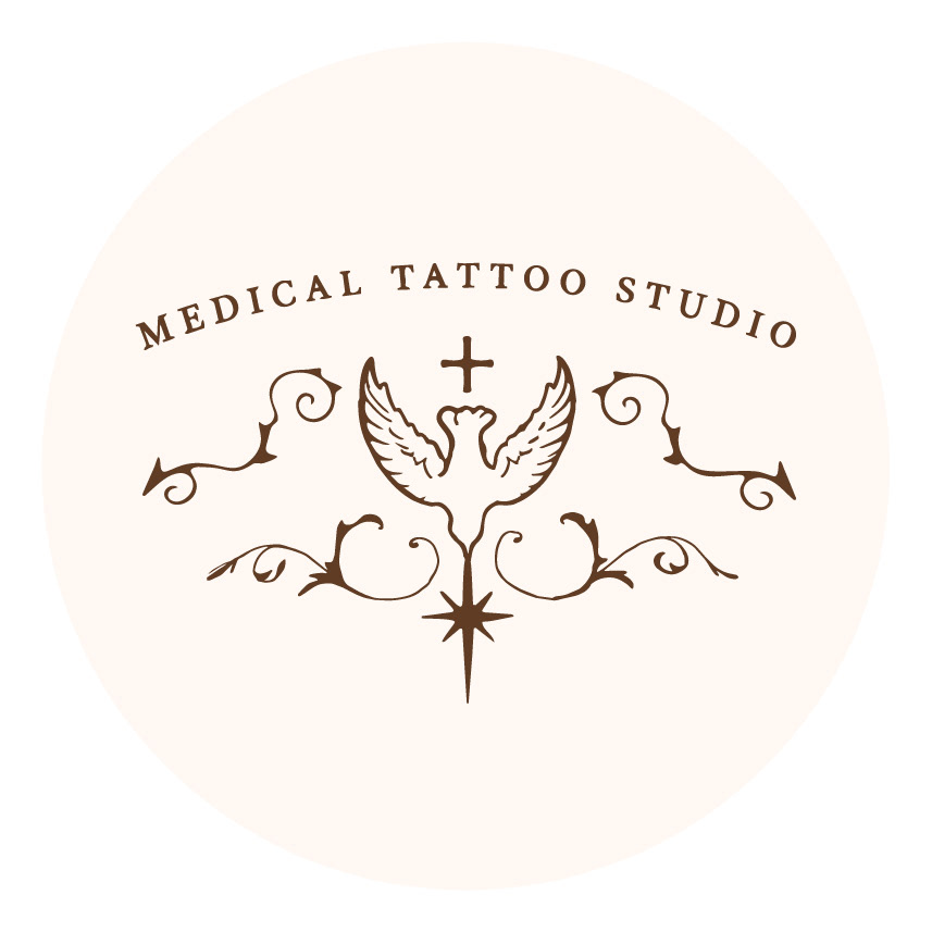
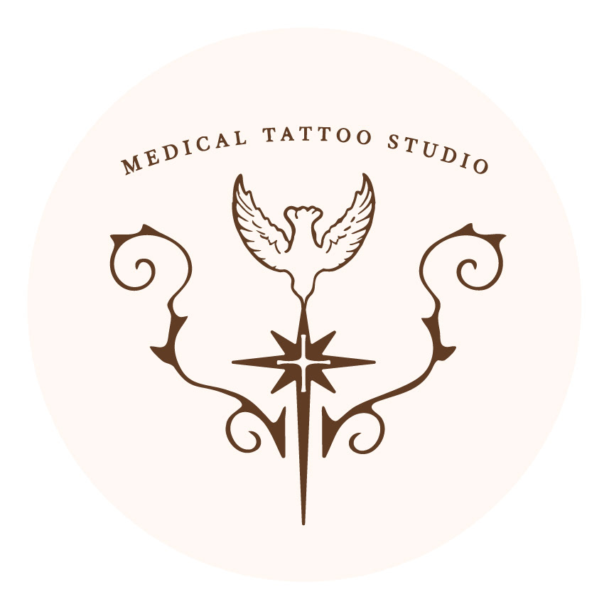
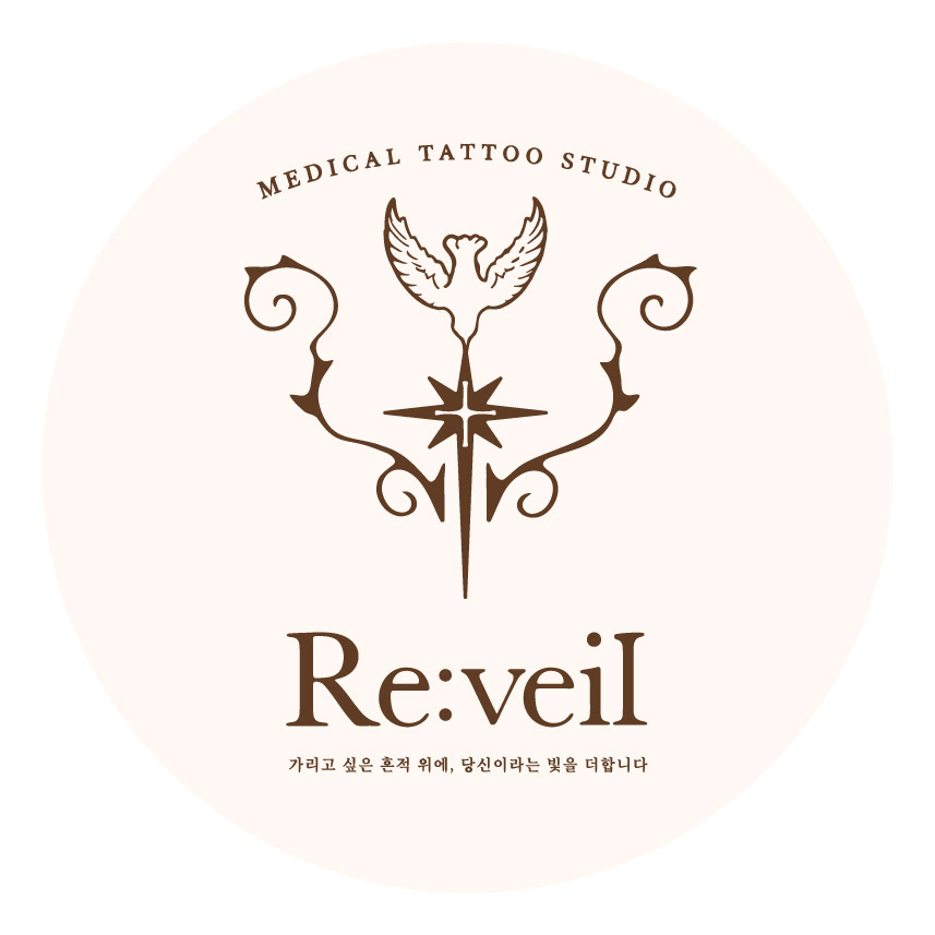
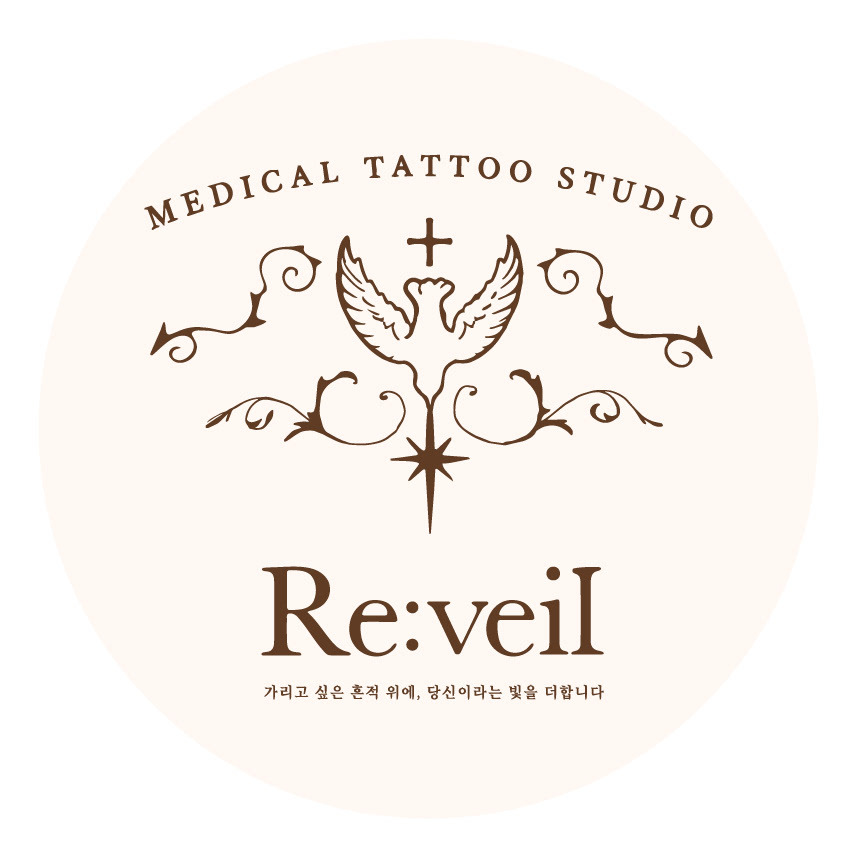
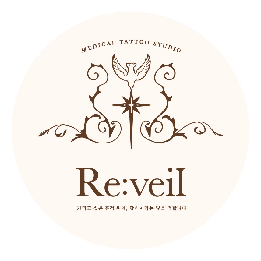
심볼은 올드스쿨 엠블럼 구조를 택했다. 의료를 지시하는 십자, 회복을 지시하는 비둘기와 별, 그리고 이들을 감싸는 아라베스크 덩굴이 하나의 문장(紋章)을 이룬다. 클라이언트 피드백을 거치며 타원 프레임을 해체하고 획 두께를 덜어냈으며, 고딕 계열 덩굴을 흐르는 곡선의 아라베스크로 교체해 여성적 온기를 확보했다. 워드마크는 커스텀 레터링으로 r과 l의 장식 획에 손의 온도를 남겼고, 베이지·누드 계열 위 골드로 브랜드가 지향한 찬란함을 구현했다.
Brand identity for a medical tattoo studio specialising in scar and stretch mark coverage, areola reconstruction for breast cancer patients, vitiligo camouflage, and scalp micropigmentation. The name folds re (again) and veil (to cover) into the doubled reading of reveal — a premise that treats the covering of a wound as the very process of recovering one's own beauty. The central task was to secure a register of professionalism and gravity that sets the studio apart from conventional semi-permanent makeup shops.
The symbol takes the form of an old school emblem. A cross for medicine, a dove and a star for recovery, and arabesque tendrils enclosing them resolve into a single crest. Through rounds of client feedback the oval frame was dissolved and stroke weights pared back, with gothic vine elements replaced by flowing arabesque curves to bring in a feminine warmth. The wordmark was custom-lettered, keeping the temperature of the hand in the ornamental strokes of the r and l, and rendered in gold over beige and nude tones to reach the radiance the brand had asked for.
Category: Brand Identity, Logo Design
Key Subjects: Medical Tattoo, Emblem, Recovery
Visual Elements: Old School Emblem, Arabesque Tendril, Custom Lettering, Beige & Gold
Key Subjects: Medical Tattoo, Emblem, Recovery
Visual Elements: Old School Emblem, Arabesque Tendril, Custom Lettering, Beige & Gold
re:veil