서화다과 Seohwa Dagwa | Brand Identity & Packaging
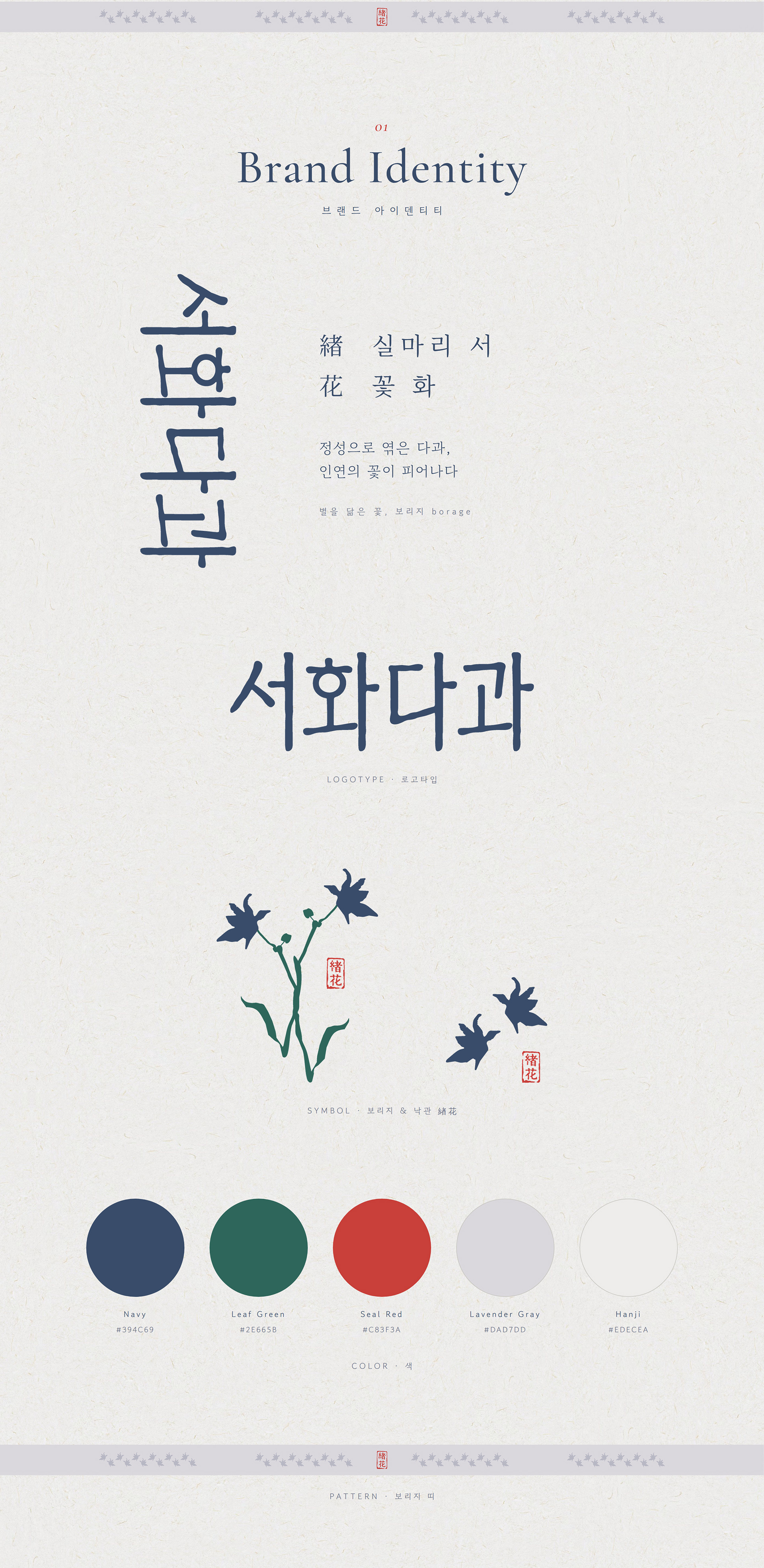
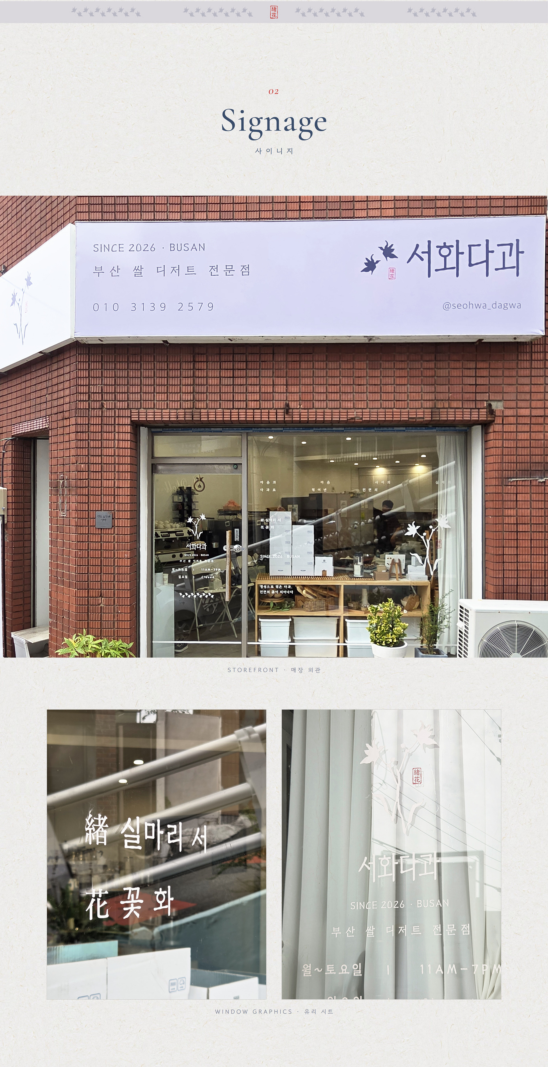
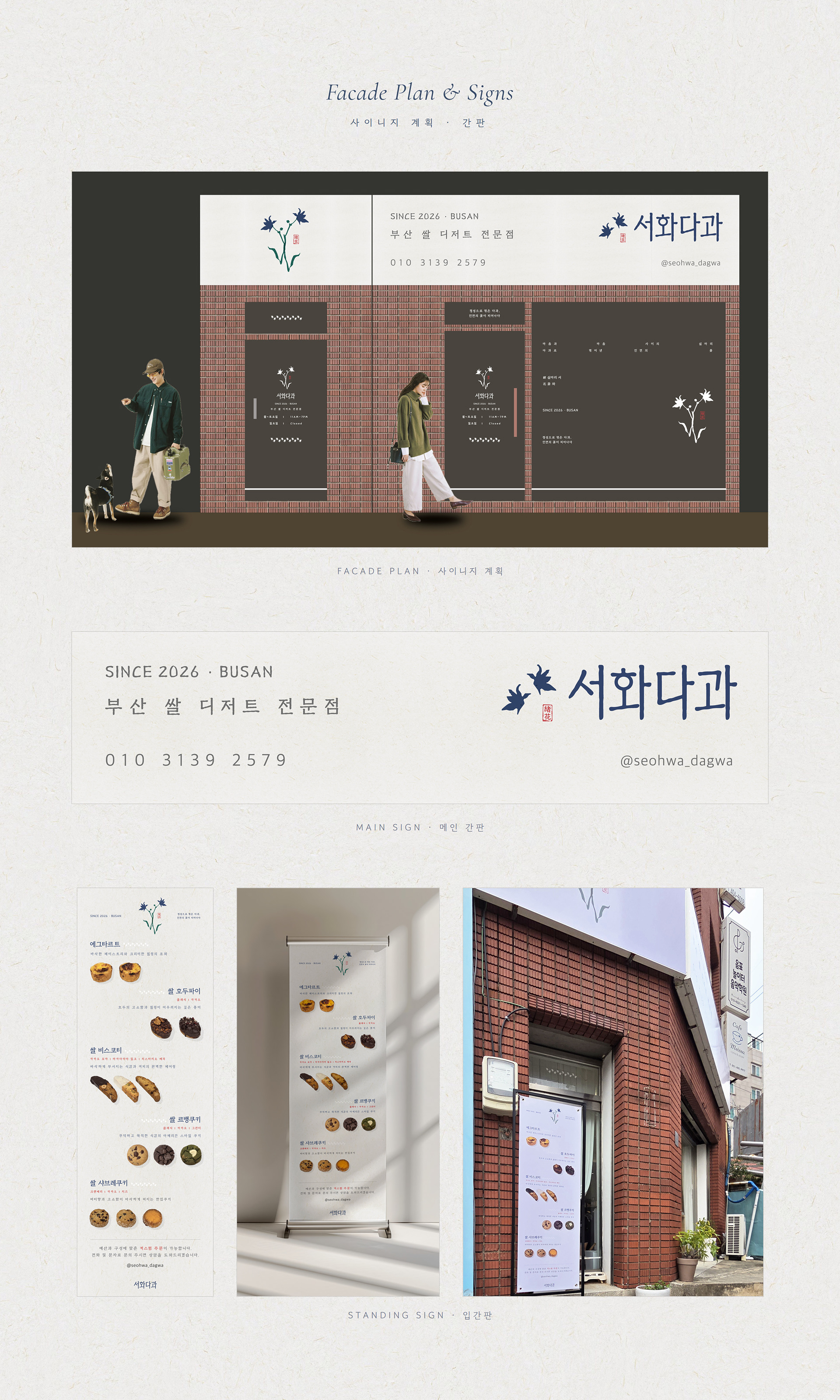
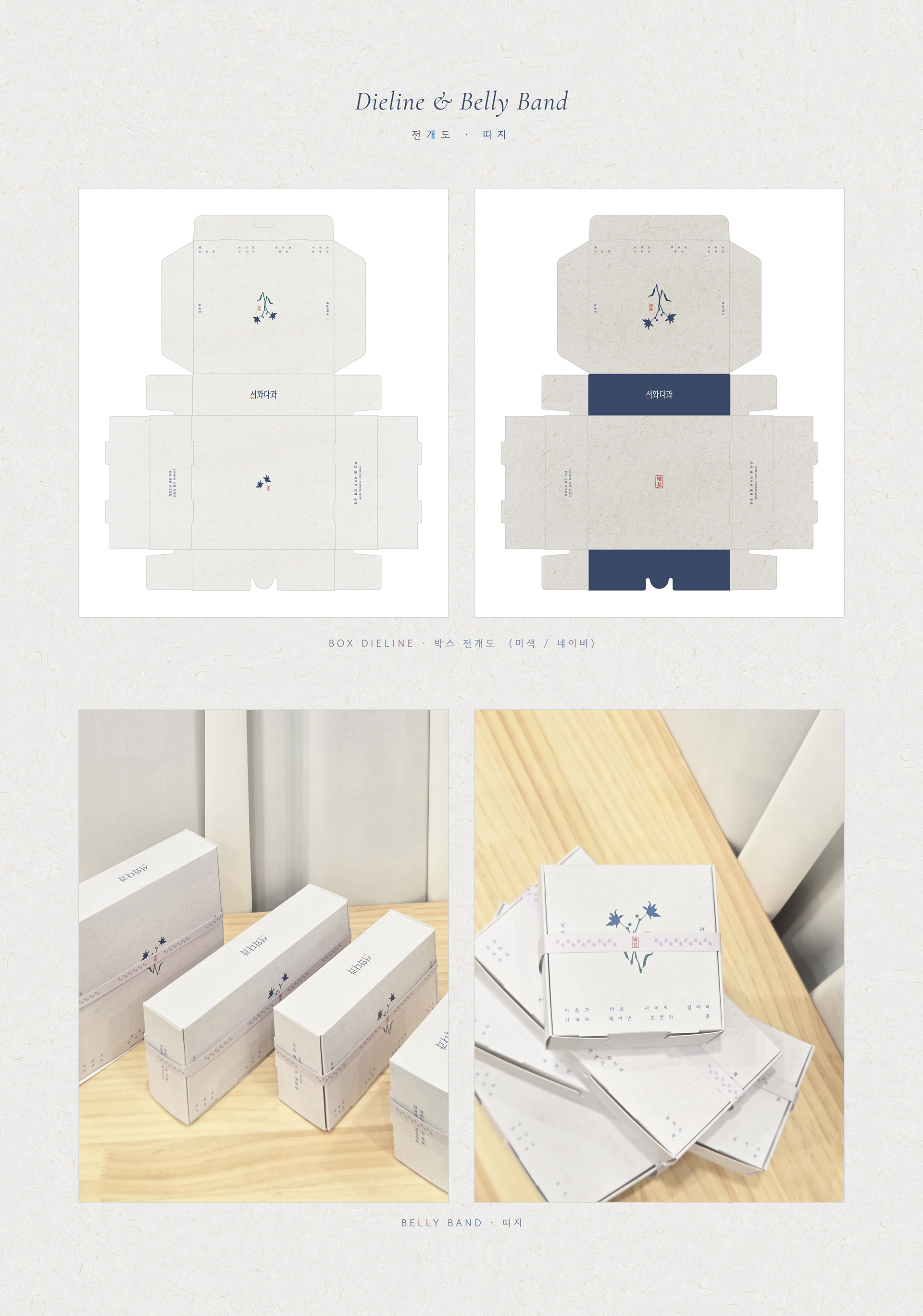
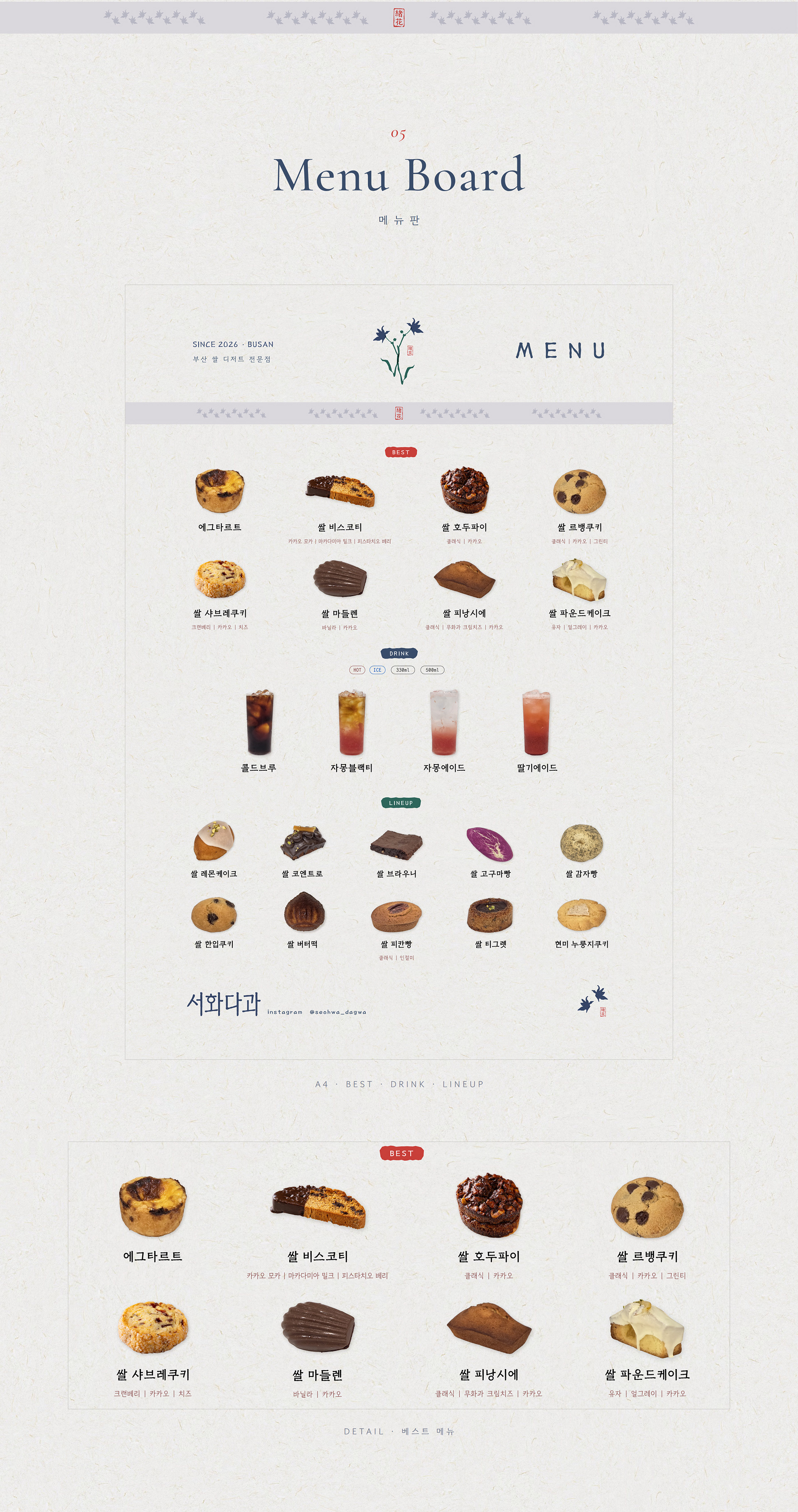
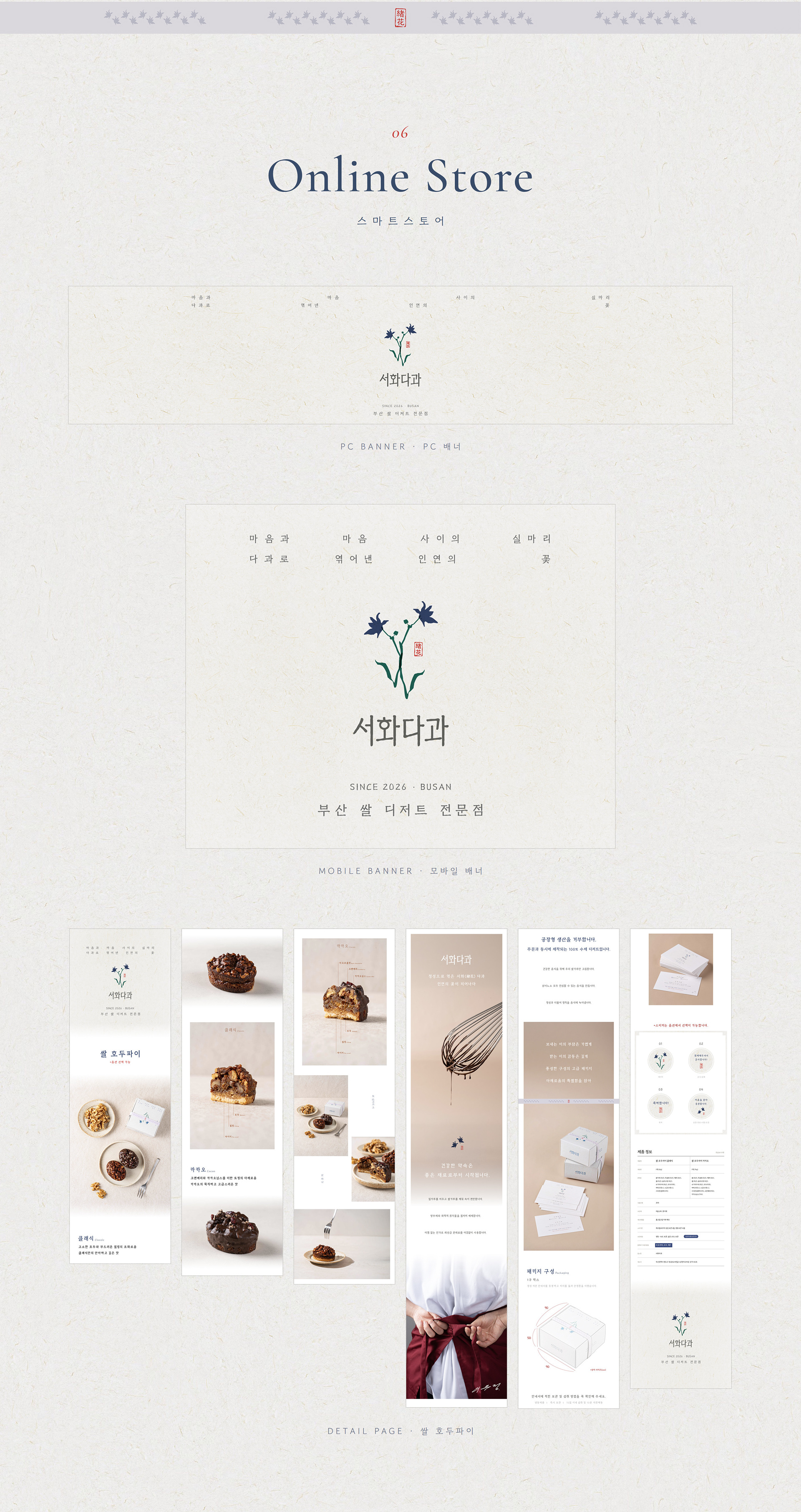
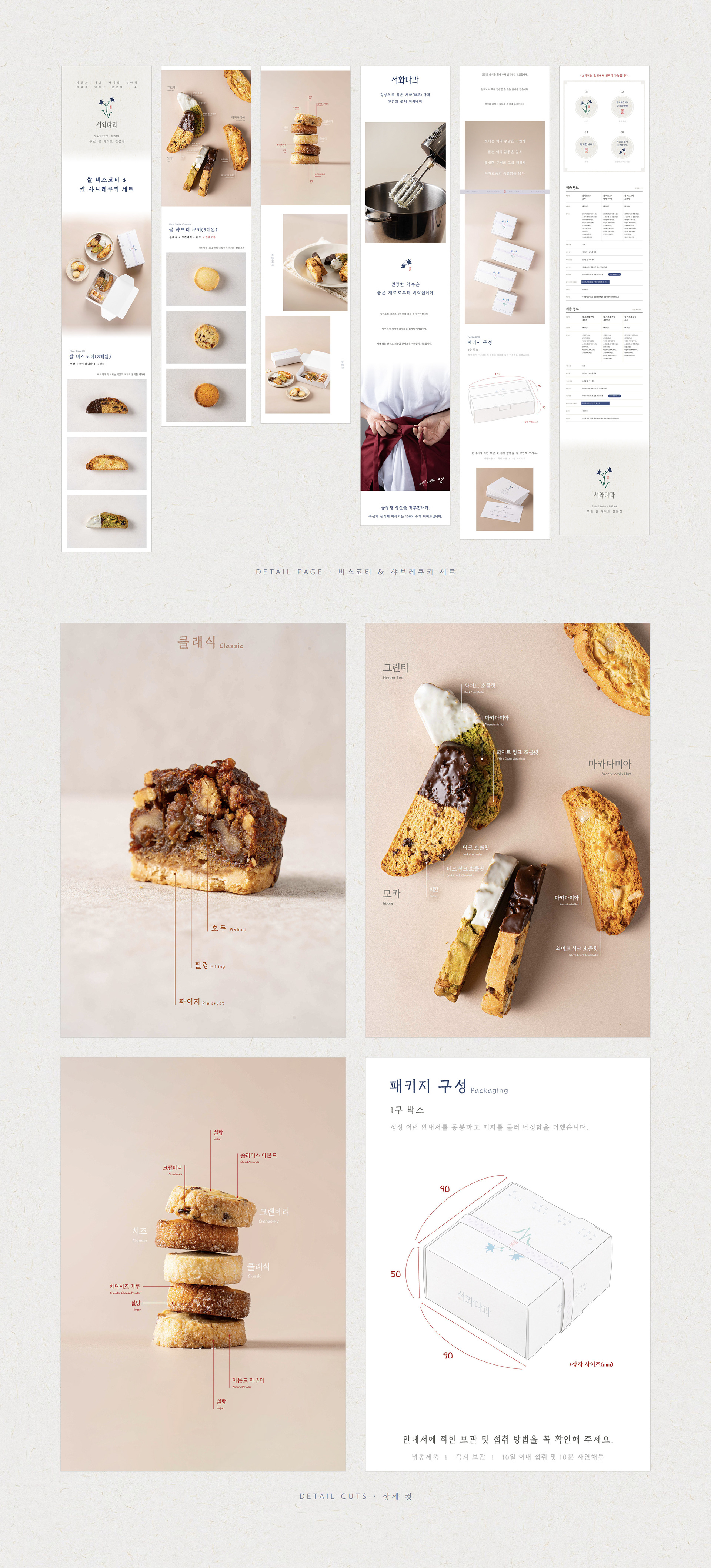
Seohwa Dagwa is a rice dessert shop in Yeongdo, Busan. It bakes rice biscotti, walnut pies and financiers to order only, and packs thank-you gift boxes around each customer's budget. The name joins two characters: 緖 (seo), the loose end of a thread, and 花 (hwa), a flower. On the leaflet and banners they open into two vertical lines: a thread between one heart and another, and a flower of connection woven from sweets. The symbol is borage, a star-shaped flower that people in old Europe floated in the cup of someone leaving on a long journey. The brand carries that farewell onto its gift boxes: two blooms on separate stems, one for the giver and one for the receiver, beside a red seal reading 緖花. Navy, leaf green and seal red sit on hanji off-white, with a pale lavender grey for the belly-band pattern. The work covers two signs (4050 × 1000 mm and 1900 × 1000 mm), cut-vinyl graphics for the doors and shop window, gift boxes in four sizes in off-white and navy, belly bands, shopping bags, business cards, a tri-fold leaflet, a guide card, an A4 menu, and banners and product pages for the online store.
서화다과는 부산 영도의 쌀 디저트 전문점입니다. 쌀 비스코티, 쌀 호두파이, 쌀 피낭시에 같은 구움과자를 100% 예약으로 굽고, 답례품은 예산과 구성에 맞춰 상자째 꾸려 줍니다. 서화(緖花)의 서는 실마리, 화는 꽃입니다. 리플렛과 배너에는 '마음과 마음 사이의 실마리'와 '다과로 엮어낸 인연의 꽃'을 세로 두 줄로 나란히 세웠습니다. 심볼은 보리지입니다. 별처럼 다섯 갈래로 피는 이 꽃을 오래전 유럽에서는 먼 길 떠나는 사람의 잔에 띄웠다고 합니다. 그 배웅의 장면을 답례 상자 위로 옮겼습니다. 서로 다른 가지에서 핀 두 송이는 건네는 사람과 받는 사람이고, 곁에는 붉은 낙관 緖花를 찍었습니다. 색은 남색, 잎 초록, 낙관 빨강. 바탕은 한지 미색이고 띠지 무늬에는 옅은 라벤더 회색을 썼습니다. 간판은 4050×1000mm와 1900×1000mm 두 면이고, 유리문과 통창에는 흰색·빨간색 시트를 오려 붙였습니다. 답례 상자는 90×90, 170×90, 170×160, 220×90mm(높이 50mm) 네 가지를 미색과 네이비로 나눠 만들었습니다. 쇼핑백, 명함, 3단 리플렛, 안내서, A4 메뉴판, 스마트스토어 배너와 상세페이지까지 같은 한지 질감으로 맞췄습니다.
Client Seohwa Dagwa (@seohwa_dagwa)
Design Han Haram Design Studio
Year 2026